Course · Part 2 · Assignment 4
Apply 
Apply Visual Principles
![]() Time limit: 2 hours
Time limit: 2 hours
Remember to use your visual timer! We recommend the inventor’s iOS and Android apps — just search for “Time Timer” in the app store.
Explanation
In this assignment, you’ll take the visual principles you just learned about, and apply them to a short design brief: design a flyer!
Instructions
Study the brief
 Set your timer: 20 minutes
Carefully read through the following design brief, and jot down some of the important points in your notebook. You could also note any initial ideas that come to mind.
Background: Rework is a small group of coworking spaces in London, England. They have been in business for just under 2 years, and are opening a new space in the Spitalfields area of the city.
Design direction: The flyer needs to be impactful and exciting, but it also needs to be cool and professional. The aim is to appeal to young professionals who freelance. They might currently work from home, or already use a different coworking space. The flyer needs to be in black and white only, and it will be on A5 paper.
The following text needs to appear in the flyer:
[Logo] Rework
Work smarter, not harderRework’s new Spitalfields coworking space can help you improve your productivity and focus, get your work/life balance back, and find new connections.
Book a day’s free trial
Call 020 12345678
Or email bookings@rework.coDeliverables: Initial thumbnail sketches, and one full-size sketch of a flyer design.
Jargon Buster
In both graphic design and digital product design, the term deliverable is used to refer to each item that needs to be “delivered” during a project. For example, deliverables for a logo design project might include a set of image files containing the logo, and a PDF document explaining how to use it.
Make some thumbnail sketches
Set your timer: 40 minutes
Next, make some thumbnail sketches of different layouts for the flyer, similar to those you made in Part 1.
Here’s a quick recap of thumbnail sketching. A thumbnail sketch is a quick, “zoomed-out” version of a design, which allows you to rapidly move through different ideas. Thumbnail sketches don’t include many details, and often just use lines and shapes to represent text and graphics.
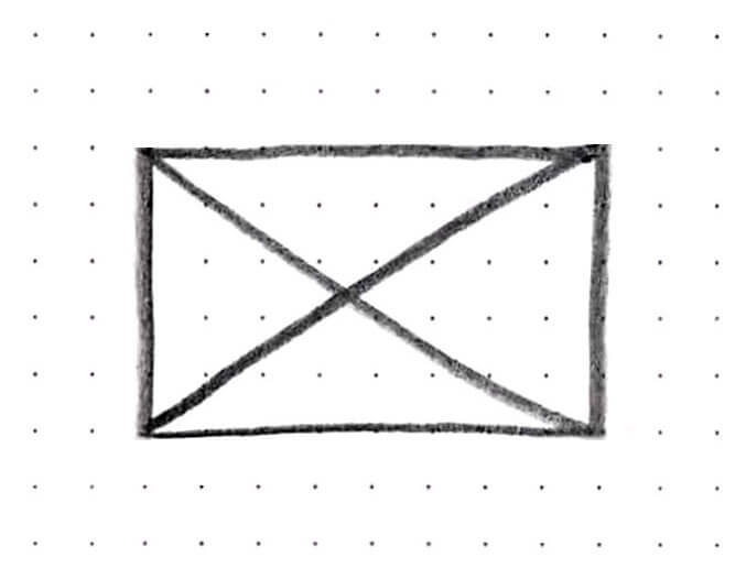
Although you can create designs using text only, feel free to include shapes and graphics as well. If you imagine using a photo, you can just sketch a placeholder that looks like this:
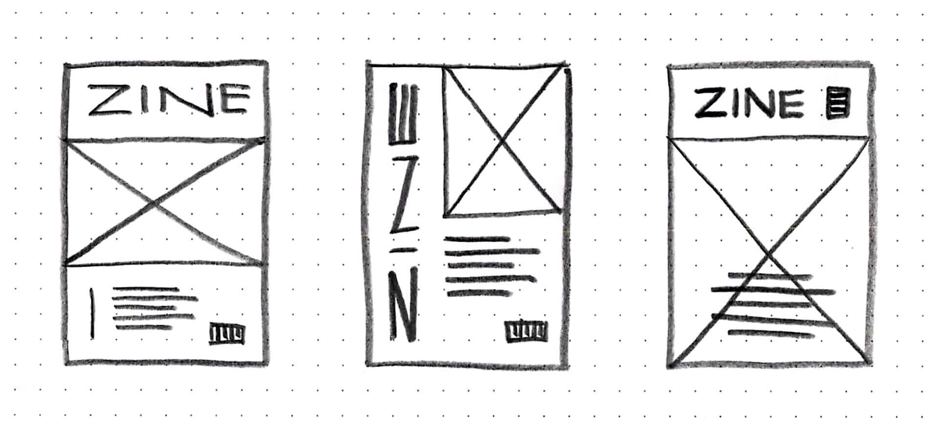
Here’s an example of what thumbnail sketches might look like for a magazine cover:
Here’s that list of visual principles once more:
- Proximity and grouping
- Visual hierarchy
- Spacing
- Alignment
- Contrast
- Balance
- Repetition and consistency
- Pacing
Create a full-size sketch
Set your timer: 50 minutes
Finally, choose the thumbnail you think is best, and sketch that design at full size, including all the text. Remember to use your visual principles!
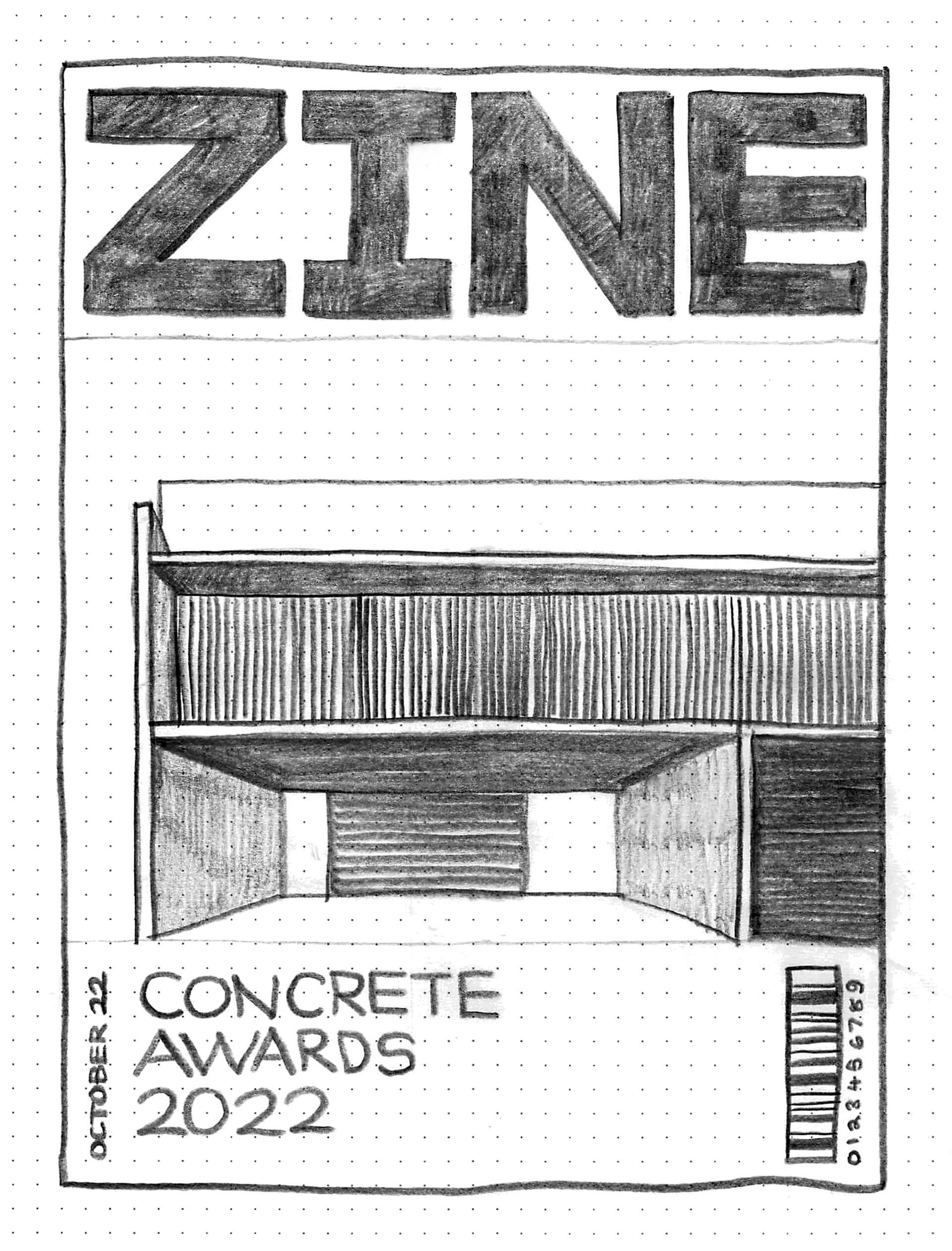
To give you an idea of what’s required, here’s one of those magazine cover thumbnails sketched at full size:
Review the example solution
Once you’ve completed your work on this assignment, take a few minutes to review the example solution below.
Example solution
Here are our thumbnail sketches:
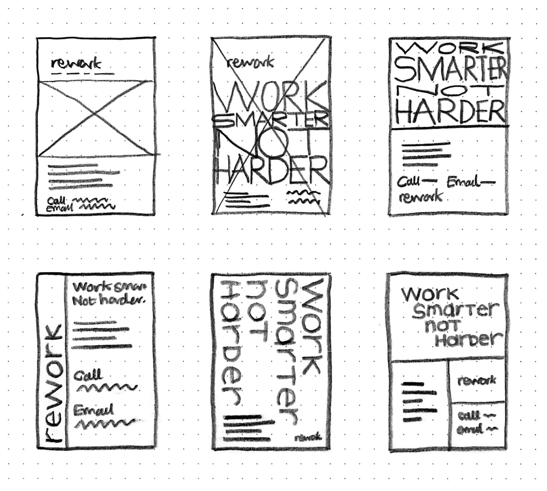
And here’s the full-size sketch of the one we chose:
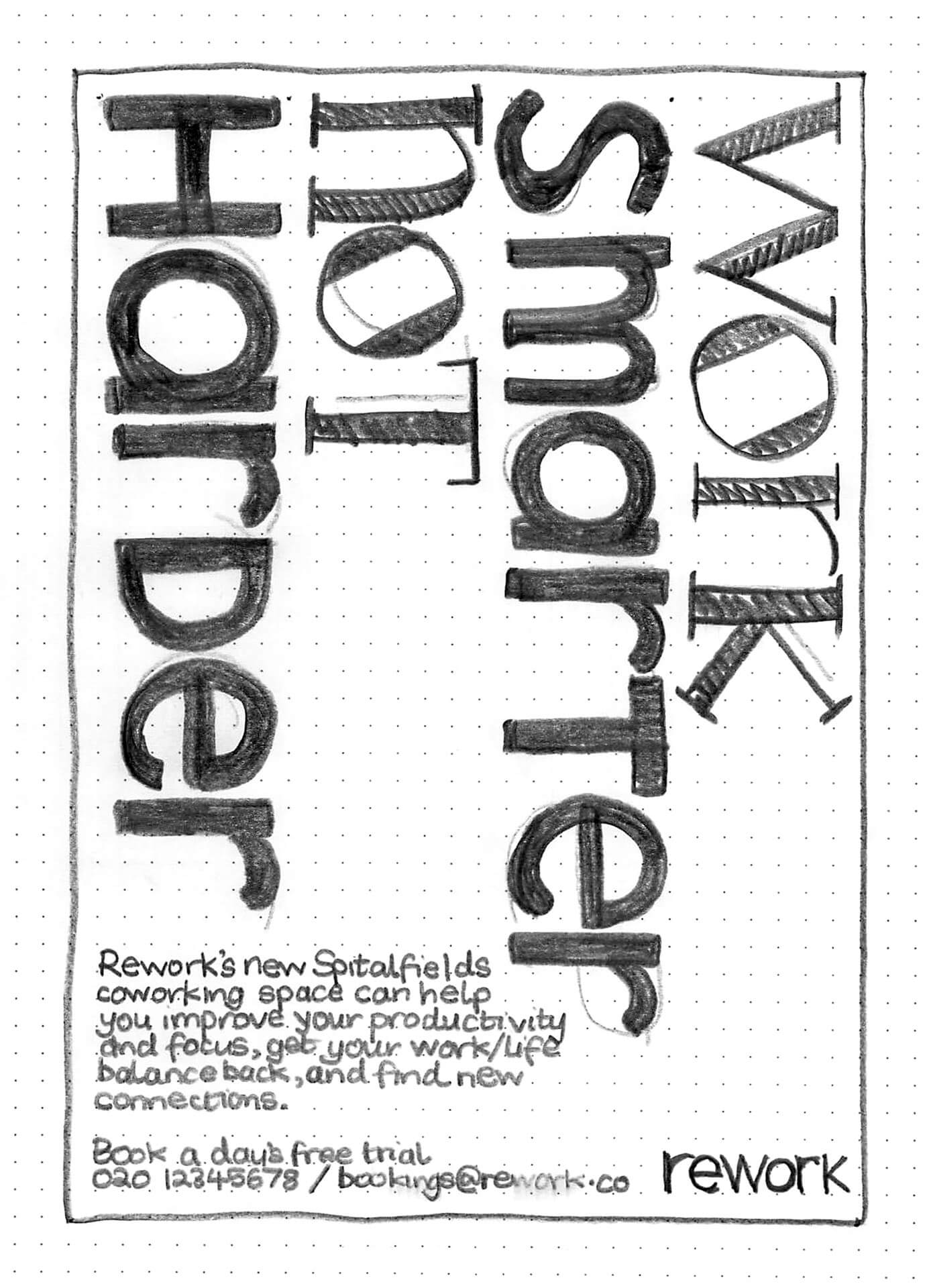
We tried to create:
- Alignment using the four columns of rotated text (a bit like that Müller-Brockmann poster)
- Contrast between big and small text, and between two different styles of lettering
- Grouping of the information together at the bottom, and
- Balance between top and bottom
Of course, this is just an initial sketch, and we can also see lots of room for improvement. Currently, for example:
- The balance isn’t working very well, because the big lettering dominates the details at the bottom
- The design needs more spacing, because the lettering at the top is also too close to the other text
- Our hierarchy could be better — at the moment there isn’t any visual emphasis on the action we want people to take (“book a day’s free trial”).
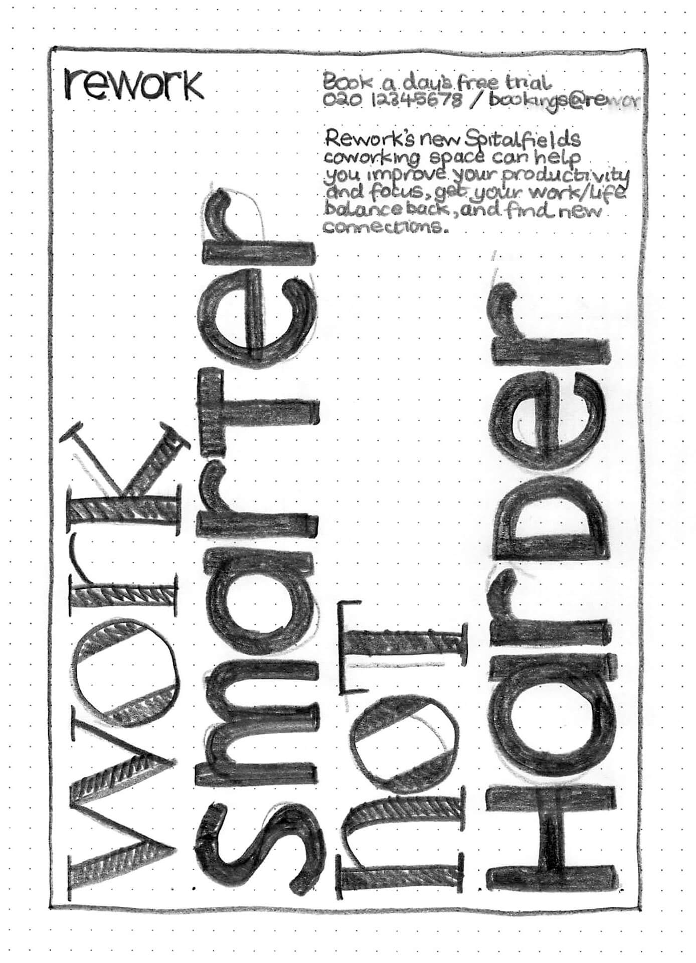
Pro Tip (◉ܫ◉)
Always try turning things upside-down.
We did it with this sketch, and it gave us the idea to flip the whole layout. So we rearranged the design to see what it would look like:
Take a critical eye to your own sketch. Can you spot anything you think could be improved? You can refer back to that list of visual principles above.
In conclusion...
That wraps up our work on visual principles for now. In the next assignment, let’s start talking about usability!