Course · Part 2 · Assignment 3
Practise ![]()
Identify Visual Principles
![]() Time limit: 1 hour
Time limit: 1 hour
Remember to use your visual timer! We recommend the inventor’s iOS and Android apps — just search for “Time Timer” in the app store.
Explanation
In this exercise, you’ll study a poster design and analyse how it uses the visual principles discussed in the previous assignment.
Instructions
Analyse this poster design
 Set your timer: 50 minutes
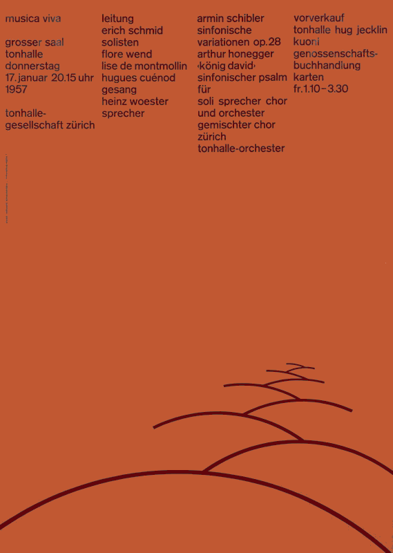
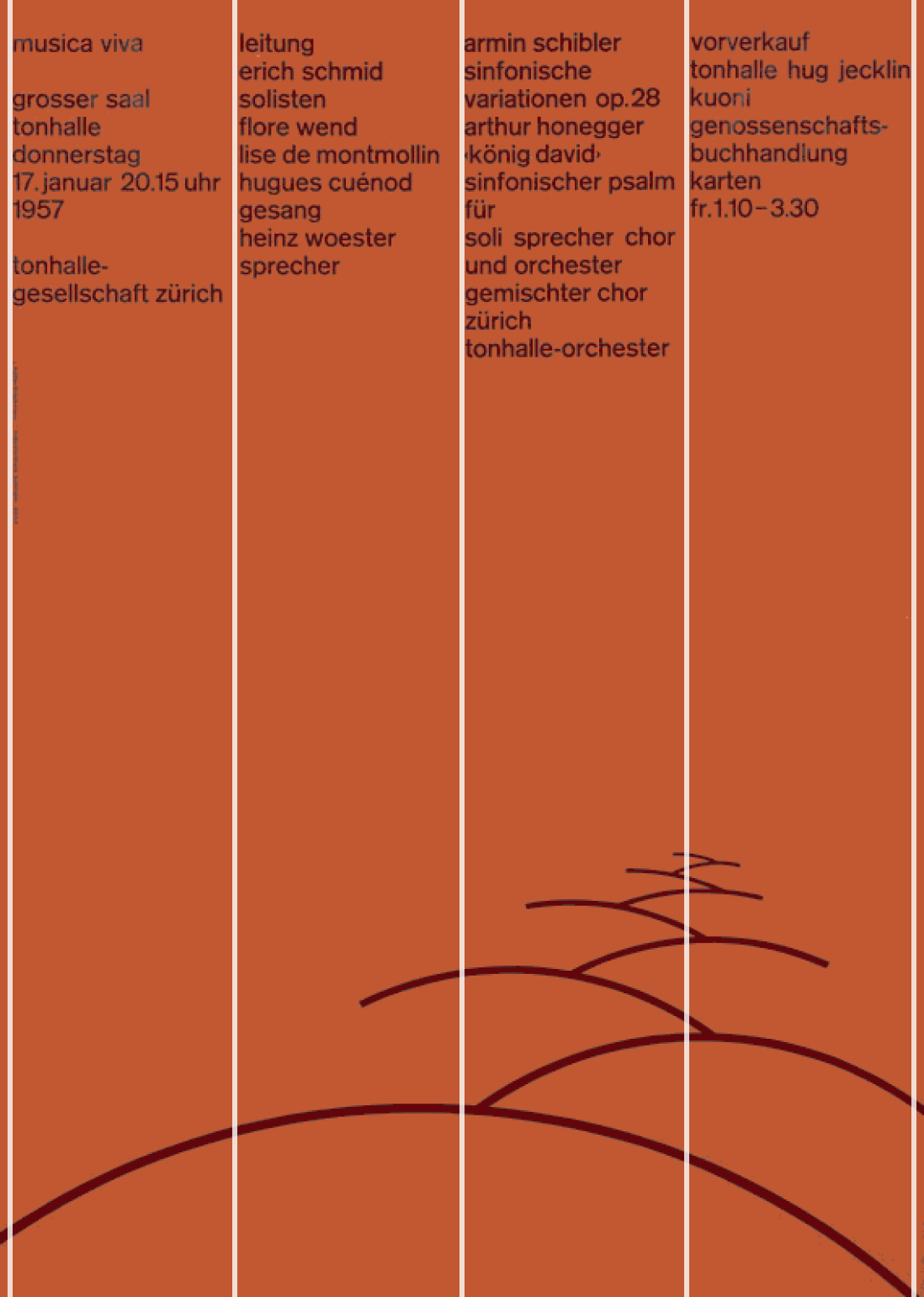
Pictured below is a poster by the twentieth-century Swiss graphic designer Josef Müller-Brockmann.
Study it carefully, and write down how you think he uses the visual principles introduced in the previous lesson. Here they are again:
- Proximity and grouping
- Visual hierarchy
- Spacing
- Alignment
- Contrast
- Balance
- Repetition and consistency
- Pacing
Review the example solution
Once you’ve completed your work on this assignment, take a few minutes to review the example solution below.
Example solution
In Müller-Brockmann’s poster, visual principles are at work in the following ways:
Proximity and grouping
The text elements are grouped, forming one visual area, and the graphic elements are grouped, forming the illustration. The text is also grouped into four separate columns.
Visual hierarchy
Arguably Müller-Brockmann doesn’t create clear hierarchy within this design, and this is likely intentional. By creating two areas of roughly equal visual weight (top and bottom), with no clear order, the designer is likely deliberately creating a sense of tension.
Our eye wants to begin in the top-left, because that’s where it’s used to starting on a page, but we are equally drawn to the bottom-right, with the graphic leading the eye back up the page.
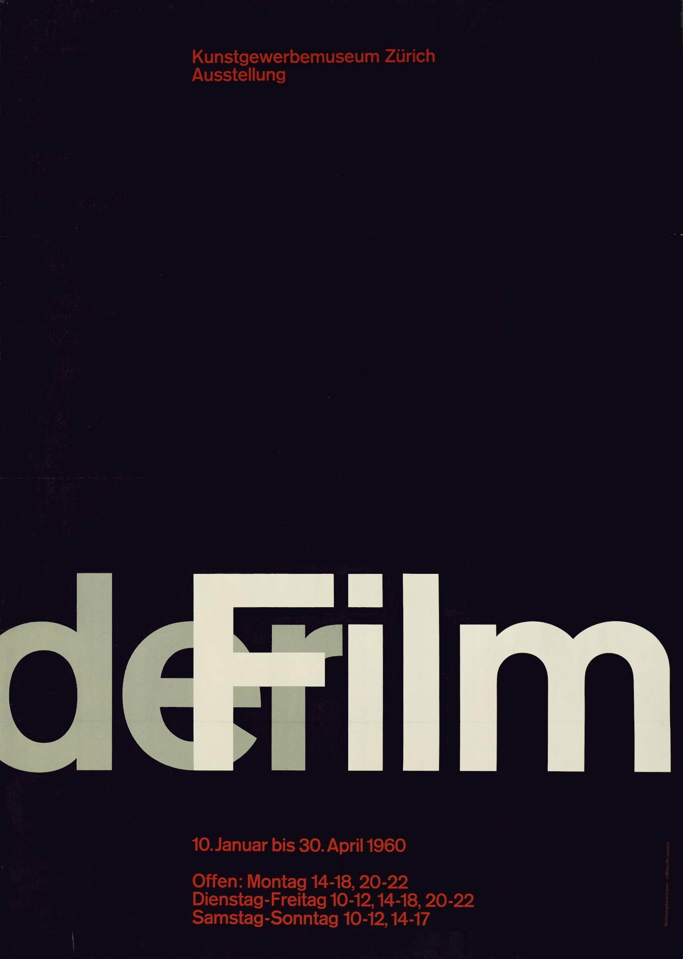
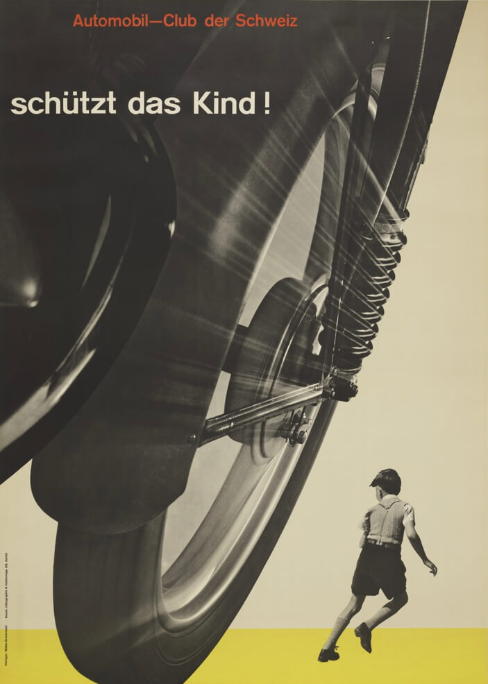
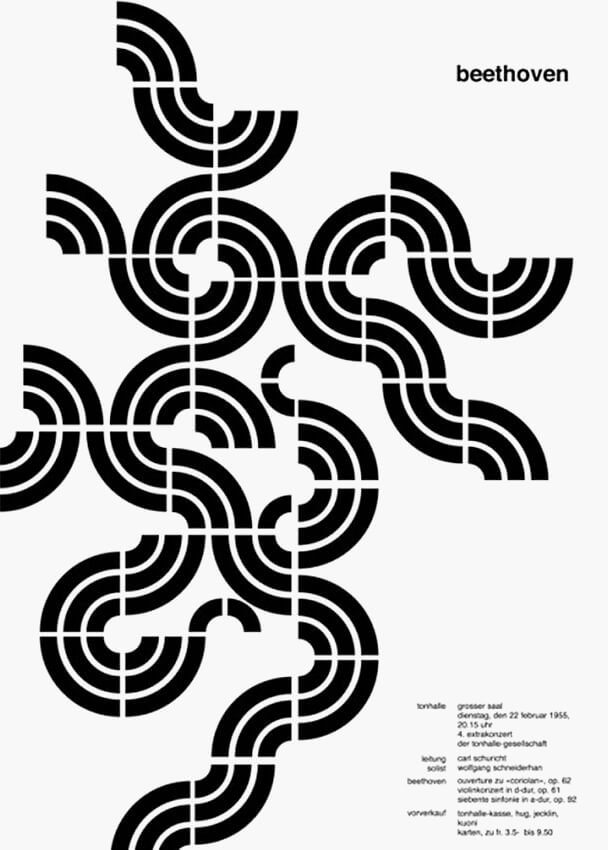
Here are three of Müller-Brockmann’s other posters, where he uses hierarchy in a more conventional way, with larger text rising above other elements in the hierarchy. Remember, in a simple sense, hierarchy means “what your eye sees first”.
Spacing
Müller-Brockmann’s use of spacing in this design is generous and sophisticated. Increments of spacing between the curved lines at the bottom create a perspective effect, contrasting with the regularity of line and column spacing in the area of text. The large area of space in the centre also supports the design by directing our attention to the text and to the illustration.
Alignment
Alignment is used in the text in two key ways:
- Column alignment — the lines in each column line up along the left edge
- Baseline alignment — each line of text lines up horizontally with the line in the next column
These are shown below.
Column alignment
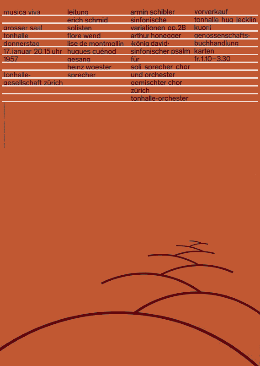
Baseline alignment
Contrast:
Müller-Brockmann creates contrast between:
- The vibrant red background, and the neutral black foreground
- The vertical columns at the top, and the curved, horizontal lines at the bottom
- The area of text and the area of shapes
- The even distribution of text columns and the uneven distribution of the curves at the bottom
- The two areas of positive forms (the text and the curved lines) and the open, negative space in the centre
Balance
Müller-Brockmann achieves balance using both symmetry and asymmetry.
- The balance is symmetrical in the sense that there are groups of elements of roughly equal visual weight at both the top and bottom of the page
- The balance is asymmetrical in the sense that the elements at the top and bottom of the poster are not graphically similar
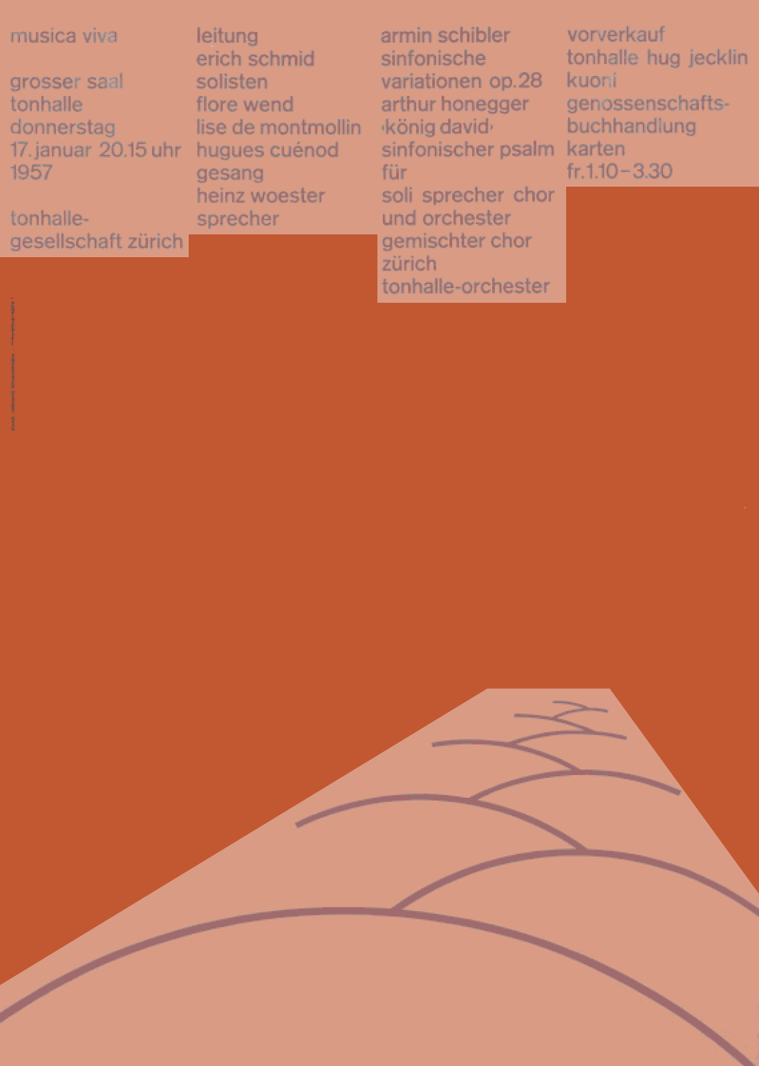
Balance between positive forms (highlighted)
Repetition and consistency
These can be seen at a few different levels:
- The text column widths are consistent, and form a repeated pattern across the page
- The curved line graphic at the bottom of the page is repeated nine times to create the wave effect
- The curved line graphic is used in two rotations — the left rotation is repeated five times, and the right rotation is repeated four times
- The text is highly consistent: it’s set in the same font, at the same size, and using the same lowercase style
Pacing
There is very little content in this design, so there isn’t much need for pacing. Nevertheless, breaking the text into four columns does introduce some management of pace, by allowing us to read and conceptualise the information in four chunks.
In conclusion...
Through this exercise, hopefully you’ve seen how even a very simple or minimalistic design still relies heavily on visual principles. Next, it’s time for you to apply them in a design of your own!