Course · Part 4 · Assignment 9
Read ![]()
How to Combine Fonts
KeyThree
The key points from this assignment.
- Choose one font first – don’t try to pick both at the same time
- Pair serifs with sans-serifs, and vice versa
- There are three approaches to font pairing: maximise contrast, harmonise, and maximise harmony
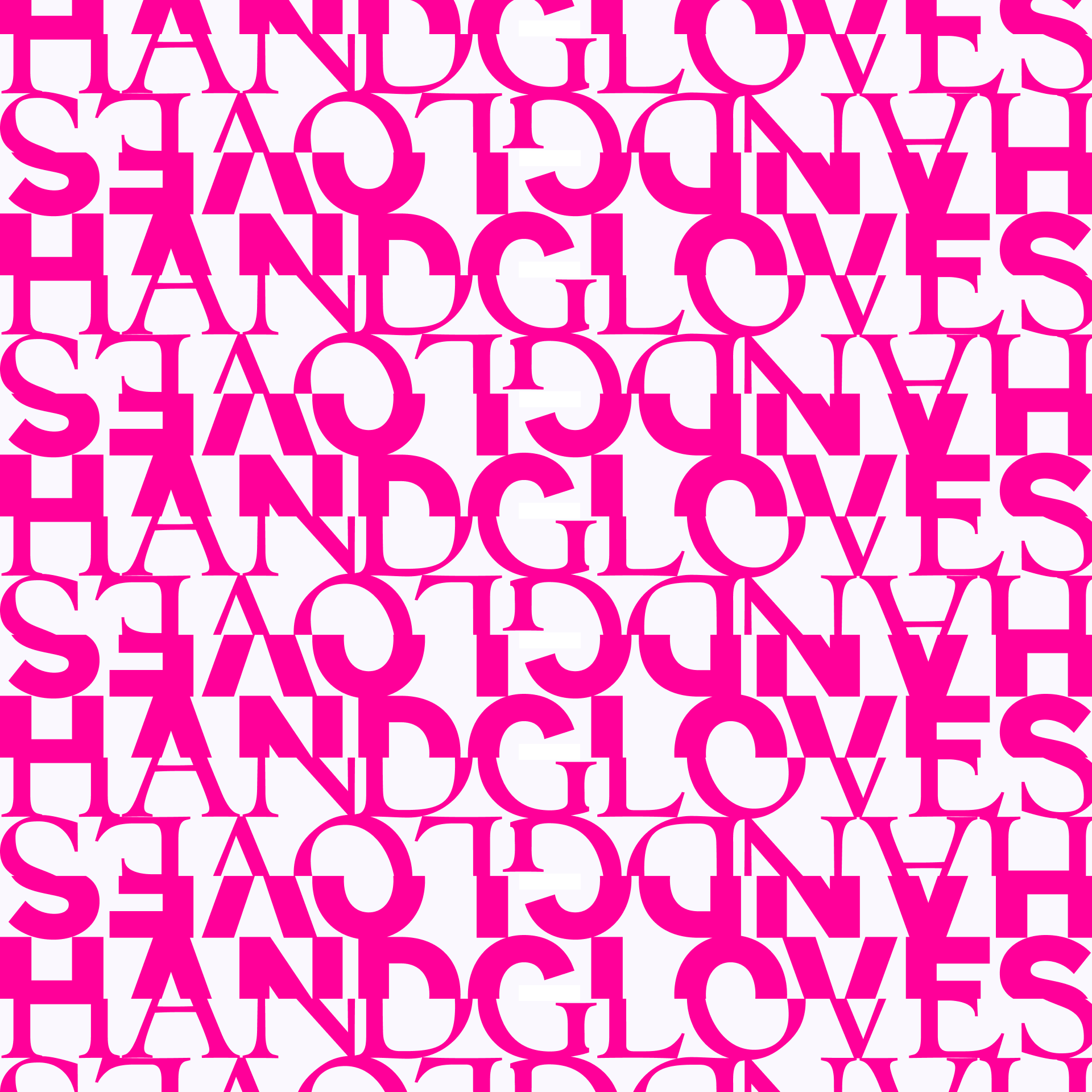
Image credit: Baseline Team
Introduction
There’s a lot to say about how to combine fonts. This assignment offers some key practical principles which can help you to start pairing fonts with confidence. Remember, most design projects can be executed using just one or two typefaces. Get lots of practice pairing two fonts before trying to combine three or more!
Ground rules
Choose one typeface first
It’s always best to change one variable at a time — so start by choosing one typeface using the method we covered a few assignments ago.
Once you’ve picked that one, you just have to look for a second font to pair it with. After you’ve explored possible combinations with that first choice, you can start the process again with a different one.
Working in this way makes the process more structured and manageable.
Don’t pair serifs with serifs, or sans‑serifs with sans‑serifs
Although there are some cases when pairing serifs with serifs or sans-serifs with sans-serifs can work, they are few and far between, and difficult to get right.
Instead, pair serifs with sans-serifs, and vice versa
Pairing sans-serif headings with a serif for body text, and vice versa, is a tried and tested path to happy font combinations.
Three approaches to font pairing
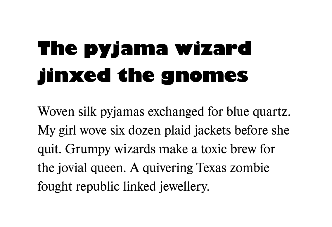
Approach 1: Maximise contrast
For maximum contrast, the two fonts should have some or all of the following:
- Distinct letter shapes
- Contrasting weight
- Different stroke contrast
- Contrasting letter widths (for example, regular and condensed)
- Different styles (for example, regular and italic)
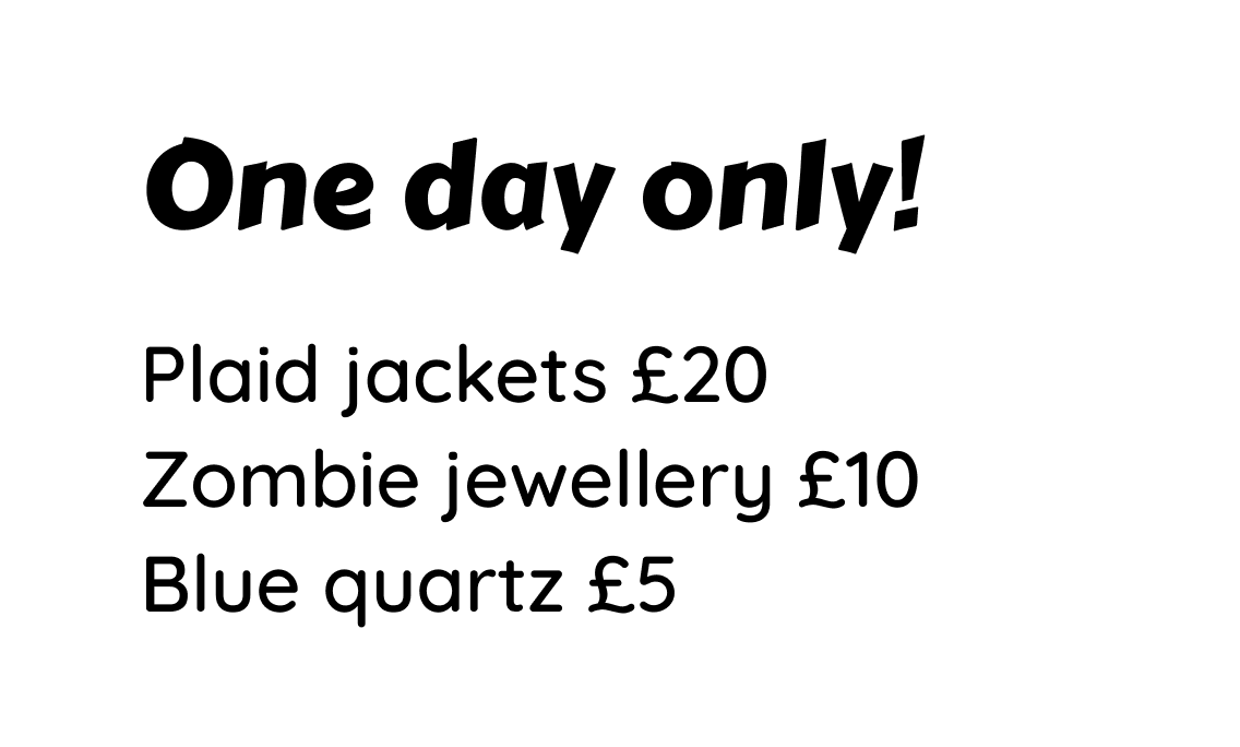
To achieve clear contrast, it will often be best to choose a display serif and pair it with a sans-serif or vice versa. Here are some examples:
Gilroy Extra Bold (display sans-serif) and Clarendon Light (serif)
Gill Sans Ultra Bold (display sans-serif) and Nimbus Roman (serif)
Rakkas (display serif) and Montserrat Medium (sans-serif)
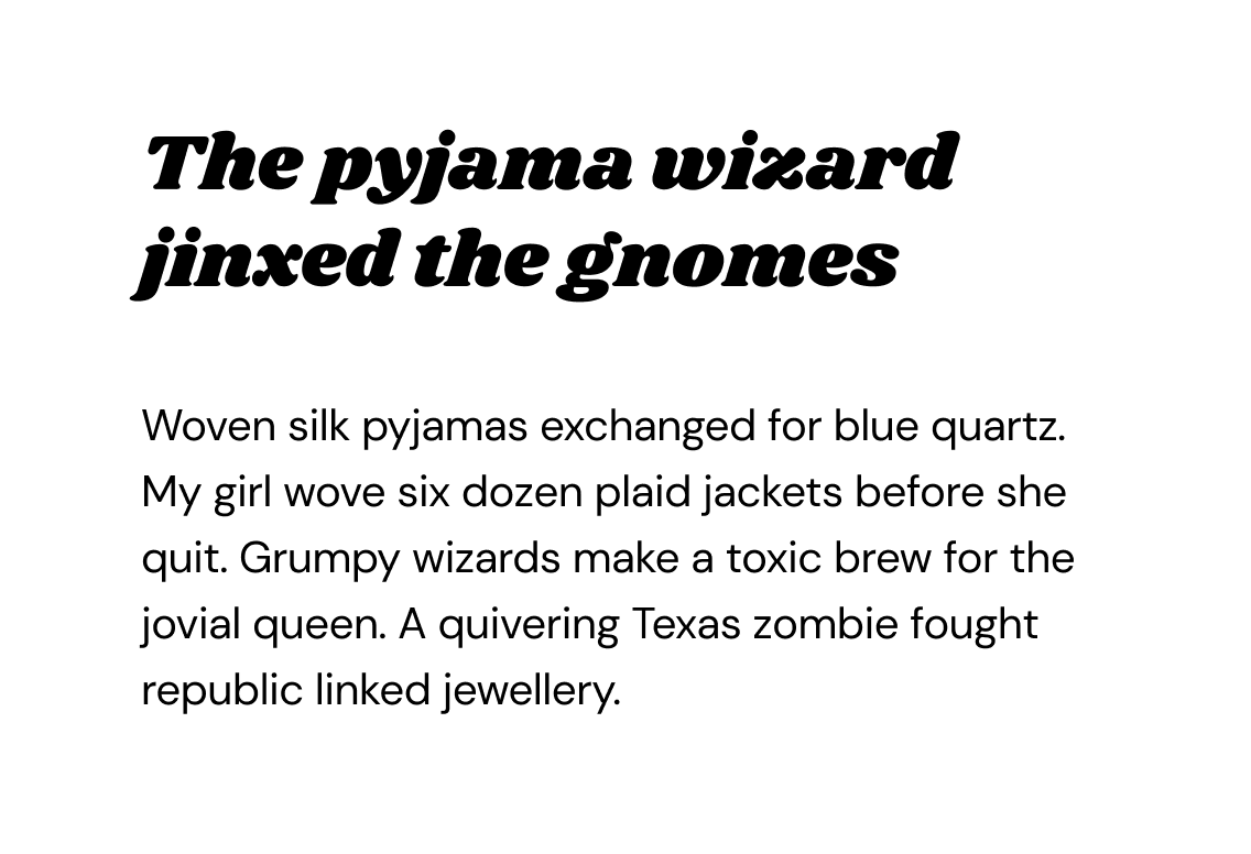
Shrikhand (display serif) and DM Sans (sans-serif)
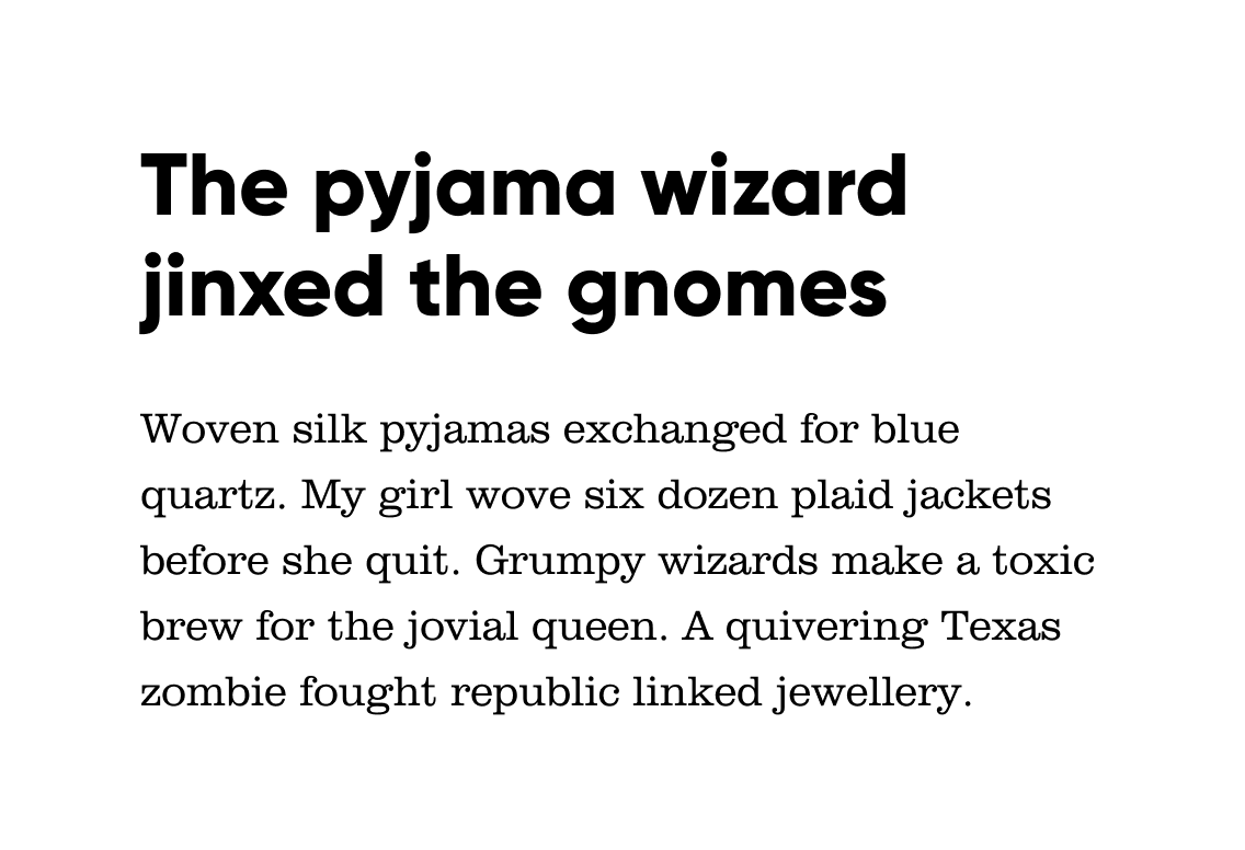
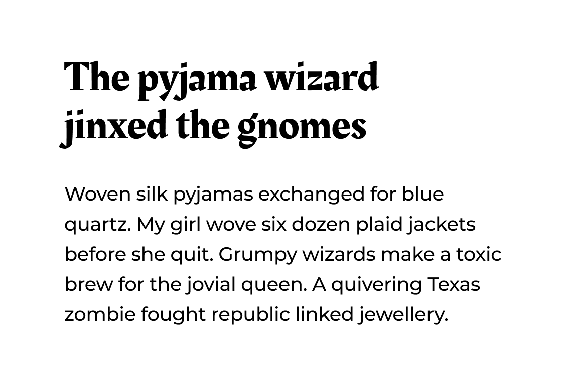
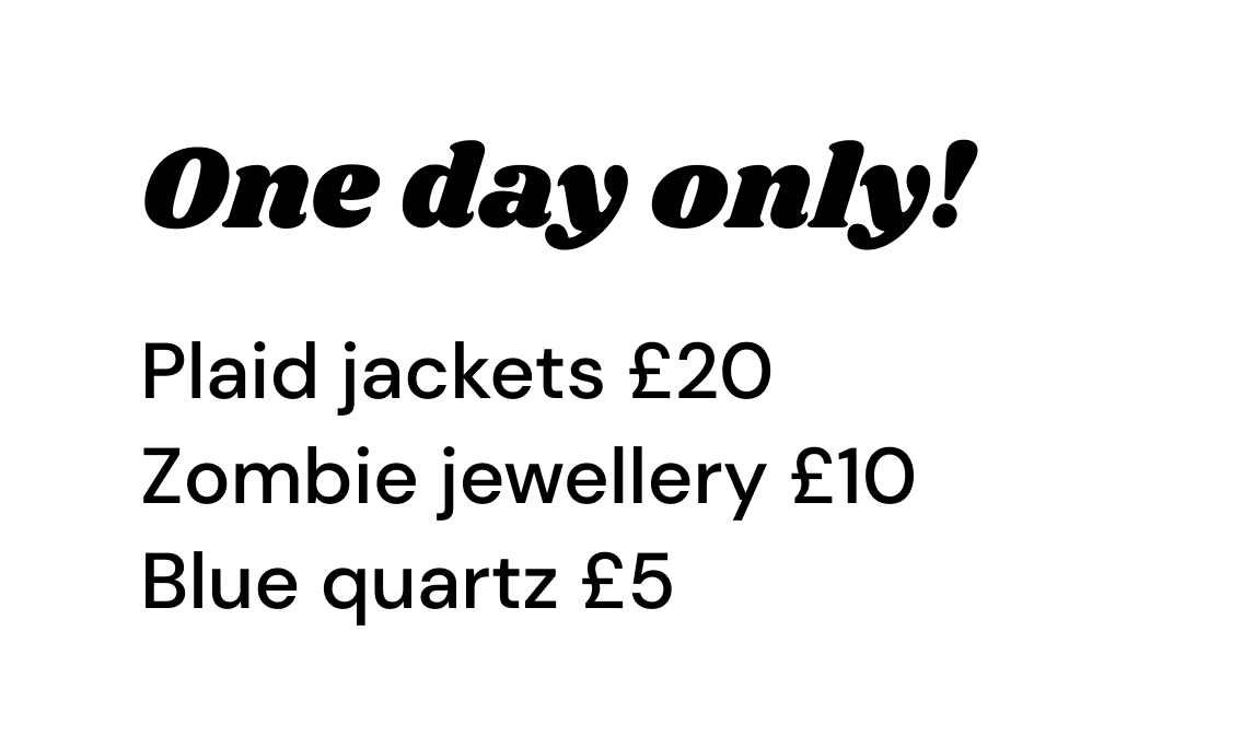
Approach 2: Harmonise
For a harmonious pairing, look for fonts that have:
- Similar letter shapes
- Similar x-heights
- Similar personalities (for example, both have a “handwritten” feel)
As long as these things harmonise, there can still be contrast in weight, stroke, style, or other details — in fact, keeping some contrast in the details can often make the combination more interesting and effective.
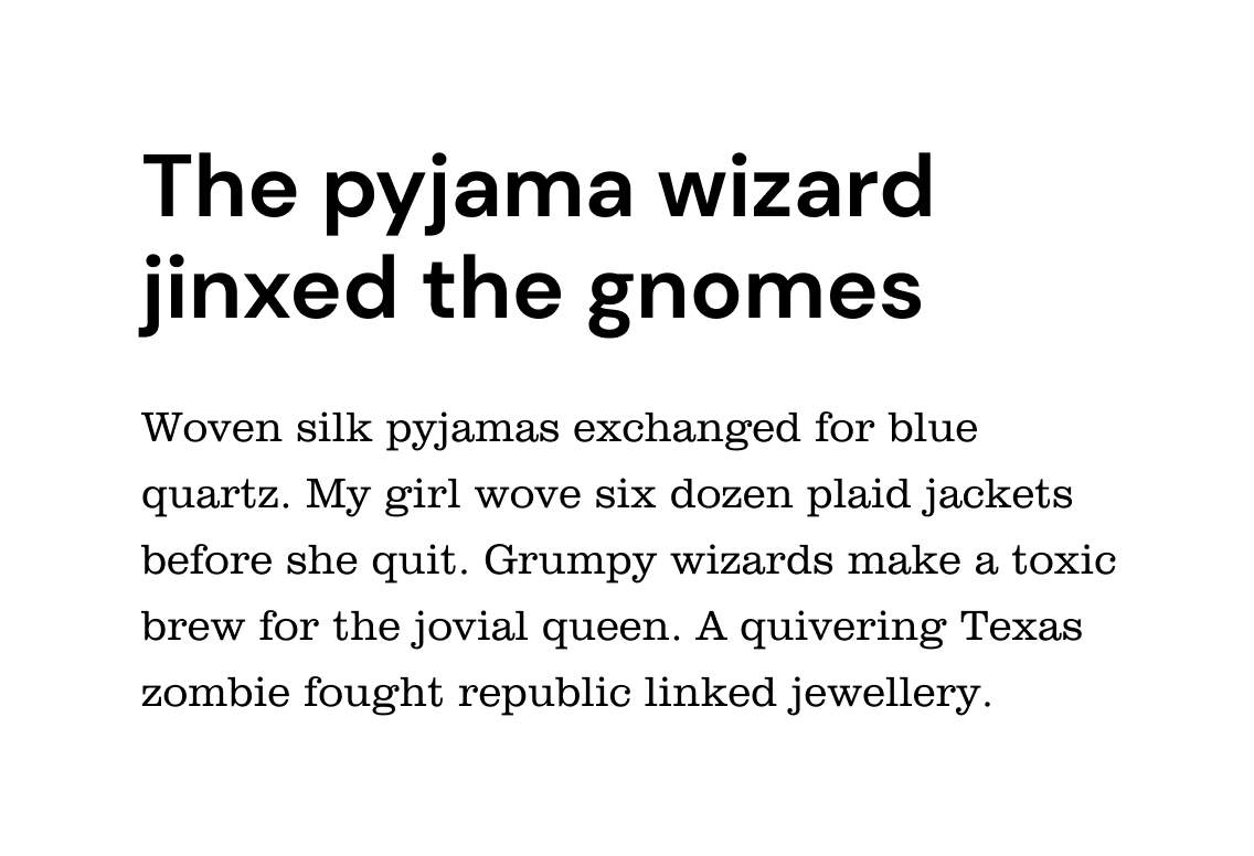
DM Sans (sans-serif) and Clarendon Light (serif)
Optima Bold (sans-serif) and Palatino (serif)
Caponi Text Bold (serif) and Helvetica (sans-serif)
Söhne Halbfett (sans-serif) and Tiempos Text (serif)
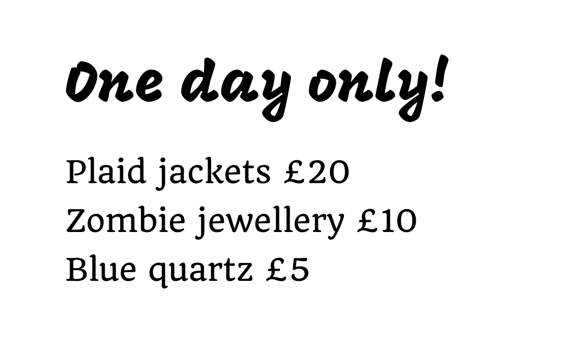
Approach 3: Maximise harmony — superfamilies
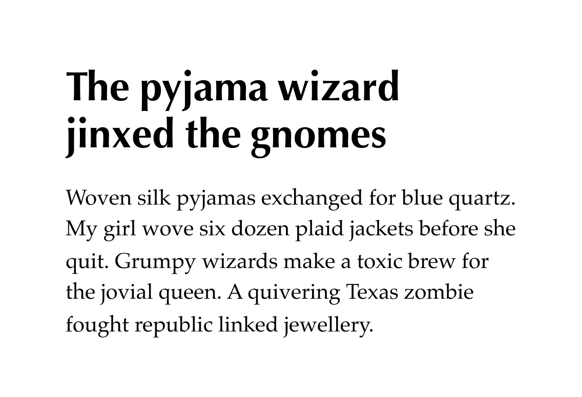
To achieve maximum harmony in a font pairing, use a serif and a sans-serif from a superfamily. Their letterforms normally share the same basic skeleton, as well as similar weight and stroke contrast.
Here are some examples available for free on Google Fonts. Notice how, although in each case one font has serifs and the other doesn’t, they both have the same shape letters:
IBM Plex Serif and IBM Plex Sans
Quattrocento and Quattrocento Sans
PT Serif and PT Sans
Josefin Slab and Josefin Sans
Jargon Buster
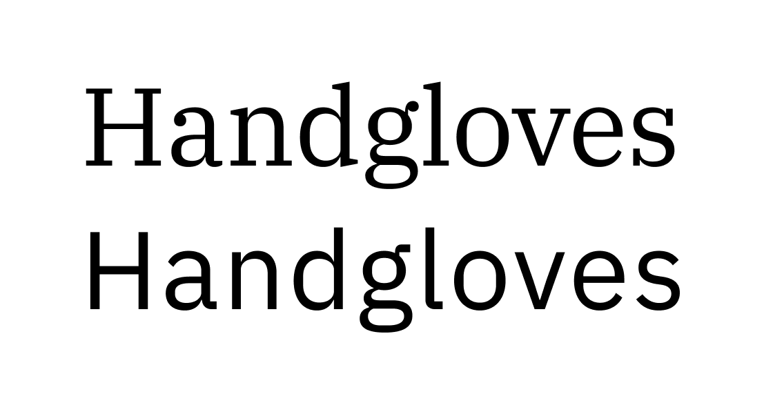
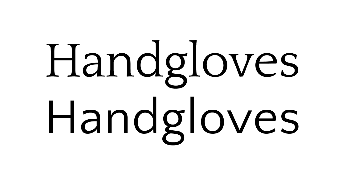
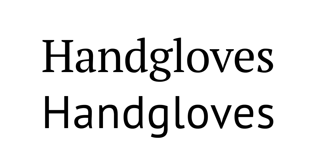
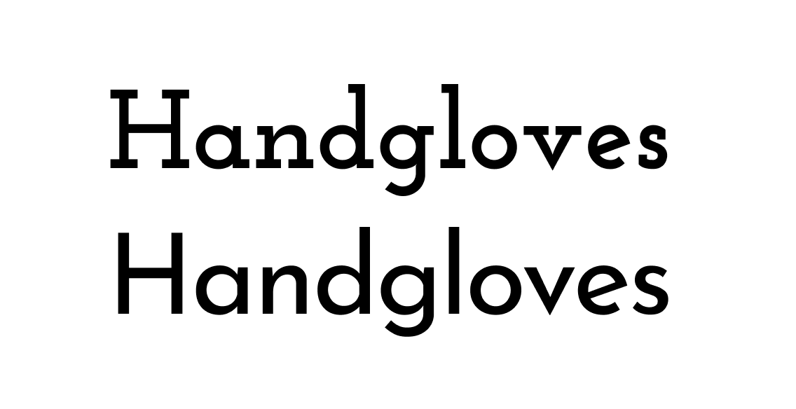
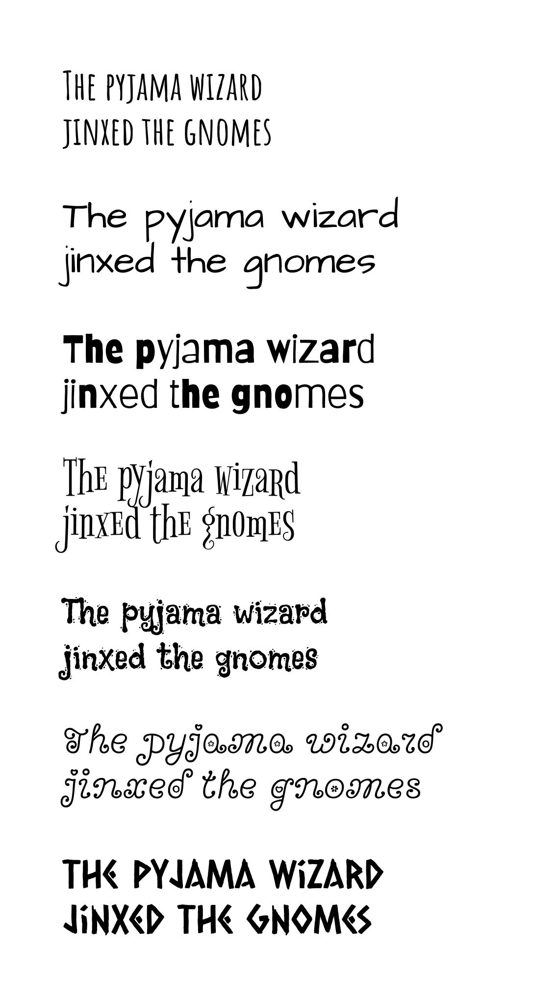
Handgloves is a word often used by designers — type designers in particular — to get an overview of all the shapes and details in a typeface. The letters in it represent all of the most common strokes in the alphabet.
Bonus tips
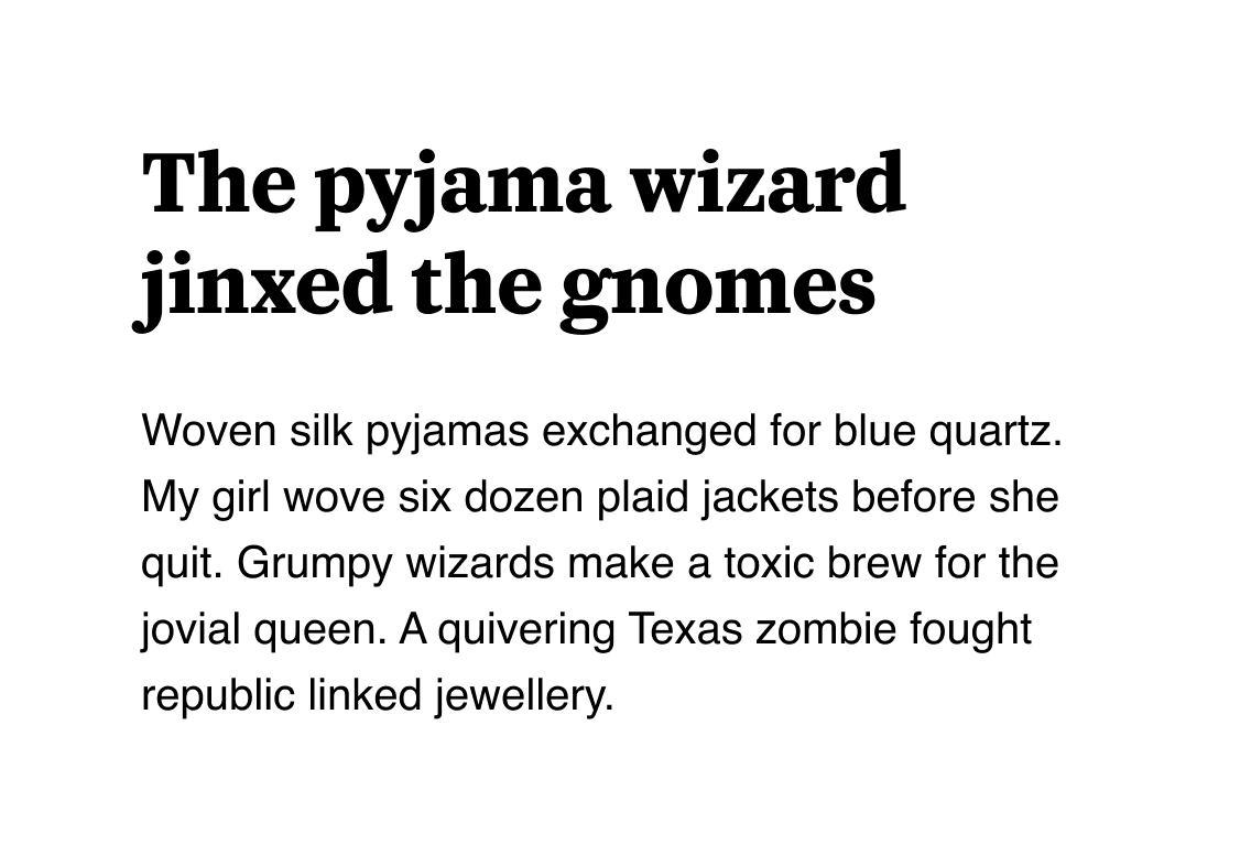
Pair a display font with something that contrasts graphically, but complements it in personality
One way of assessing the personality of two typefaces is to ask, “if these fonts were people, would they be friends?”
Friends, of course, don’t need to be the same to get along. But most of the time, people want their friends to share their outlook on life.
Carter One (display) and Quicksand (sans-serif)
Shrikhand (display) and DM Sans (sans-serif)
Mogra (display) and Quando (serif)

Erica One (display) and Roc Grotesk (sans-serif)
Avoid tasteless novelty fonts (they’re impossible to pair)
Taste can’t be taught, so you’ll just have to trust us that the following fonts won’t work in any context other than a child’s birthday party:
Just a few of the novelty typefaces on Google Fonts
In all seriousness, though, there’s not really such thing as a bad typeface — just the wrong place to use it. There will be the right project for even the “worst” font in the world.
As you gain in practice and experience, you’ll also develop your own unique typographic taste, which will help you to filter out the noise.
In conclusion...
If you’re interested in learning more about typography, we strongly recommend exploring Typewolf’s huge Site of the Day archive (3000 sites and counting).
We also recommend purchasing Typewolf’s Flawless Typography Checklist . Despite its humble claim to be a mere checklist, it’s really an invaluable, in-depth online resource that will help you make more intelligent font choices throughout your career.
In the next assignment, let’s get some practice by analysing typeface combinations.