Course · Part 4 · Assignment 24
Practise 
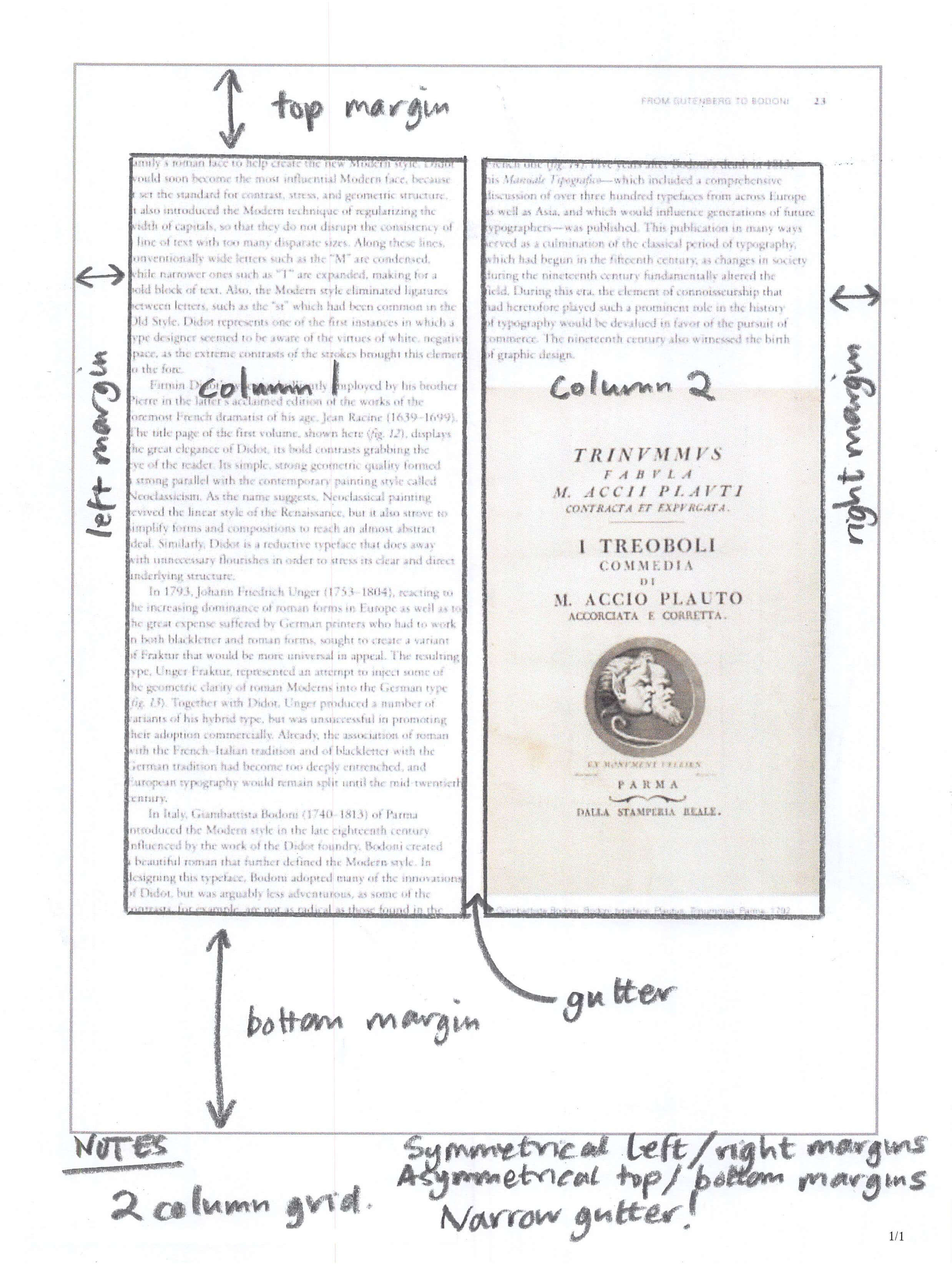
Identify and Assess Grids in Use
 Time limit: 1 hour
Remember to use your visual timer! We recommend the inventor’s iOS and Android apps — just search for “Time Timer” in the app store.
Explanation
In this assignment, you’ll look at some examples of print and digital design, and analyse them to work out what kind of grid they use.
If you have access to a printer, we recommend printing out the images so that you can draw on them and annotate them easily.
If you don’t have access to a printer, you can copy and paste each image into a Figma file instead.
Instructions
Analyse the layout of these designs
Set your timer: 50 minutes
Analyse each of the layouts in the “images” section below, and figure out:
- What kind of grid or grids are in use — for example, baseline, manuscript, column, modular
- The characteristics of the grid or grids in use — for example, if it’s a column grid, number of columns, size of margins and gutters
- Any other observations you make, or questions you have
Tips
Here’s an example of how to complete this assignment:
Example image
Example image with annotations
Images
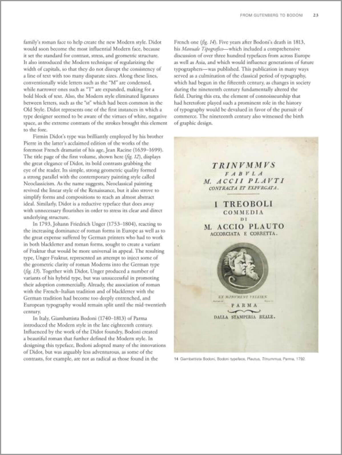
Layout 1
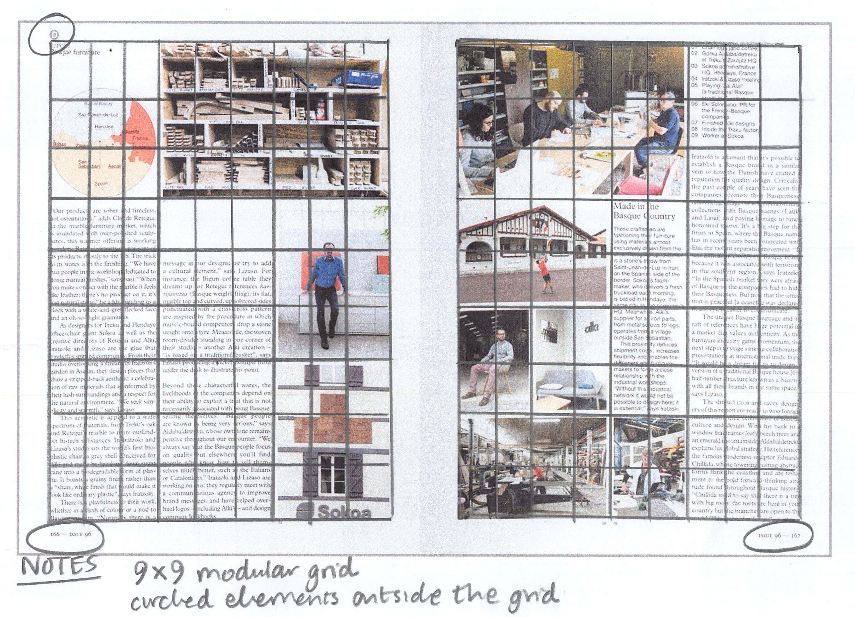
Image credit: Vestre
Layout 2
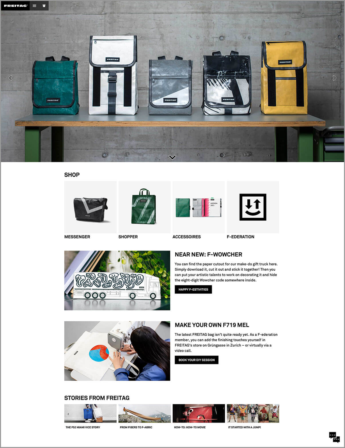
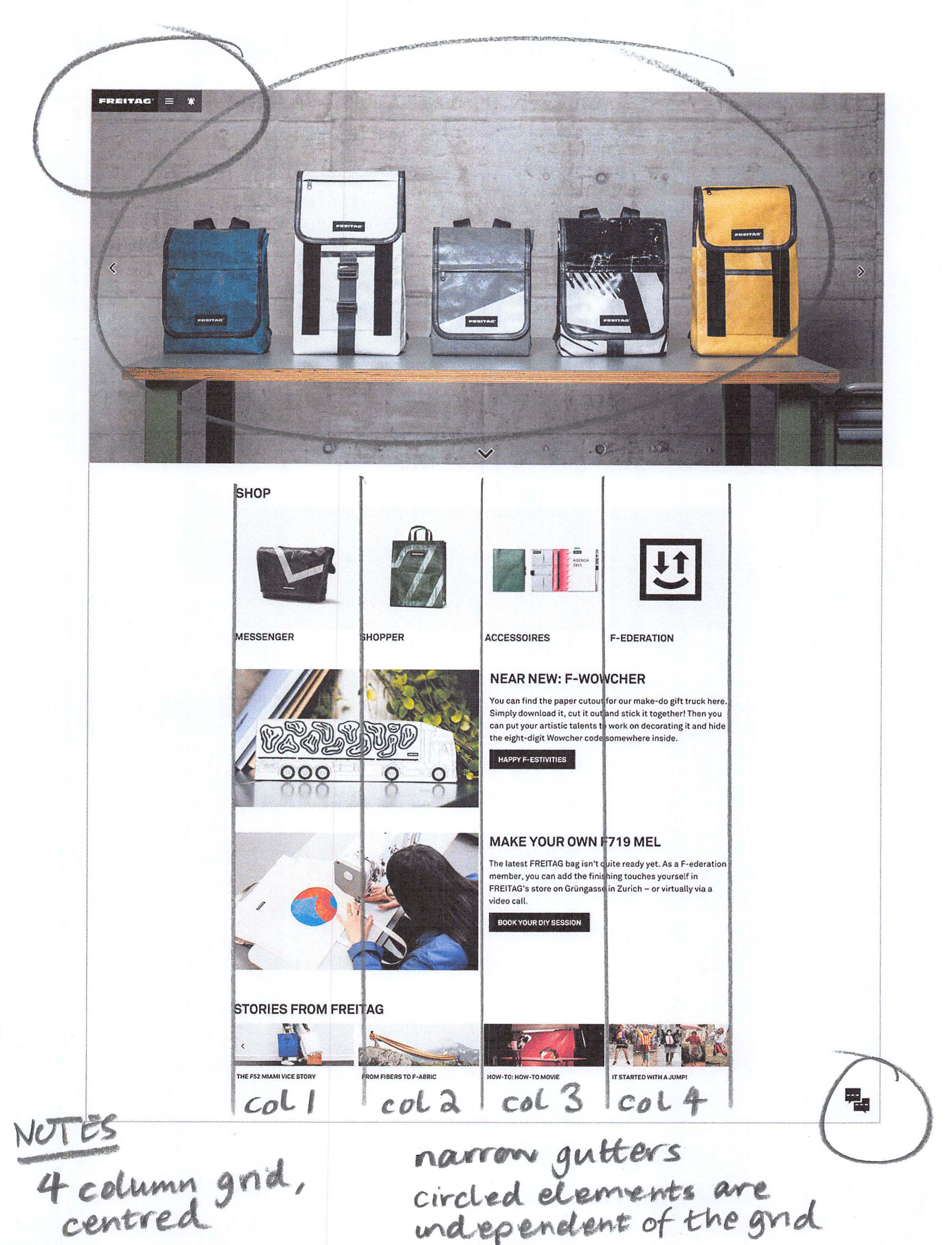
Image credit: Freitag
Layout 3
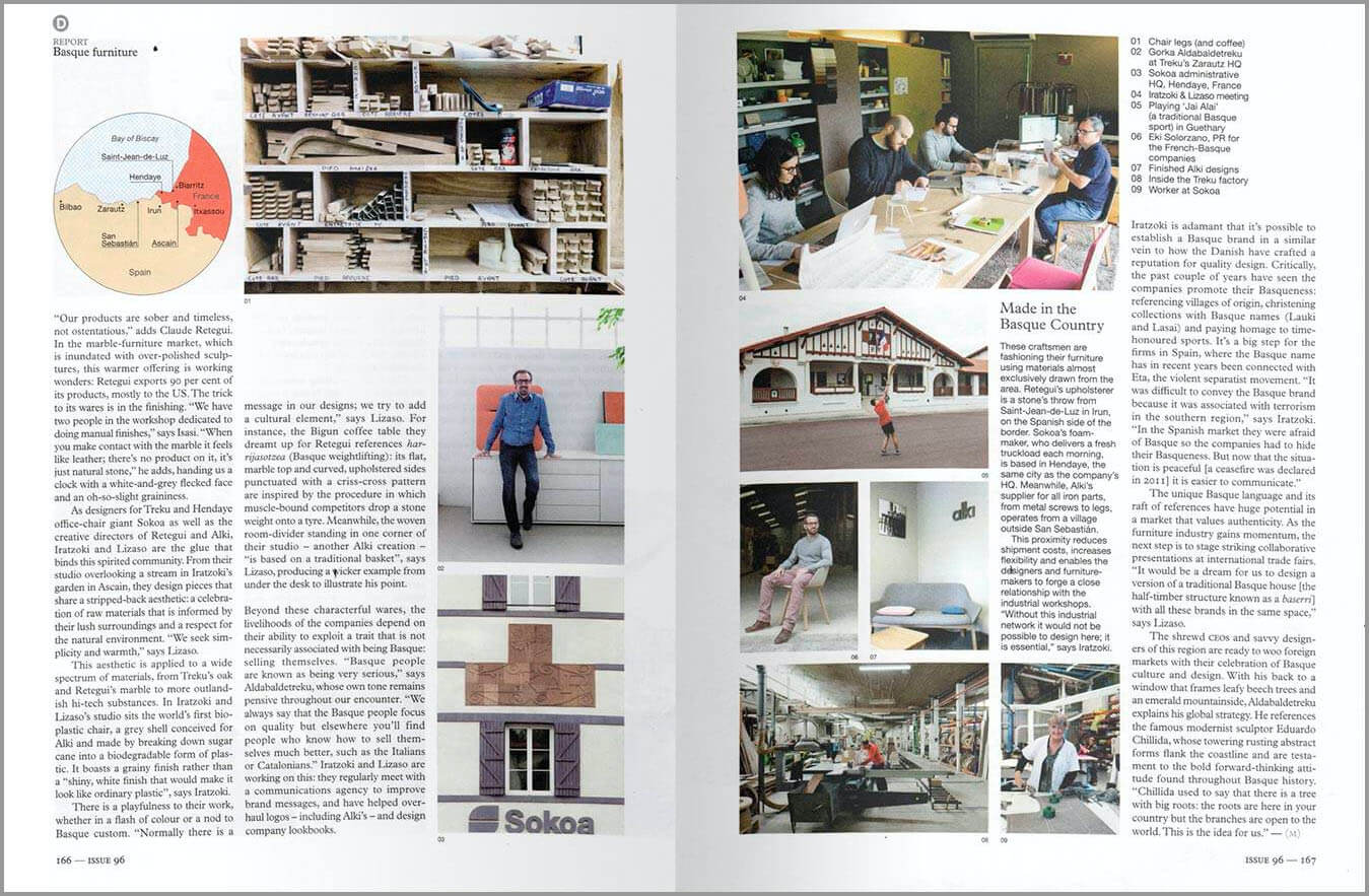
Image credit: Monocle
Review the example solution
Once you’ve completed your work on this assignment, take a few minutes to review the example solution below.
Example solution
Layout 1 solution
This report uses a three-rows-by-three-columns modular grid. Although there is only one element aligned to the grid on the second page, it is still there.
Layout 2 solution
This website uses a 4-column grid, with a number of elements at the top and bottom aligned to the edge of the page instead of the grid. Content which runs right from one edge of a page to the other is sometimes called “full bleed”. This refers to a printing term, because a full bleed image will run off the edge of the page and into the “bleed” area which gets trimmed off. See our annotations below.
Layout 3 solution
There is more to this layout than meets the eye! Looking at the first page, you’d be forgiven for thinking that this is a pretty standard three-column layout. However, notice that there are also a number of vertical points of alignment too, creating extra structure. Also, by looking at the varying widths of text areas on the second page, we can figure out that the grid actually contains nine columns rather than three.
Side note...
All of these examples contain elements that sit outside the grid, and may or may not be aligned to it. In print design in particular, these elements are called “page furniture”.
This term generally refers to repeated elements like page numbers, headers, footers, and so on. Although they are visually small, these elements often still play a very important role in creating structure and consistency throughout a design.
In conclusion...
This assignment has provided some practice with grids. Next up, prepare to combine your new layout knowledge with your understanding of typography and colour, as we tackle a magazine design brief!