Course · Part 4 · Assignment 20
Read
Layout Basics
KeyThree
The key points from this assignment.
- In graphic design, layout refers to the visual arrangement of content and graphic elements within a defined space
- Factors in layout decisions include the amount of content, the space available, and the overall goals of the project
- Other important considerations are the project keywords, the level of impact required, and the context in which the design will appear

Image credit: Brett Sayles
Introduction
In this assignment, we’ll cover what layout means in the context of graphic design, and then work through some of the different factors when making layout decisions.
What is layout?
In graphic design, layout refers to the visual arrangement of content and graphic elements within a defined space.
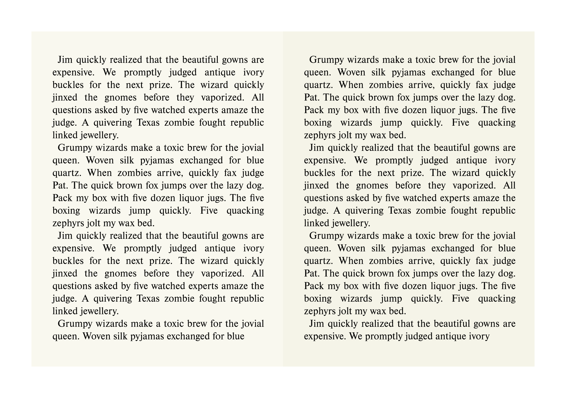
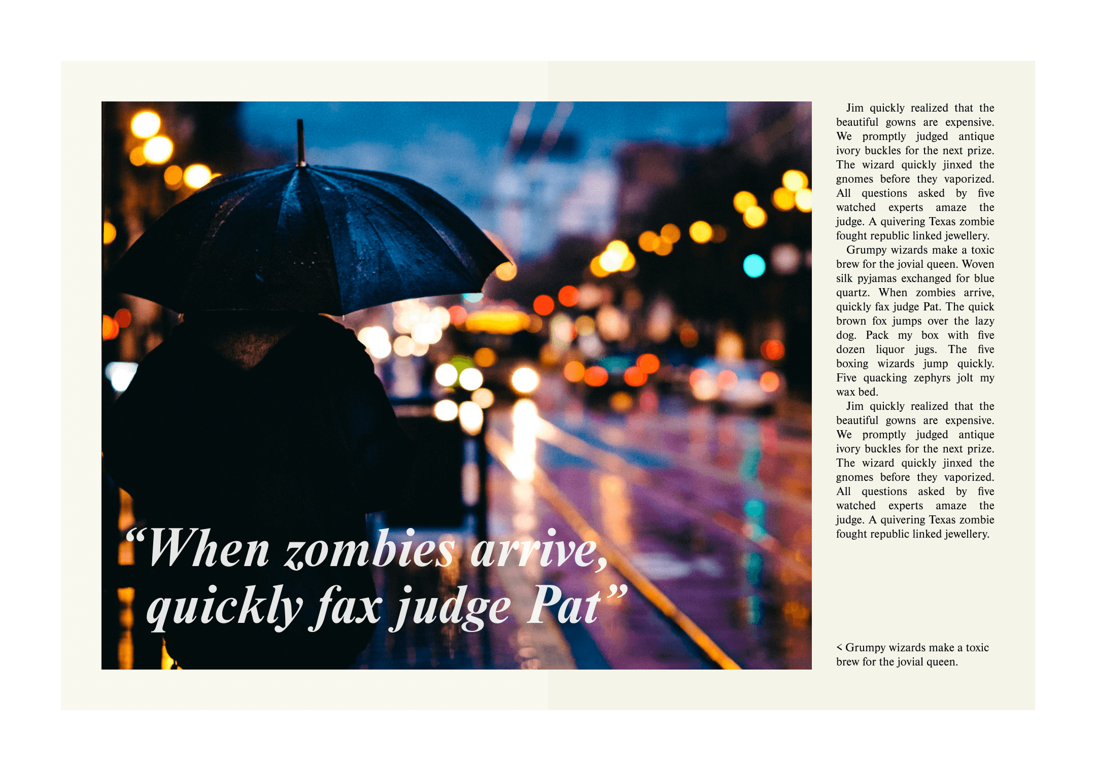
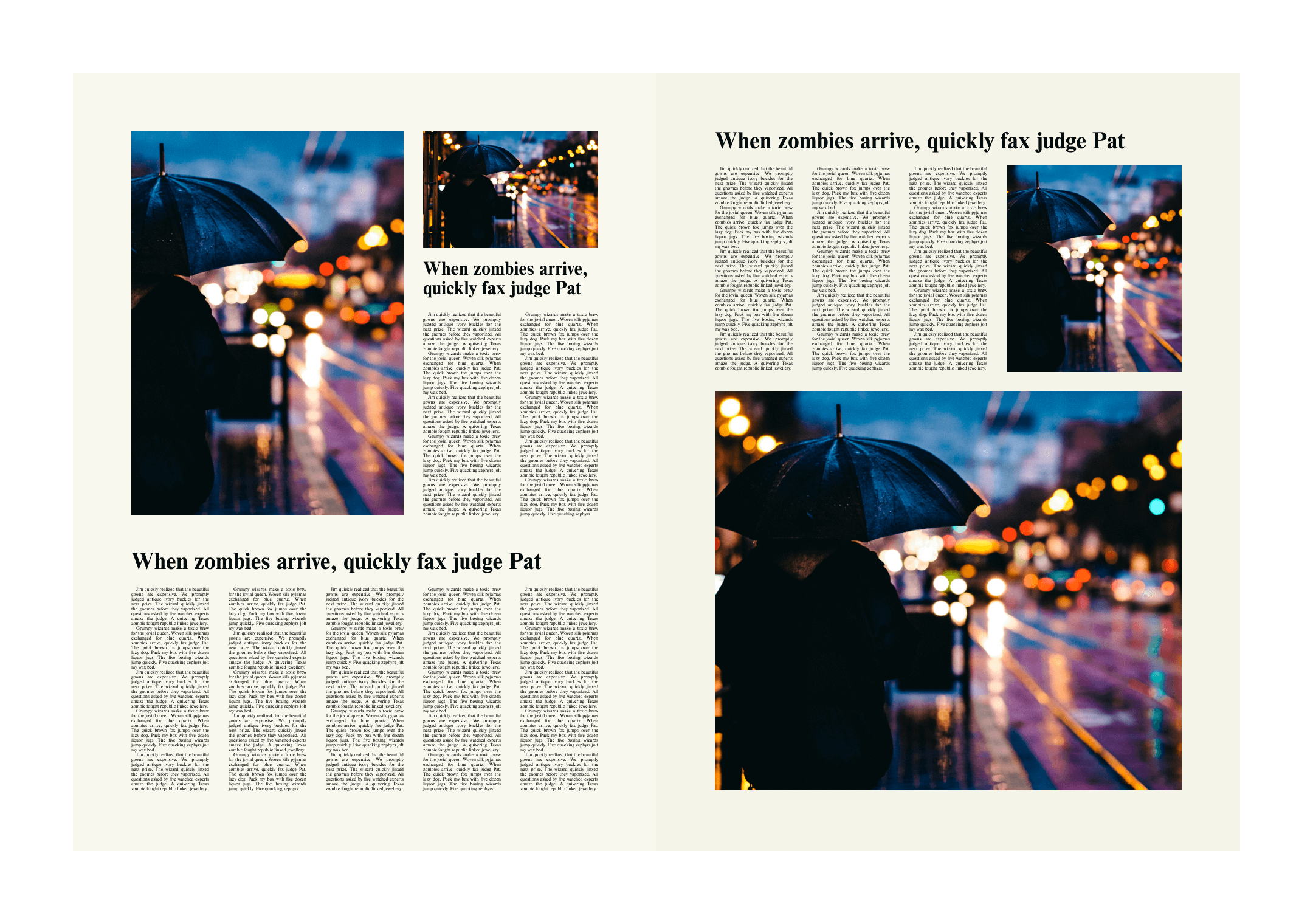
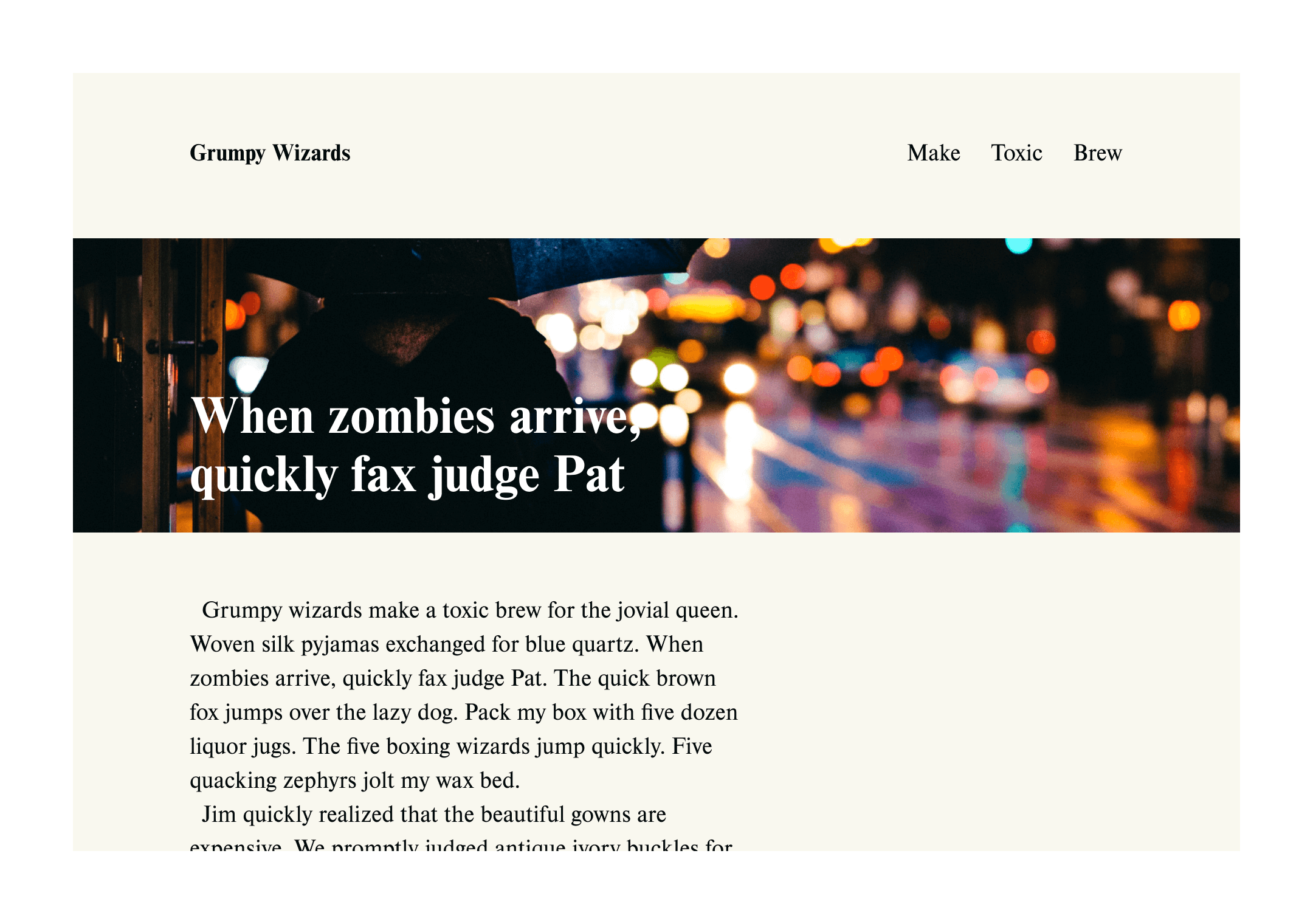
Specific types of project often result in broadly similar layouts, because they share the same constraints. Can you identify the types of projects below, based just on their layout decisions?


Factors in layout decisions
As designers, we need to take layout decisions based on a number of factors, including:
- The amount of content and space available
- The overall purpose and goals of the project
- Brand or project keywords, values, and design guidelines
- Inclusion of a call to action
- Level of impact required
- Context of use
- Usability, accessibility, and inclusion
Let’s go through each one in detail.
1. The amount of content, and the space available
Although it’s true for all aspects of graphic design, it’s especially important to put content first when making layout decisions. To put it another way: a design should support the communication of content, not the other way round.
In print design, where space is limited, our first priority should be to figure out how much text we’re working with, how many pages we have available, and the minimum font size we can use for body text.
Those constraints alone will tell us a lot about our layout options. For example, if we know we’re going to have to use 80% of the available space for text, we’re going to have to be a lot more creative with how we use the remaining space for images and other graphic elements.
2. The overall purpose and goals of the project
The layout decisions we make should support the purpose and goals of the project. For example, if we’re designing an annual report for a financial services company which needs to reassure existing investors and encourage new ones, we might want to consider a relatively conservative, classic layout.
3. Brand or project keywords, values, and design guidelines
Most projects don’t exist in isolation, so it’s important to consider things like existing brand guidelines, previous and future editions (in the case of things like magazines and reports), and the values, ideas, and feelings that need to be associated with the project or brand.
4. Inclusion of a call to action
Some projects — mainly things likes adverts and posters — include some kind of “call to action” (CTA). This can be as simple as “Call now” or “Book online”.
If a CTA is required, it’s important to plan for it from the beginning of the design process. That’s because how we lay out the other content can help to support how impactful and compelling the CTA is.
5. Level of impact required
Some projects need to be shocking or arresting, while others need to be calm and quiet. Talk to the client, assess the brief, and read through the content, to make an informed decision about the level and kind of impact the design needs to achieve.
6. Context of use
Layout decisions also need to respond to the environment and conditions in which the audience is going to see or use the thing you’re designing.
For example, if you’re designing an advert to be displayed in a train station, most people aren’t going to be able to stop and read it more carefully, or move closer to get a better look. They’re probably also only going to see it for a few seconds. The layout you choose can help to get the key message across in spite of these limitations.
Sometimes, the amount or type of content you’ve been given by a client won’t be compatible with the context in which that content is going to be seen. The most common mistake is simply to provide too much content, or copy that is too wordy.
In this situation, it’s part of our job as designers to make the client aware of the problem, and ideally to make suggestions for how the content can be reduced or made more concise.
7. Usability, accessibility, and inclusion
Unfortunately, principles of usability, accessibility, and inclusion, tend to be talked about less in print design projects than in digital projects. But that doesn’t mean that you can’t strive to consider these factors in your work.
Here are some issues to consider when making layout decisions:
- Is this layout easy to interpret and understand?
- Is the minimum text size I’ve chosen accessible to all (as far as is possible)?
- Can the content or images unintentionally discriminate, offend, or exclude people?
In conclusion...
Layout decisions shouldn’t come out of nowhere. Choosing a layout for a project requires a process of deliberate reasoning in response to its constraints and requirements.
In the next assignment, let’s talk about the most powerful layout tool in a designer’s armoury — grid systems!