Course · Part 5 · Assignment 30
Read ![]()
More Advanced Data Visualisation
KeyThree
The key points from this assignment.
- More advanced data visualisation conventions include sparklines, alluvial diagrams, bump charts, cartograms, and many more
- Used well, interactivity can support people’s understanding of the data by allowing them to query and compare data
- However, with more advanced visualisations, be especially careful not to make the graphic too complex or hard to use

Image credit: Baseline Team
Introduction
In this assignment, we’ll look at some more advanced data visualisation conventions that you might find useful in your work.
More advanced charts
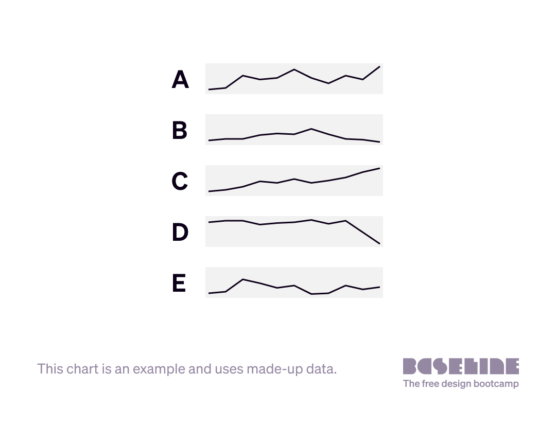
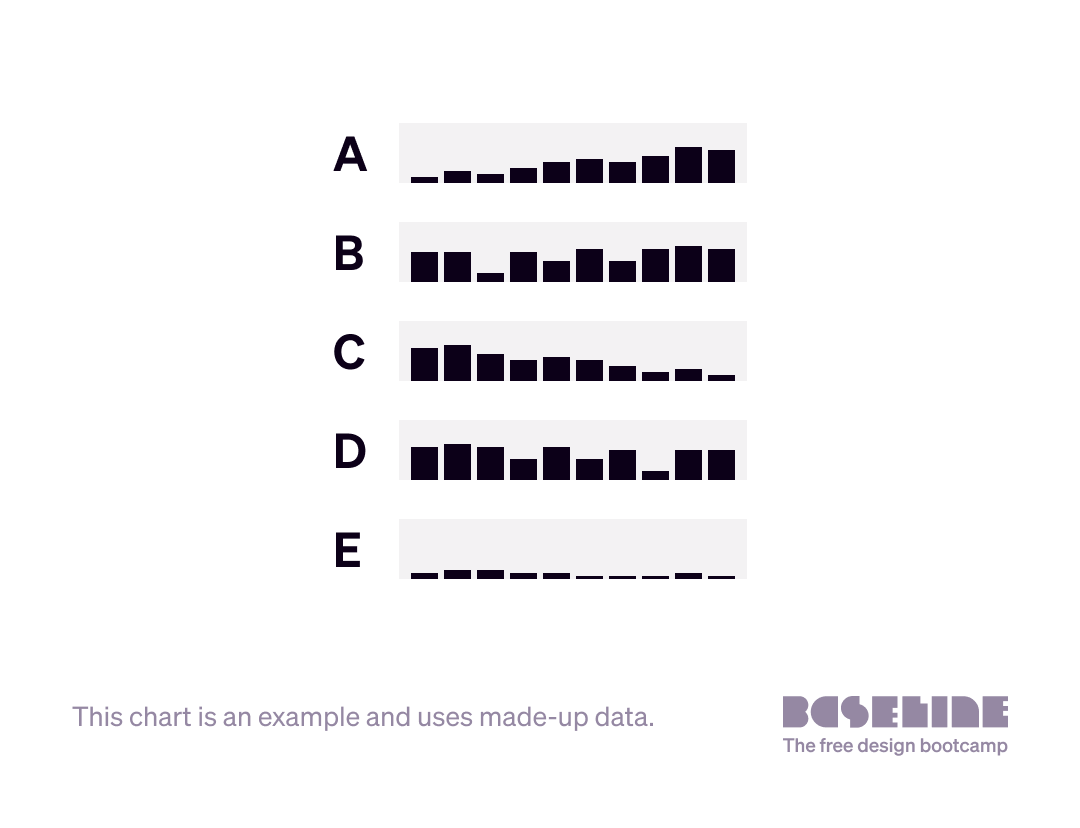
Sparklines
Sparklines are miniaturised charts that allow a large volume of information to be displayed in a small space. Here are two examples of sparklines — the first using a line chart, the second a bar chart.
Within the flow of text, sparklines might be used to explain that the FTSE-100 share index closed up  , while the Dow Jones Industrial Average closed slightly down
  .
.
During the SARS-Cov-2 pandemic, the New York Times used heat map (choropleth) sparklines to show the intensity of case rates in a compact, tabulated view, alongside other data:
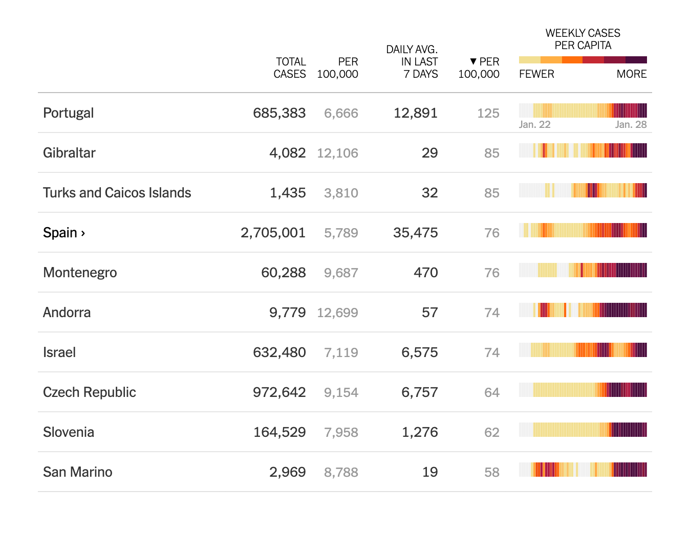
Image credit: The New York Times, “Coronavirus World Map”, online, 29 January 2021.
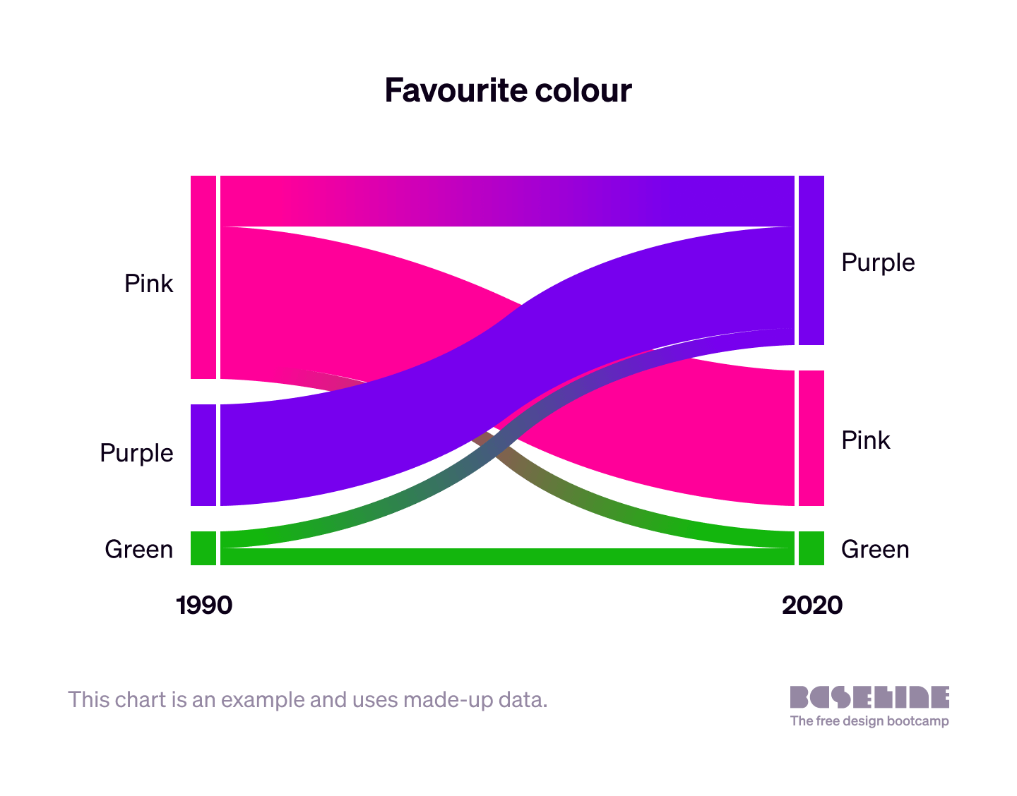
Alluvial diagram
An alluvial diagram is good for visualising change. It has the particular strength of being able to accommodate very large and complex sets of data.
Use cases include:
- change in a data set over time
- flow between steps in a process
- flow between places
- flow between states in a system
- flow from multiple starting points to multiple end points
Here’s an example of an alluvial diagram, using made-up data, that shows how people’s favourite colour changed between 1990 and 2020.
Notice how this type of chart allows us to order the categories at each vertical bar. In this case, pink was the most popular colour in 1990, but purple was the most popular in 2020, so they have swapped positions.
Here is a more complex example, which includes four “steps” (vertical bars). This example, created by The Economist newspaper, shows the following:
- the number and proportion of asylum applications made by people arriving from various origin countries (first set of vertical bars)
- the proportion of asylum seekers from each of those countries arriving in various destination countries (first set of connecting ribbons)
- the number and relative proportion of asylum claims by destination country (second set of vertical bars)
- the proportion of asylum claims made in each of those destination countries that were accepted and rejected (second set of connecting ribbons)
- the total number and proportion of asylum applications accepted and rejected across all destination countries (third set of vertical bars)
- the number and proportion of asylum applications accepted and rejected by country of origin (third set of connecting ribbons and fourth set of vertical bars)
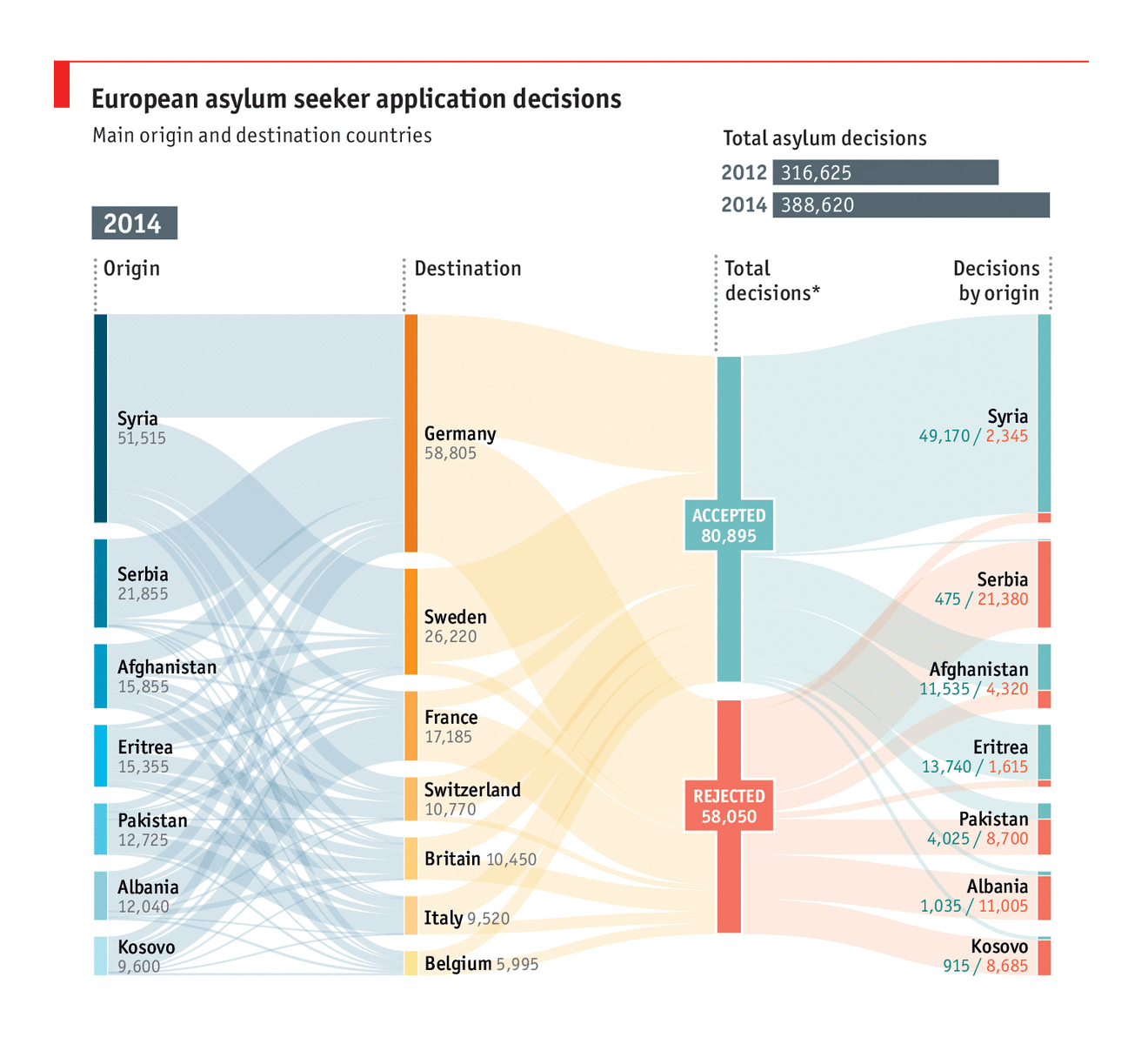
Image credit: The Economist, via the Data Viz Project
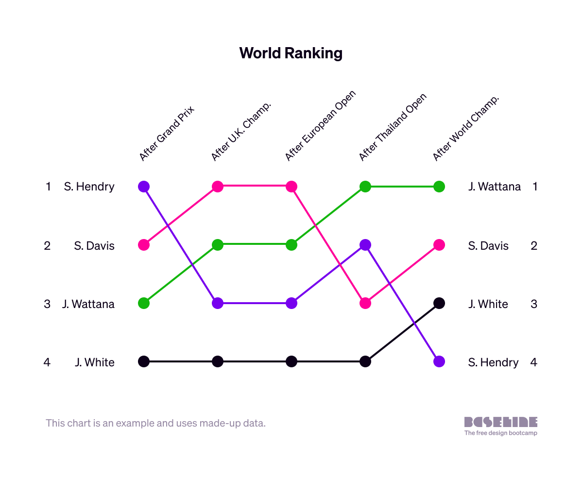
Bump chart
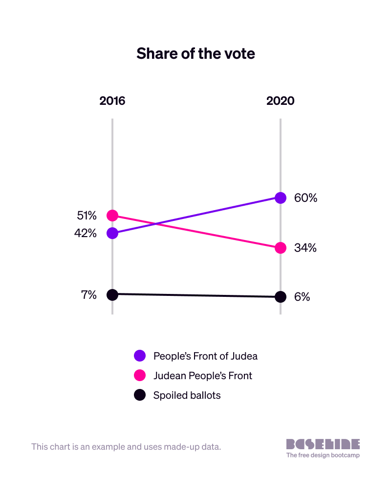
Slope chart
Dot plot
It’s also possible to use dot plots illustratively. This graphic from the South China Morning Post builds the New York City skyline out of data about the long-term costs of 9/11.
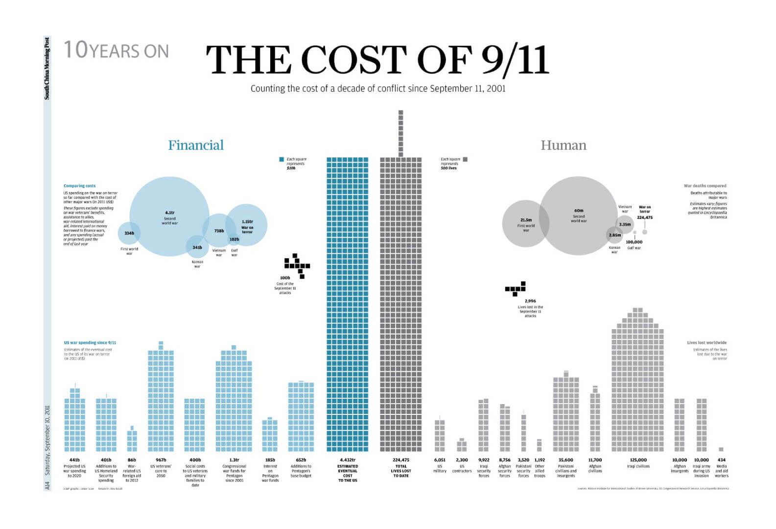
Image credit: South China Morning Post/Simon Scarr
Cartogram

Other advanced data visualisations
There are many more visualisation conventions that can be useful to refer to. Bookmark the Data Viz Project for a more comprehensive catalogue.
Interactivity
Including interactive functionality in data visualisations can allow people to look more closely at areas or aspects of the data, leading to greater engagement and deeper understanding.
Here’s video of an interactive infographic that the New York Times produced before the 2020 U.S. Election, to allow people to see how victories in different states would affect the overall chances of each presidential candidate. You can try it yourself here .
Interaction does, however, potentially add to perceived complexity, so it’s important only to use interaction where, on balance, it will add to audience understanding more than the complexity will detract from it.
From a workflow perspective, interactive data visualisations also require very close collaboration with developers.
It’s essential to involve the developer from the very beginning when designing an interactive data visualisation, in order to understand what is and isn’t possible given the time available and other resource constraints.
In conclusion...
More advanced data visualisation conventions, including the addition of interactivity, can help people understand the information in front of them.
However, it’s especially important to watch out that the graphic doesn’t become too visually complicated, and that the possibilities for interaction don’t get confusing or hard to use. A good way to sense-check this is to ask people to test your design throughout its development.
In the next assignment, we’ll discuss how multiple data visualisations can be combined into a single infographic, and look at some examples.