Course · Part 5 · Assignment 3
Read
What Makes a Brand Identity Great
KeyThree
The key points from this assignment.
- The best brand identities are highly memorable, visually distinctive, and inspire trust
- Branding needs to have an authentic connection to the products or services offered
- Done well, a brand identity can make people fall in love with a brand and establish strong brand loyalty
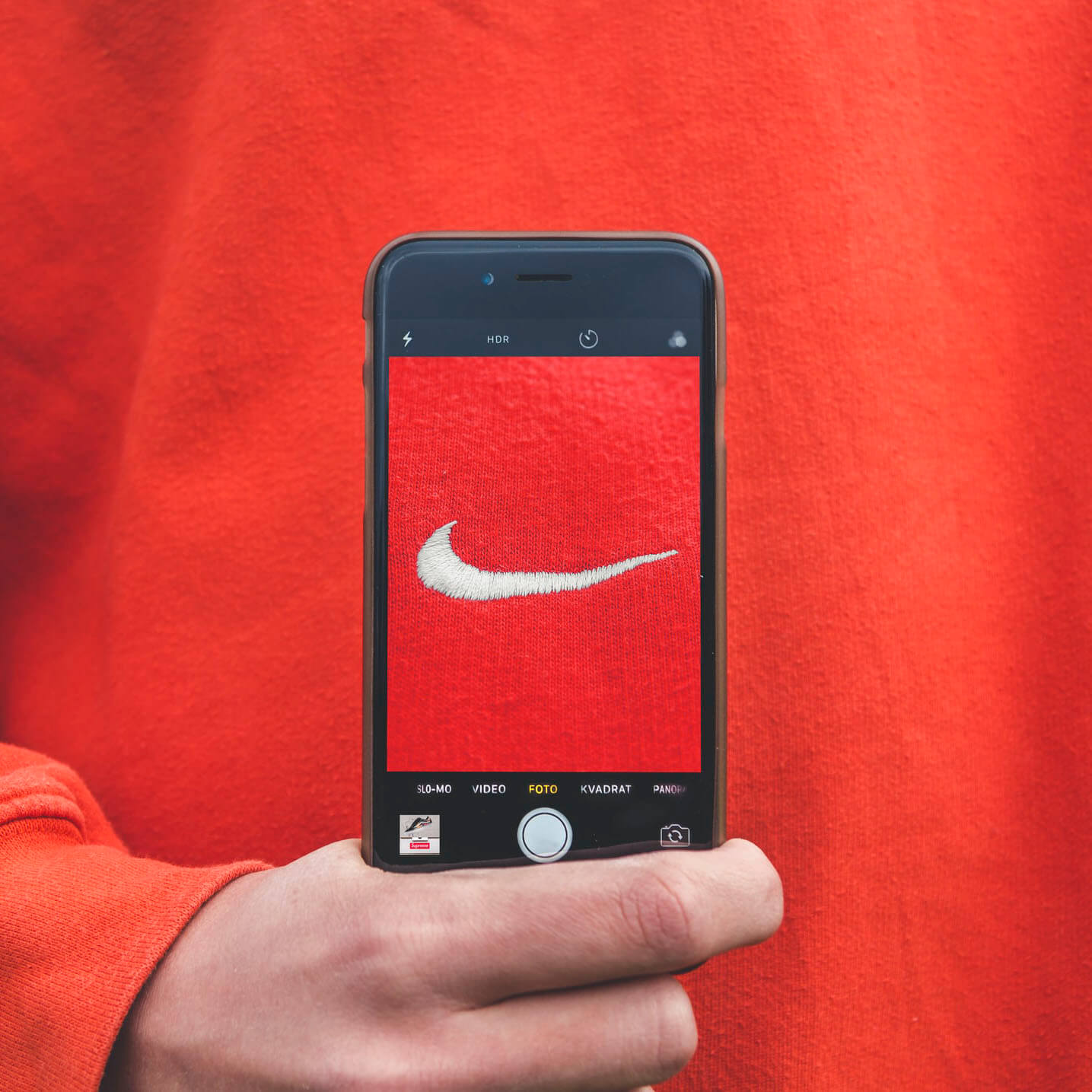
Image credit: Kristian Egelund
Introduction
Building on your learning about the term “brand”, and your knowledge of the different elements of a brand identity, in this assignment let’s go through five key things that can make a brand identity great.
1. It’s coherent and consistent
The best brand identities are those that can be applied consistently across a company’s operations and product range. Coherence is particularly important when a brand requires a certain amount of complexity.
Supermarkets, for example, often have several “sub-brands” for different price brackets and product ranges. The British supermarket chain Waitrose have Essential, No. 1, and FreeFrom ranges (amongst others), each with its own sub-branding.
Each one coheres with the main brand by consistently using the main brand logo (Waitrose & Partners), and applying matching typography, styles, and colour schemes.
On top of that, Waitrose’s branding is consistent with the brand of its parent group, John Lewis & Partners.

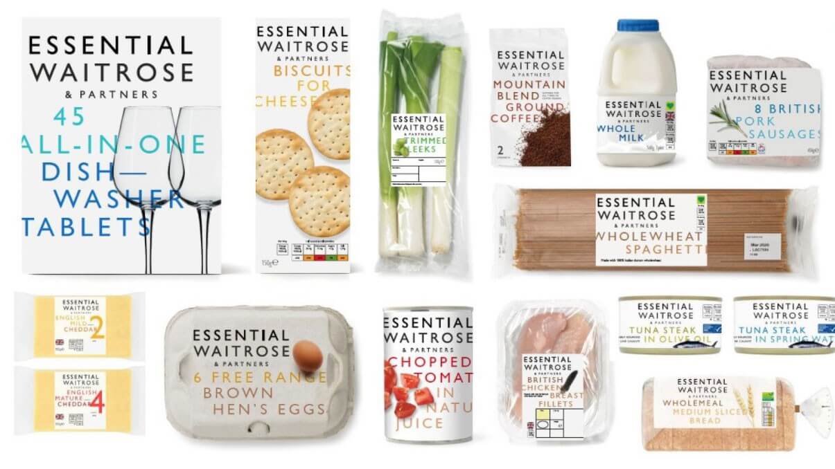
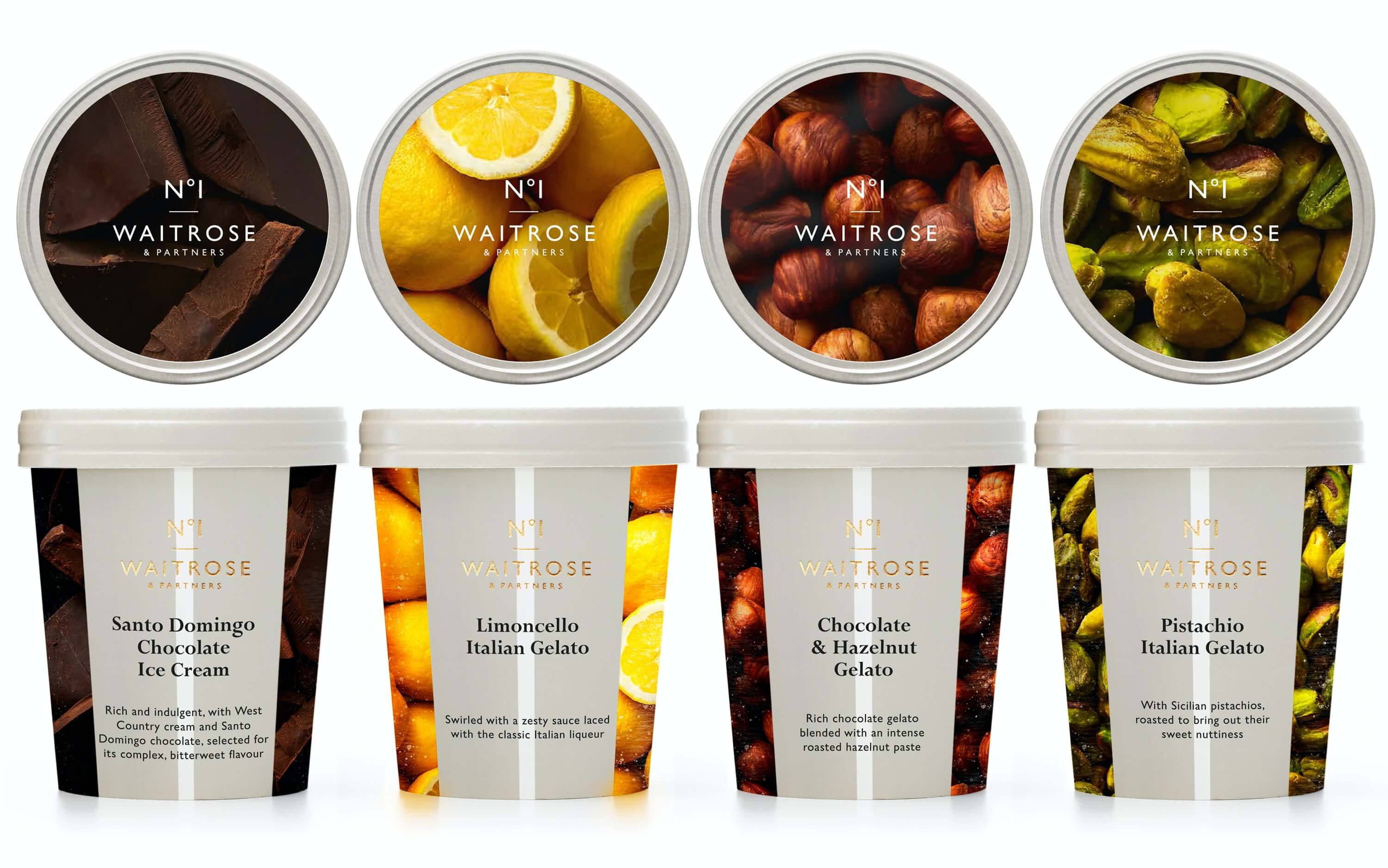
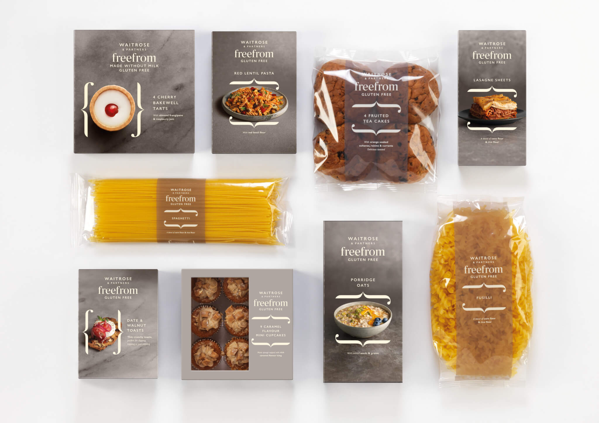
Image credits: John Lewis & Partners, Waitrose & Partners, Essential Waitrose & Partners, and No. 1 Waitrose & Partners brand identities by Pentagram, 2018. Waitrose & Partners FreeFrom brand identity by Williams Murray Hamm, 2018, building on Waitrose & Partners branding by Pentagram, 2018.
2. It’s as simple as it can be, while still meeting company and customer needs
Although the branding for Waitrose & Partners has to reflect the complexity of its product range, it forms a brand identity that is as simple as it can be while still meeting the needs of the company and the customer.
Other businesses are able to use their core branding across all of their products or services, and therefore simplify their brand identity further. For example, IKEA use the same logo, typography, and colour scheme on all of their products. The result is an extremely consistent and highly memorable brand.
This approach also reflects IKEA’s straightforwardness and affordability, even extending to the font they use both online and in print — Noto Sans, which is free.
Very simple brand identities also have a specific advantage: in a large organisation, they are easy for local, regional, and national teams to use and adapt, allowing them to stay on-brand.
A great example of this emerged in May 2020, when IKEA Russia used the famous style of IKEA instructions to release guides to help children build forts at home during lockdowns.
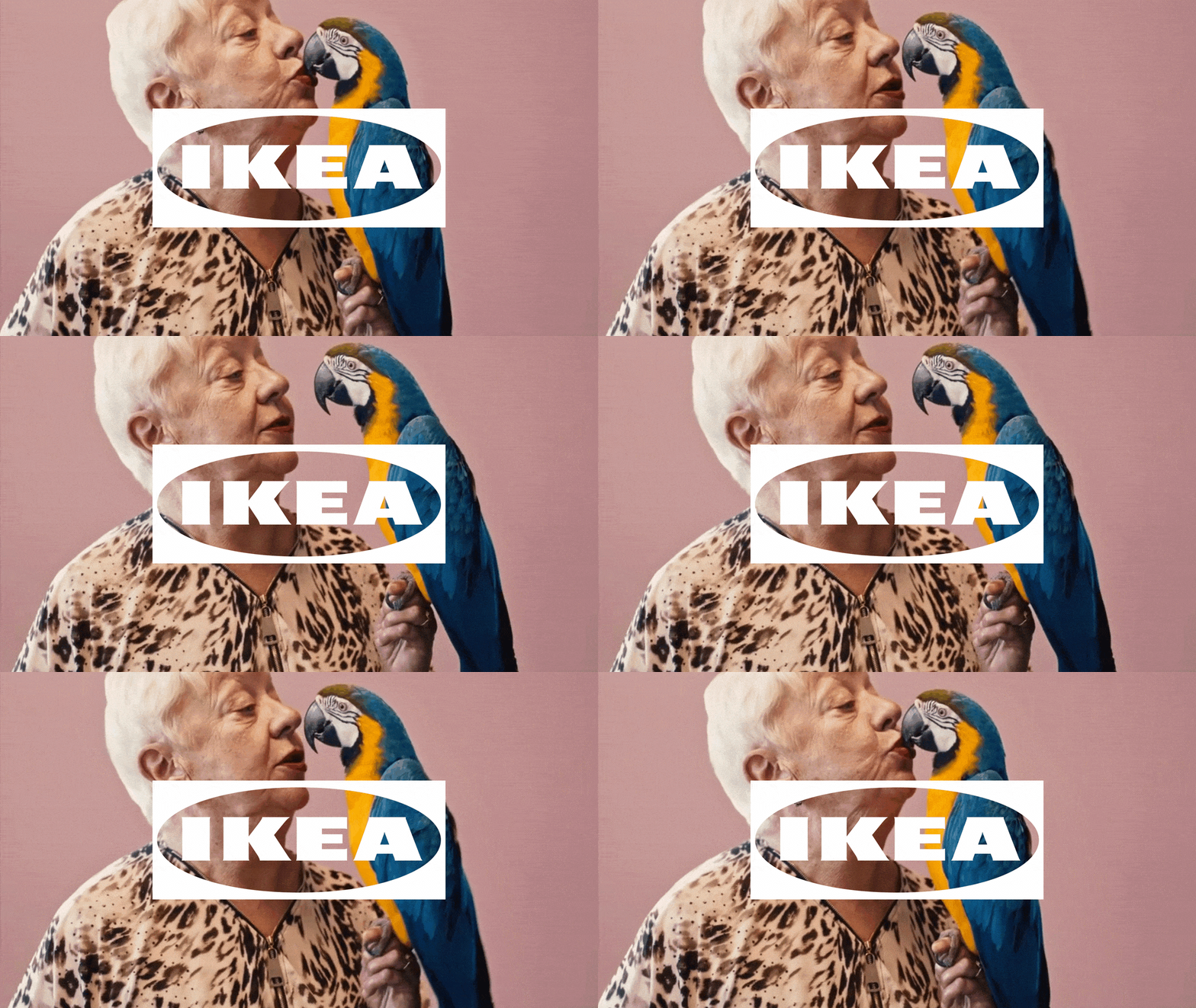
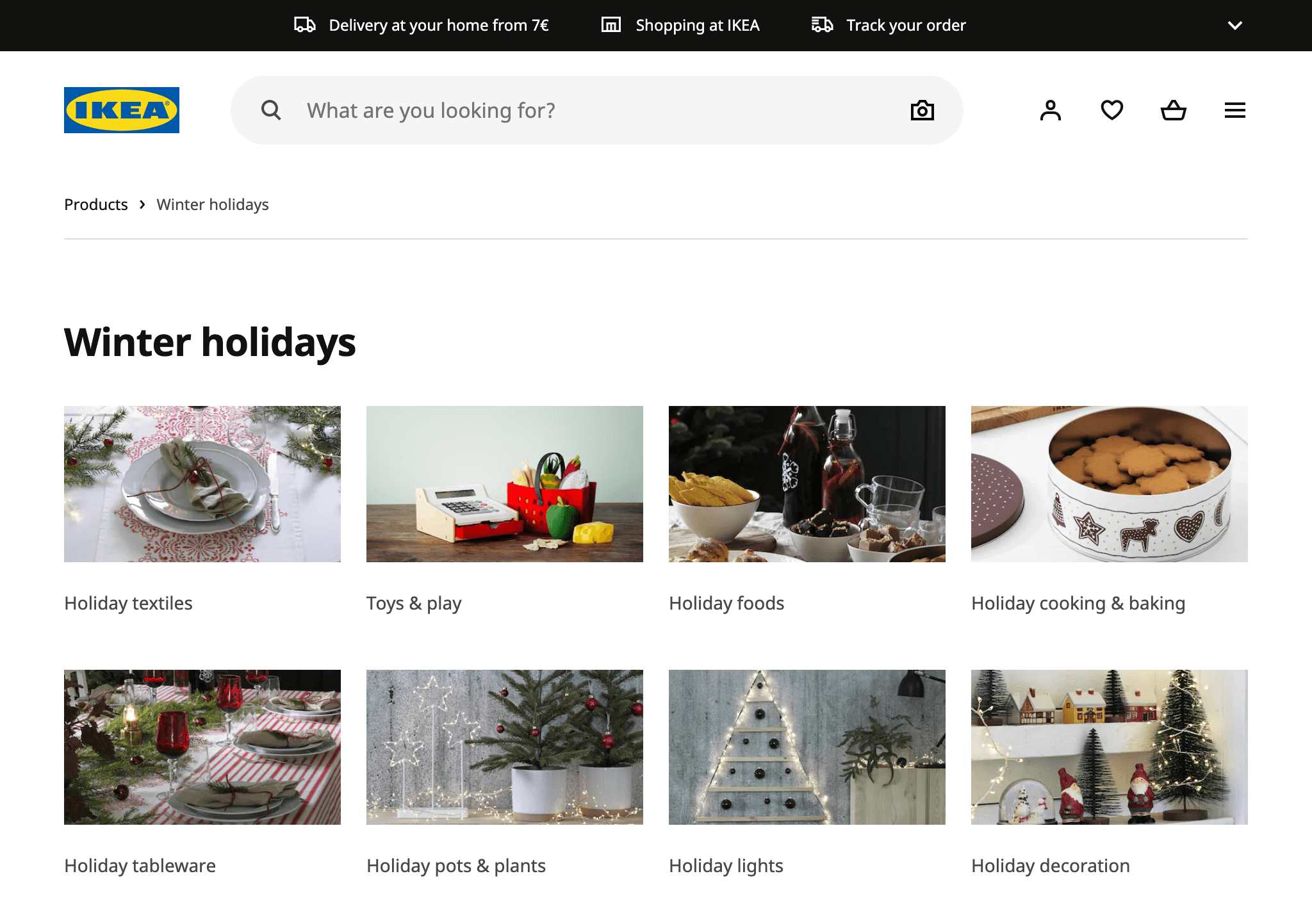
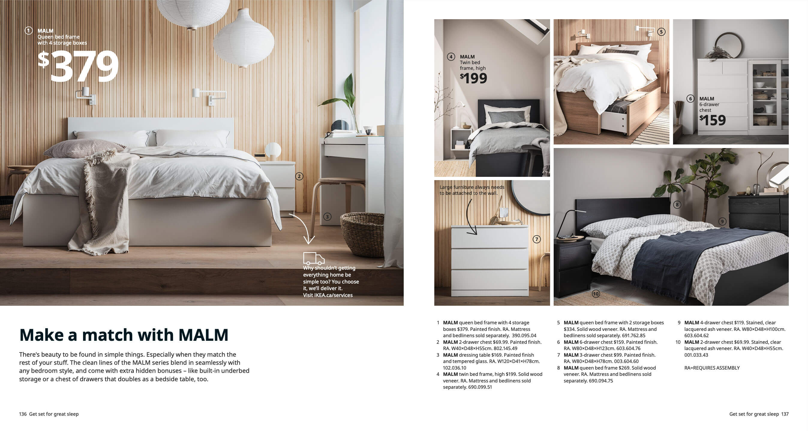
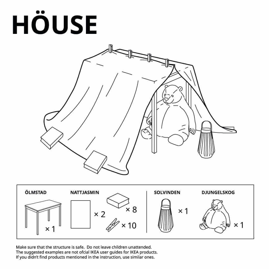
Image credits: IKEA
3. It projects a clear personality and brand voice
A brand’s words and graphics need to work together to project a clear brand personality. For example, a brand might define its personality as “youthful, informal, and funny”.
Those traits might then find visual expression through the use of on-trend colours, offbeat layouts, and memes or other visual jokes, as well as through a casual or colloquial style of writing.
Spotify is a strong example of how a playful brand personality can be applied in a brand’s visuals as well as in its writing.
Spotify describes itself as “innovative, collaborative, sincere, passionate, and playful”. Each of these traits is visible in the brand refresh the company recently commissioned to help it reach millennials.

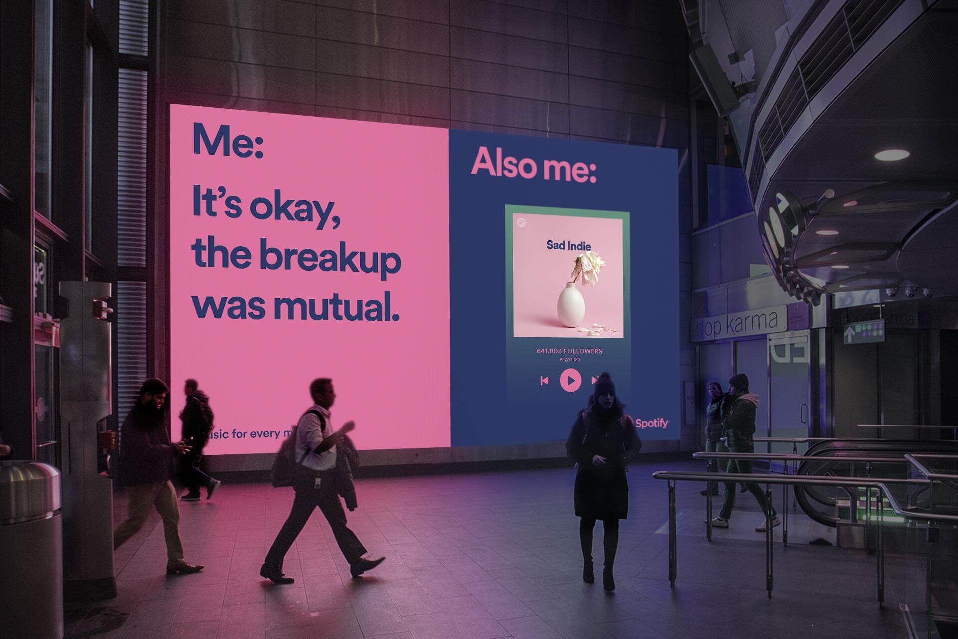
It uses on-trend colour combinations, informal copy, and ads composed like memes – including “screenshots” of the Spotify media player.
Cleverly, it also frames Spotify as a brand that collaborates with the customer — not only through conversational copywriting, but also by showing interactive elements like the media player even in print ads, and some of the Spotify’s custom playlists like “All Night Dance Party”.
Jargon Buster
In the context of design, copy simply refers to text that has been written or provided for a project. Copywriting is the discipline of creating that text, and copywriters are the professionals who do it. The word microcopy is also used to refer to very short segments of text in apps and websites — for example, headings, labels, and button text.
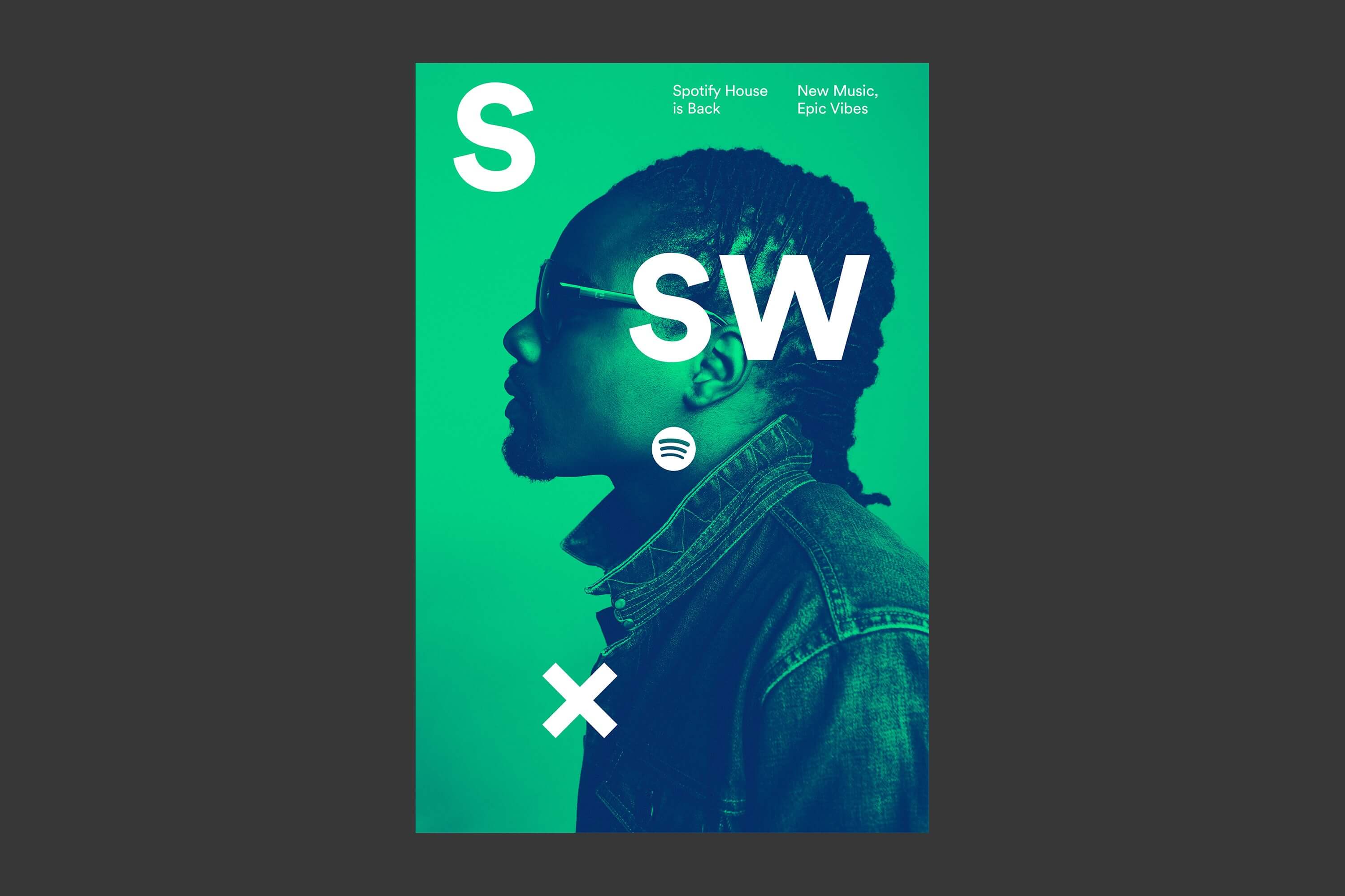
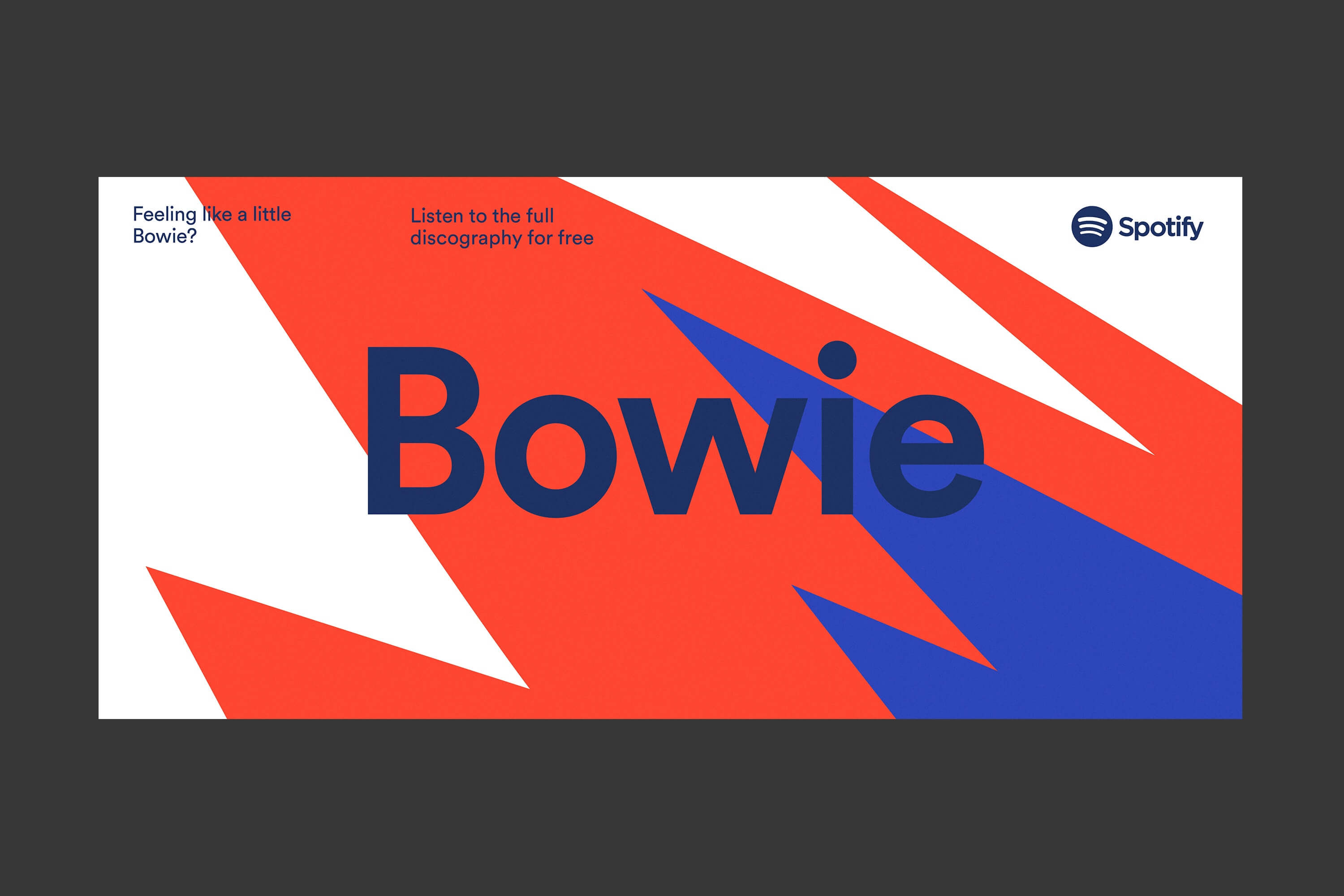
Image credits: Spotify rebranding by COLLINS, 2015
4. It’s durable and flexible enough to evolve in line with future needs
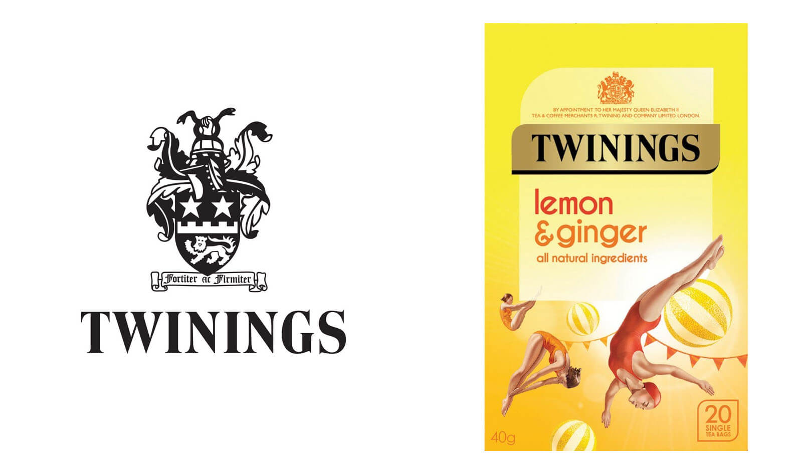
An underrated aspect of successful brand identity design is its durability. Part of a brand identity’s job is to build customer and investor trust over time, and support the long-term growth of a business.
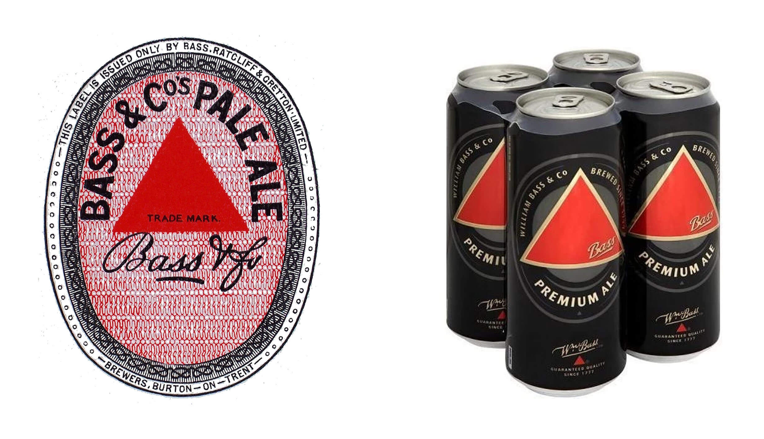
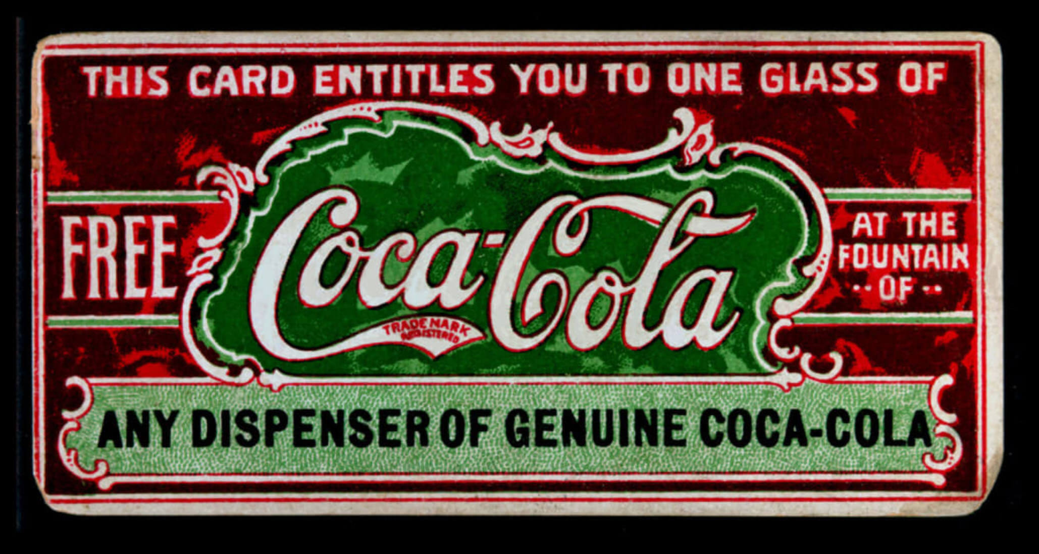
Generally, brand identities need to be long-lasting, so brand designers tend to avoid being led too strongly by visual design trends and fashions. Here are some great examples of brands whose identity was strong enough and flexible enough to endure not just for decades, but for centuries.
Twinings Tea, 1787 vs 2020
Bass Ale, 1876 vs 2020
Coca-Cola, 1887 vs 2020

5. It inspires an emotional connection between the customer and the brand
We can all think of brands that we “just” love. Achieving a truly lovable brand is a sort of alchemy, and sometimes brands that do everything “wrong” can get the most affection of any.
If you’re in the mood for a quick five-minute challenge, think about a brand you really love, and write down a few ideas about what it is about the brand that you think makes you feel that way. Click or tap below to find out which brand we chose, and why!
Example solution
We chose OXO, the homeware brand. We love them because:
1. They put the user at the centre of their designs.
Each product feels thought-through, and addresses problems that people might experience when using similar products. That’s especially true of their “Good Grips” range, which is made in consideration of people with lower grip strength. Here are their Good Grips kitchen scissors, which also come apart easily for safe and thorough cleaning:

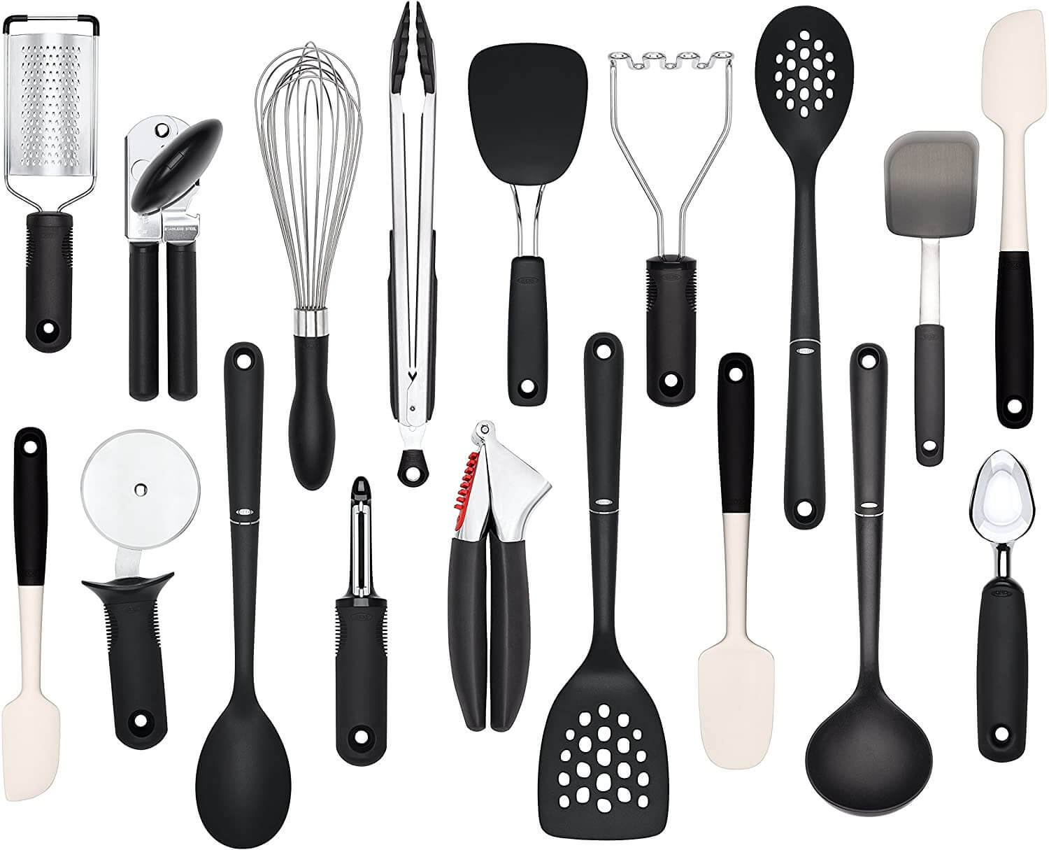
2. The physical design of their appliances and homewares is simple and consistent.
For example, most of the Good Grips kitchen product range uses only black or white silicone and stainless steel:
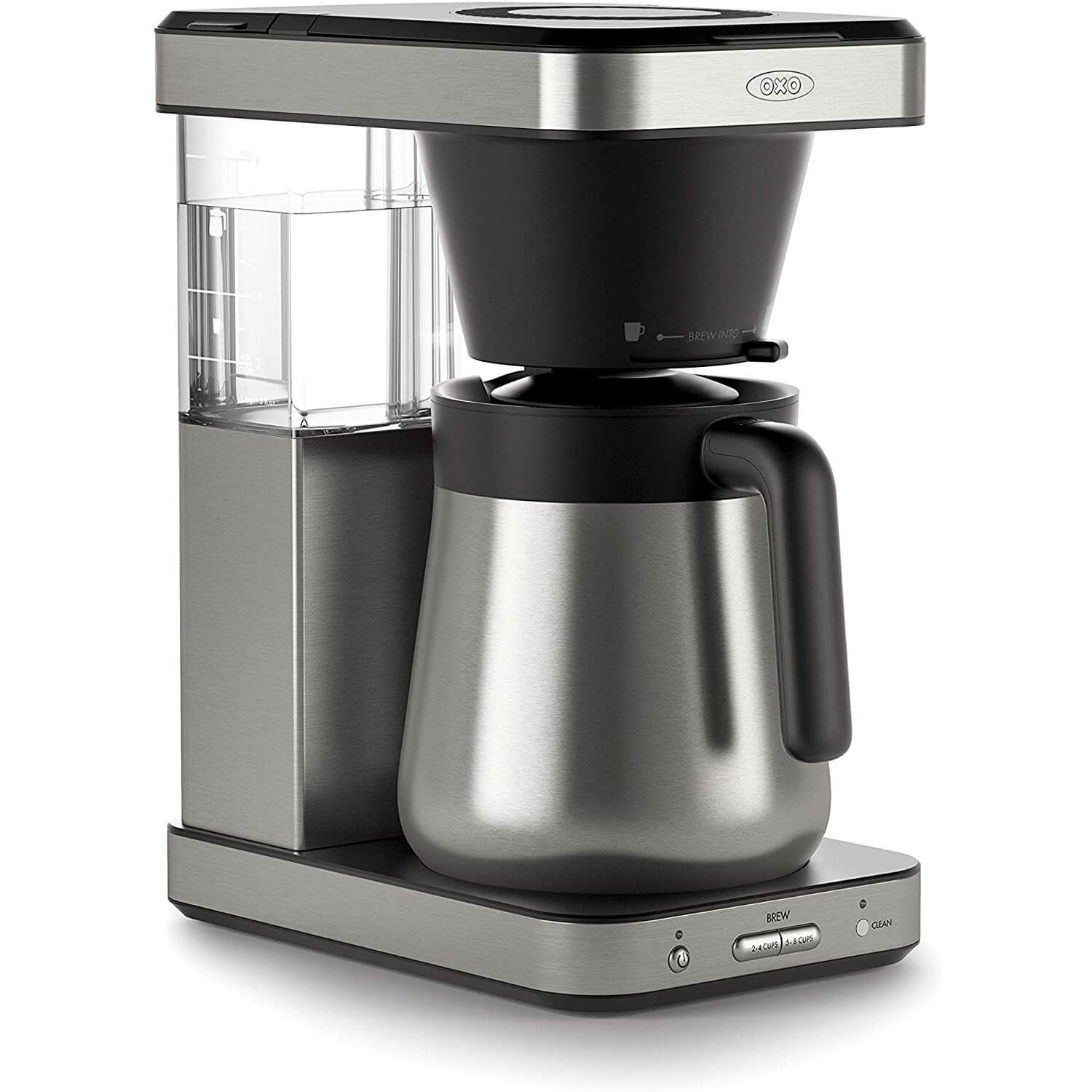
Their coffee maker also shows its user-centred design process in the range of brew options that can be selected (cup or pot at the top, then half pot or full pot at the bottom):
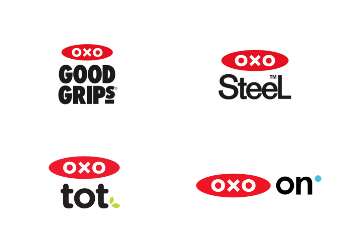
3. Their logo is simple, geometrical, and symmetrical.
It effectively reflects the clarity of vision and precision of execution in OXO products:

In conclusion...
Overall, there’s great clarity of purpose to OXO’s brand identity, combined with an emphasis on quality and accessibility. Nevertheless, the brand comes across as humble, functional — perhaps even shy. This endearing and unique personality adds up to a highly lovable brand.
And in case you were wondering... no, we’re not affiliated with OXO! We just happen to love their stuff. That’s the power of building a brand that inspires emotional connection — happy customers will do your advertising for you.
Image credits: OXO, Smart Design
In conclusion...
In this assignment, we covered five hallmarks of a great brand identity:
- It’s coherent and consistent
- It’s as simple as it can be, while still meeting company and customer needs
- It projects a clear personality and brand voice
- It’s durable and flexible enough to evolve in line with future needs
- It inspires an emotional connection between the customer and the brand
Next up, let’s get back to some hands-on work, and analyse a brand identity out in the wild.