Course · Part 5 · Assignment 18
Read ![]()
What Makes an Editorial Design Great
KeyThree
The key points from this assignment.
- Great editorial designs don’t drown out the content — they make the content shine
- They use the grid creatively, although the grid itself may be conventional or straightforward
- Through good typography and a balance of text, images, and whitespace, the best editorial designs create an emotional response in the reader
Image credit: Skylar Kang
Introduction
In this assignment, we’ll cover five ways that a great editorial design can set itself apart.
1. Its design serves the content — not the other way round
As designers, “content first” should be our mantra when working on editorial projects. The best editorial designs support the content in two main ways: by making it visually enticing (generating interest in the content); and by making it easy to read (clear and legible).
This brochure for paper maker Neenah demonstrates a perfect fusion of content and form. The page shown below is printed on an unfolded box, directly demonstrating the product’s potential through the copy, the ink, and the card itself.
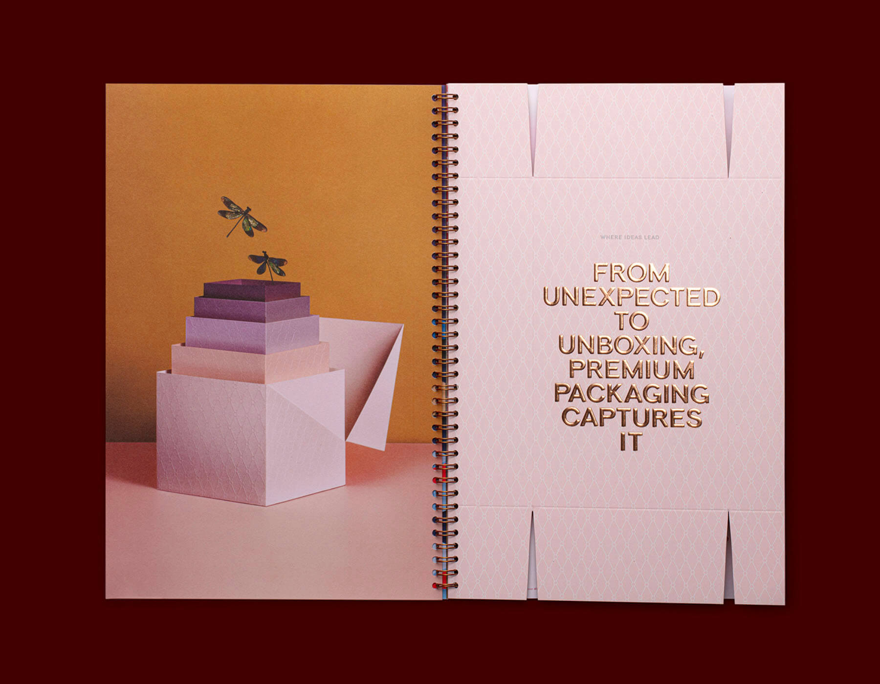
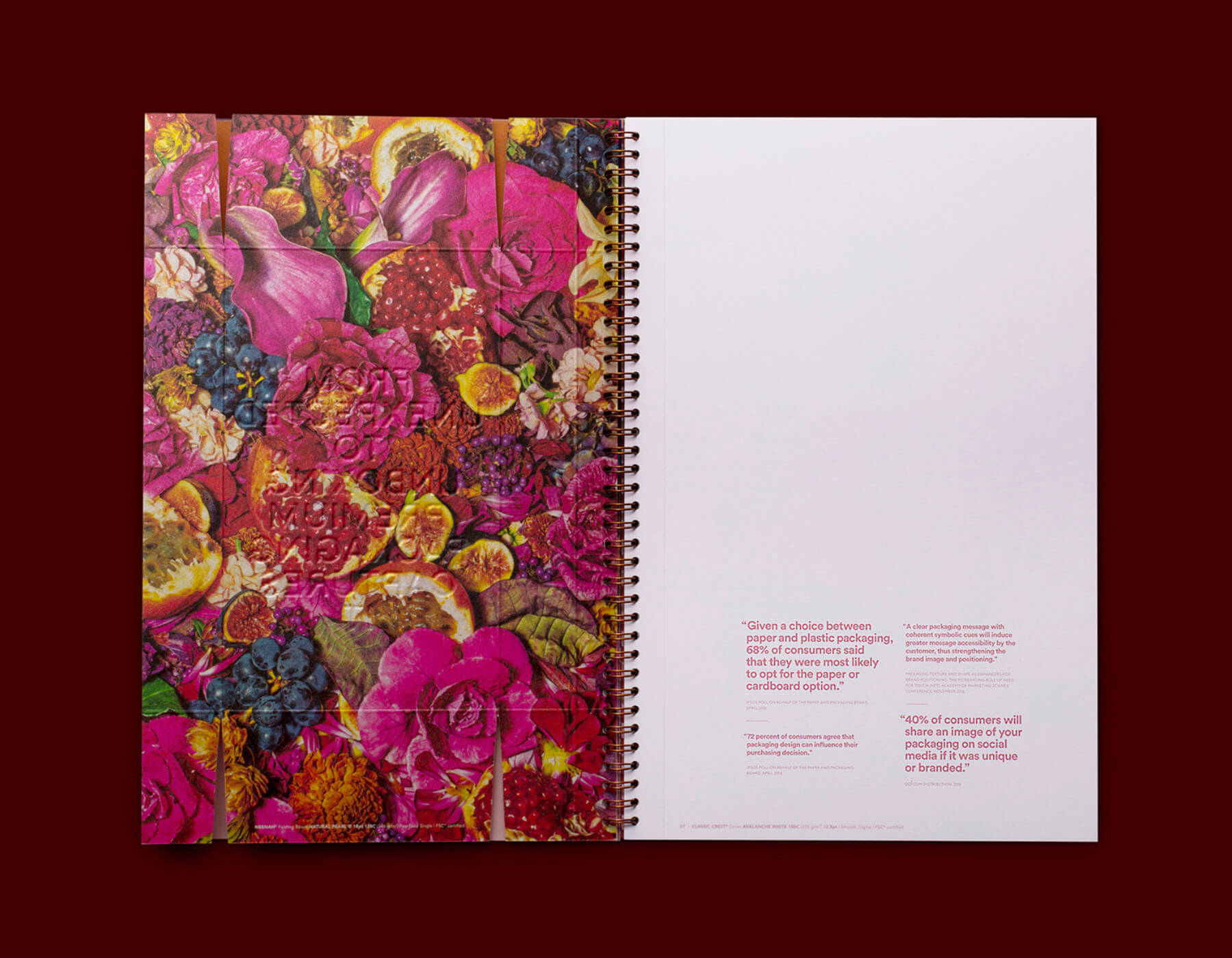
Image credit: PRINT Magazine
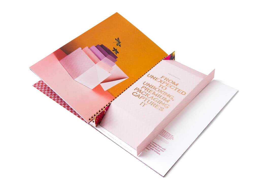
Image credit: Dieline
2. It uses the grid creatively
The grid is a constraint, but constraints are what make creativity possible. Most great editorial designs use a modular grid, which helps to create vertical structure as well as horizontal structure.
Here is another spread from the brilliant Kinfolk magazine. Here, the modular grid provides a rational starting point for the three columns of text, and permits a large area of whitespace to guide the eye through the visual hierarchy (title, columns, photo).
Note also how forming a visual “block” out of the three columns of text also allows the designer to echo the three “columns” of books in the opposite page, just as the whitespace on the left echoes the “empty” floor space in the photo on the right.
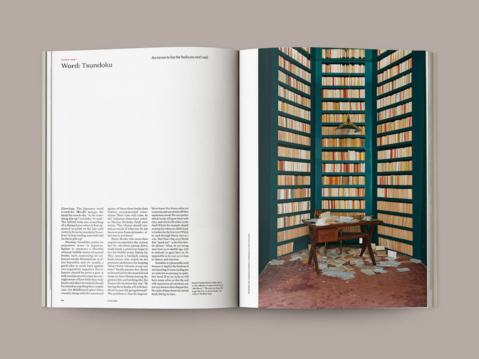
Image credit: Kinfolk
3. It balances text, images, and whitespace
Striking a balance between text and images is essential, but so is using enough whitespace to support the content’s structure, and to provide visual breathing room.
This spread is both too text-heavy, and lacks adequate whitespace — creating an effect that is overall a bit claustrophic:
Whereas the page below, from The Economist, balances text with both images and whitespace — in spite of having a lot of text to make room for.
The relatively small area of whitespace below the “Out of reach” heading is critical, as is the whitespace within the illustration.
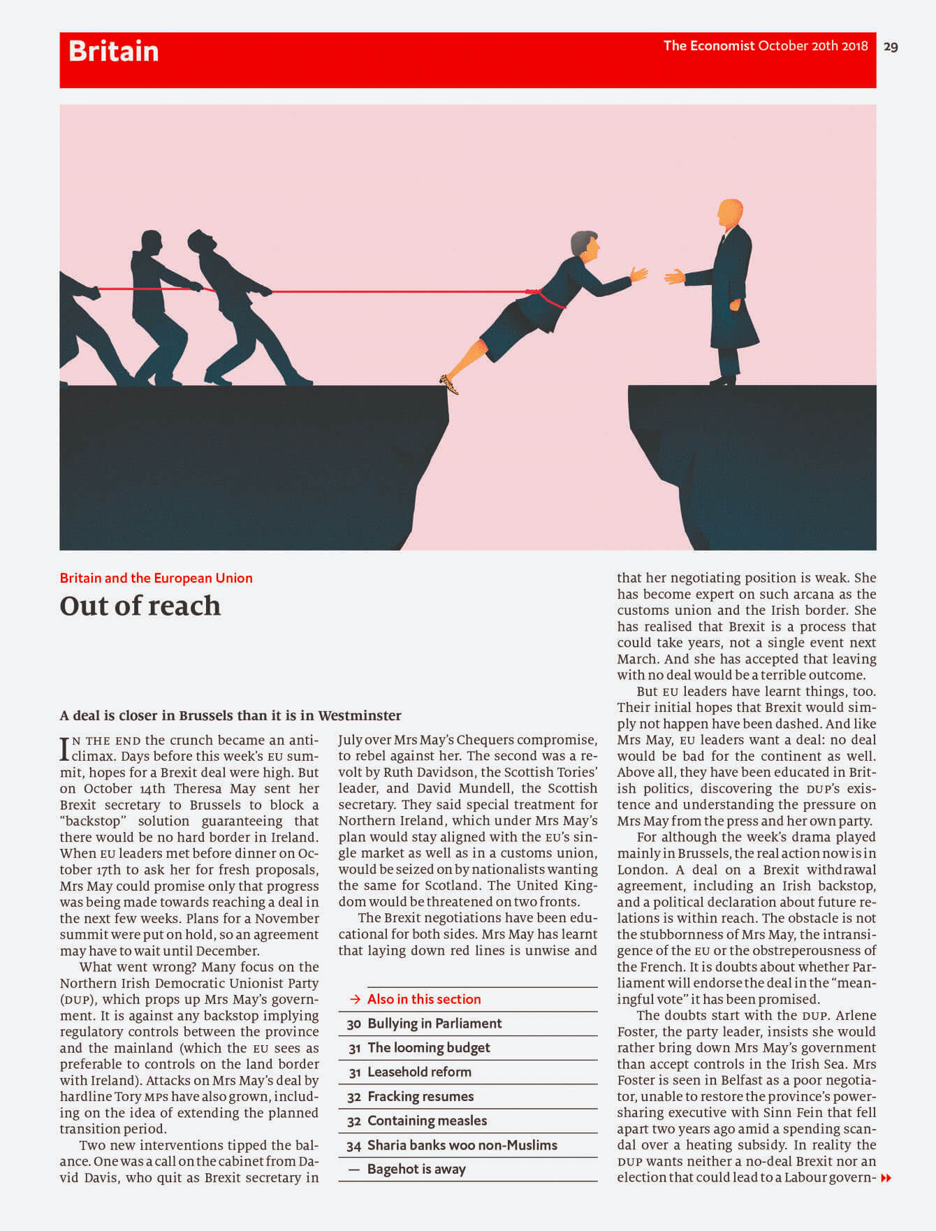
Image credit: The Economist
4. It use typography well
In the context of editorial design, using typography well tends to mean two things.
First, it mean choosing (or commissioning) a typeface for body text that is clear, legible, and supports the reading experience. As you know from the typography assignments in Part 4, it also means finding a font that has a meaningful connection to the publication and its subject matter.
And second, it means using impactful display type or custom lettering for headlines and headings, which enhances the audience’s understanding, and elevate their enjoyment, of each feature.
5. It creates loyalty and emotional resonance
The most enduring magazine designs tend to have “cult” status — which is another way of saying that they have a high degree of loyalty and esteem amongst their target audience.
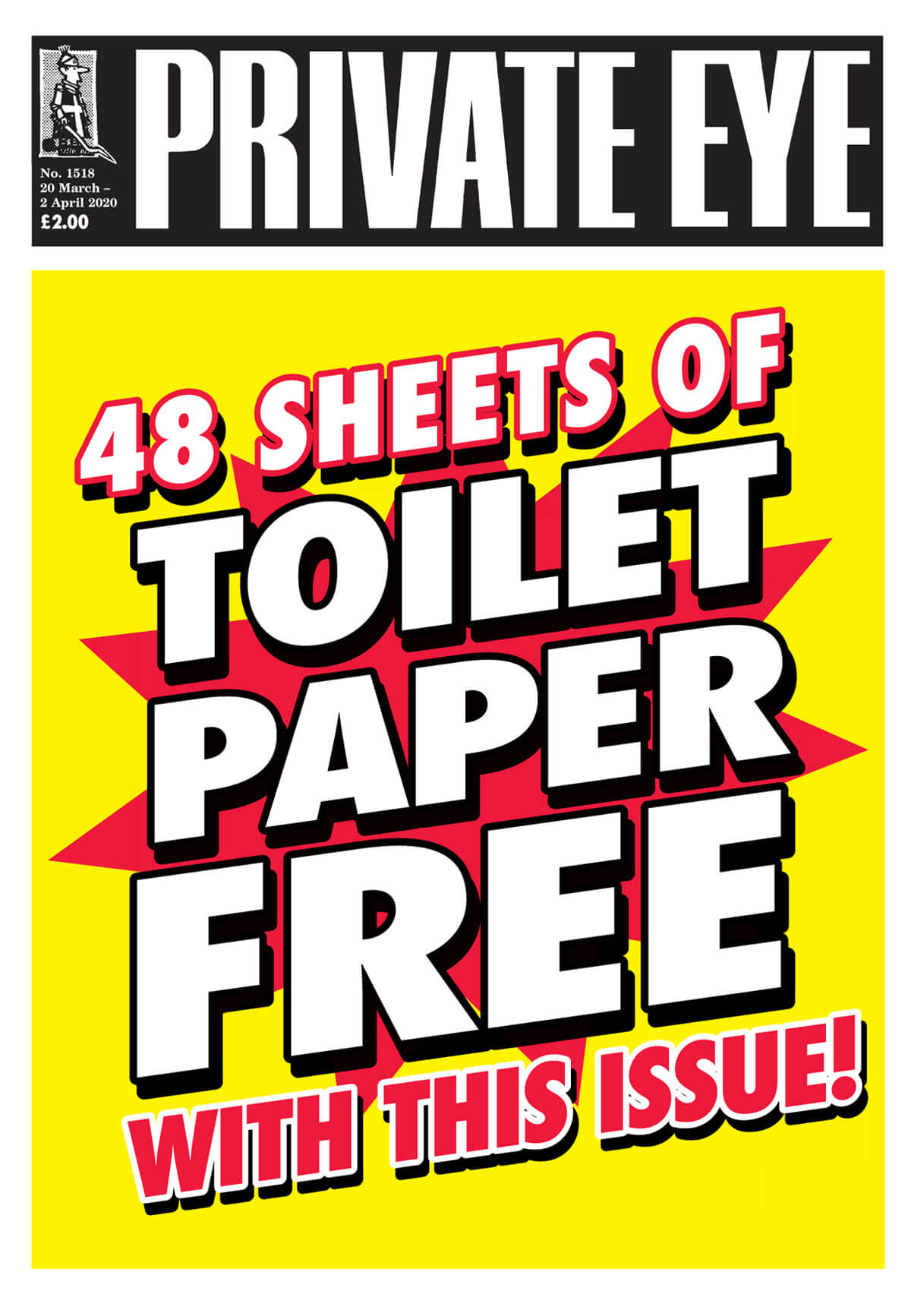
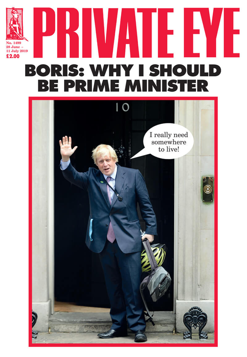
For example, the satirical British magazine “Private Eye” has now been in print for sixty years, and continues from strength to strength.
Part of its success lies in subverting “good” design aesthetics through the use of old-fashioned typesetting and exaggerated tabloid graphics, content formats, and colour schemes. These distinctive visuals support an audience’s feeling of being in-on-the-joke.
Many arts and culture publications use similar markers to signal to a particular audience, “this is something for you”.
Business and charity reports also leverage brand loyalty to create an emotional connection to their printed matter.
In conclusion...
Brilliant editorial design allows the content to shine, uses the grid creatively, and combines strong typography with a balance of text, images, and whitespace.
In the next assignment, you’ll analyse a magazine feature to identify what makes it successful.