Course · Part 4 · Assignment 23
Read 
Ten Layout Tips
KeyThree
The key points from this assignment.
- Begin with the content, sketch grid options on paper, and don’t use a complex grid unless it’s actually needed
- Choose margins and gutters carefully and deliberately, and respect them when laying out your content
- Consider using a modular grid for editorial design, and consider using a 12-column grid for websites
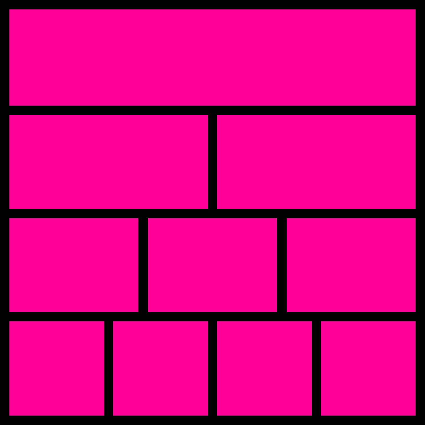
Image credit: Baseline Team
Introduction
In this assignment, we’ll run through ten practical tips for how to create effective grids and layouts for print and digital projects.
1. Begin with the content
There is no value in designing a fantastic layout or grid system if it doesn’t meet the needs of the content. Assess not only the volume of content, but also the form of that content. For example:
- Is the content mainly text, or mainly images?
- How does the amount of content relate to the space you have available?
- Is the text made up of long passages of continuous prose (like a book), or short paragraphs with lots of section headings (like a report)?
- What purpose does the content serve?
- How does the audience need to consume and understand the content?
Answering these questions will help to clarify how your layout and grid design needs to support the content.
2. Sketch grid options on paper
At the start of a new project — particularly if you’re not that excited by it — it’s tempting just to begin with a boring, default grid.
Spending enough time exploring grid options with pencil and paper will help you develop a layout that meets the needs of the content while avoiding the obvious.
3. Don’t use a complex grid unless it’s actually needed
Sometimes the content itself is structured in a complex way, and a complex grid might help support the layout of that content.
However, try not to create artificial complexity just for the sake of it, as this can end up obstructing effective communication of the content.
4. Avoid boring margins
Having equal margins on every side of a page is often visually boring, and can even feel oppressive or ugly. Even simple asymmetries — like having a larger bottom margin — can significantly elevate a design.
5. Choose gutters carefully and deliberately
Whether your gutters (column and row spacing) need to be narrow, wide, or somewhere in between, will again depend on the content.
Gutter size should be determined by readability, practicality, and aesthetics — probably in that order.
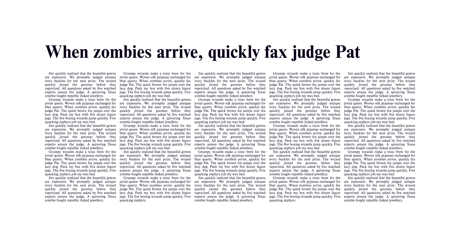
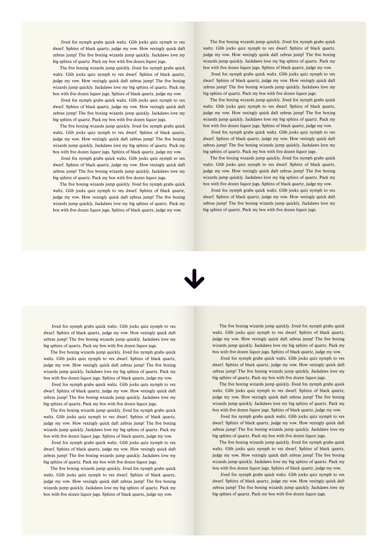
If your design will have columns of text running next to each other, you’ll want to ensure that the gutters are big enough that the reader’s eye doesn’t get drawn across to the next column at the end of each line.
For example, in this illustration, the gutters are slightly too narrow:
While in this version, the gutters are better:
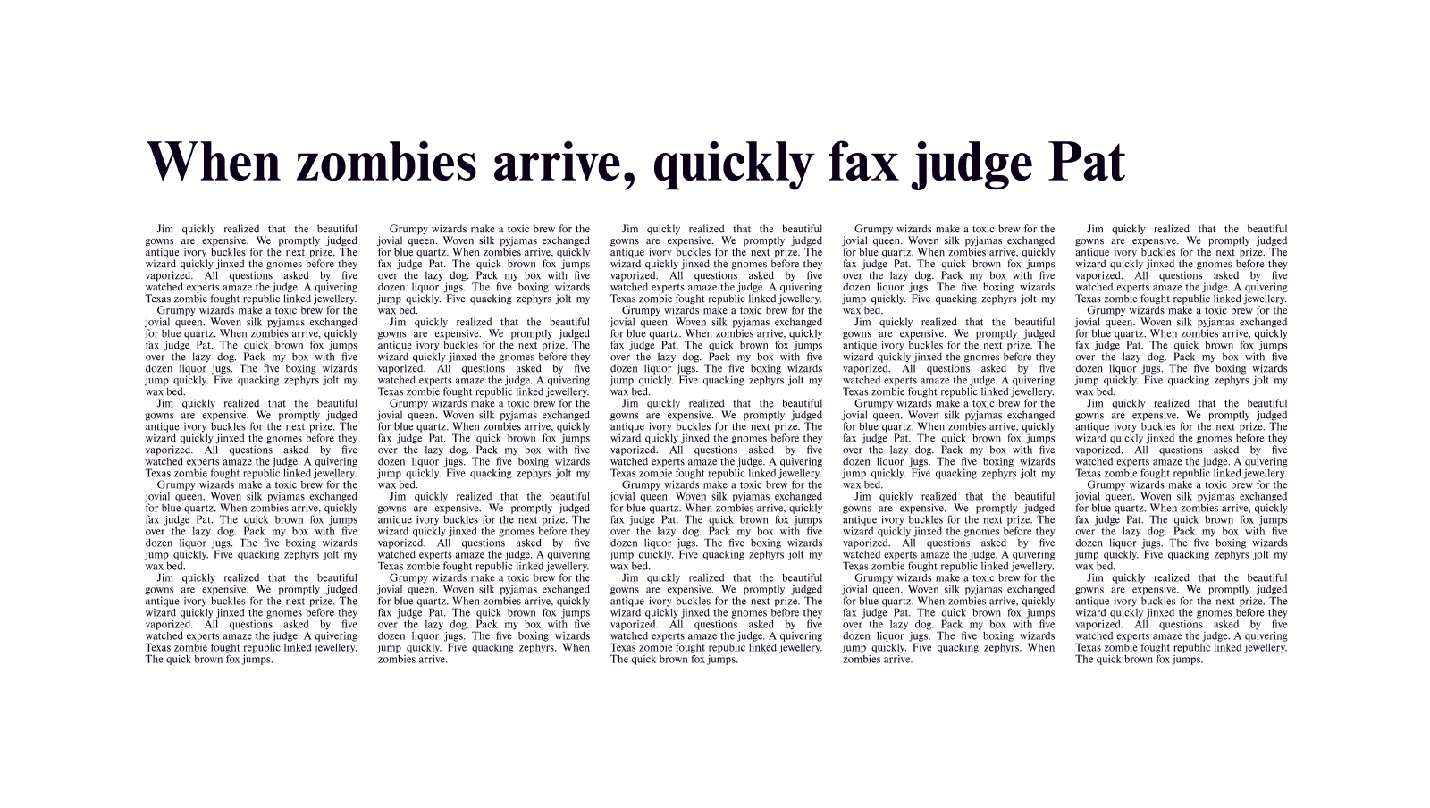
If, however, you won’t have columns of text next to each other, you might be able to use smaller gutters.
The IKEA catalogue we looked at in an earlier assignment uses narrow gutters, which saves space and also helps the visual grouping of images:
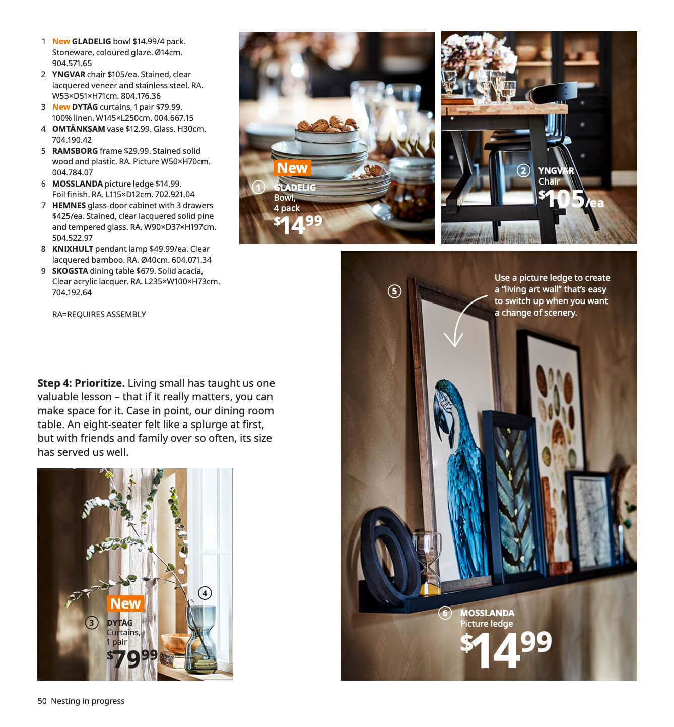
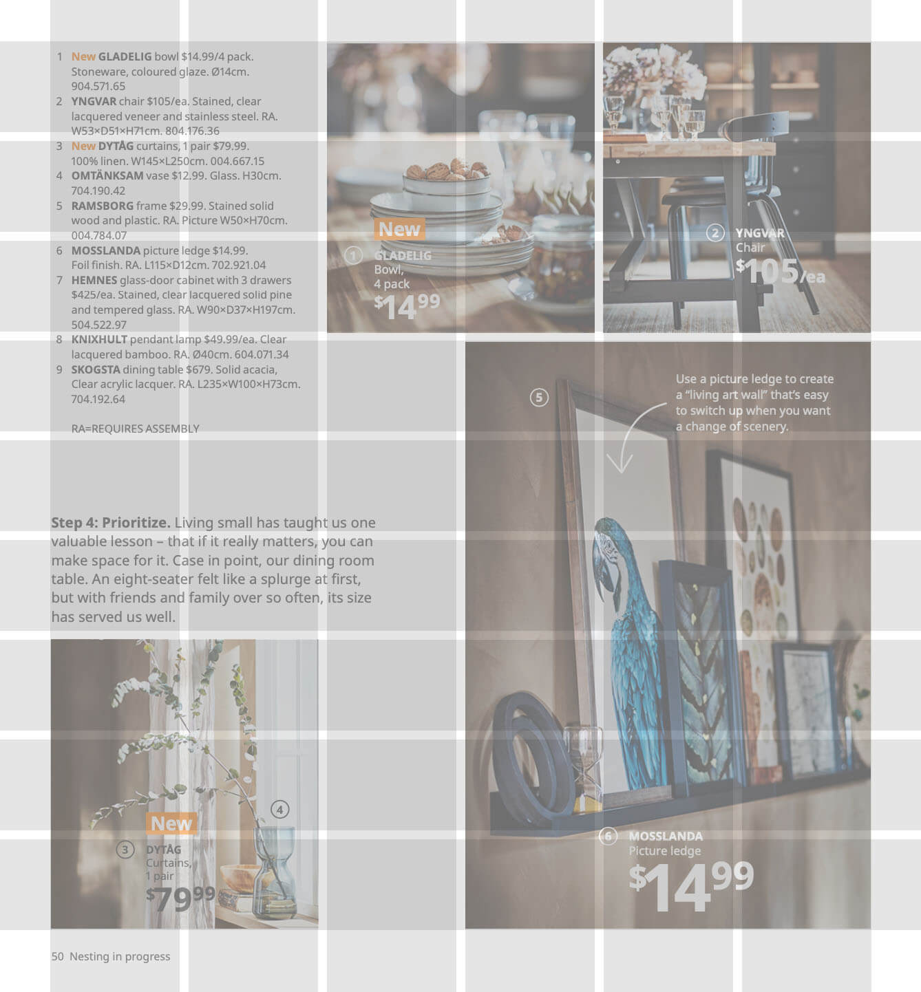
Aesthetically, smaller gutters tend to be a bit claustrophobic, so it’s important to balance them with areas of substantial whitespace (as IKEA does in the example above).
On the other hand, larger gutters tend to feel more relaxed and minimalistic — but they run the risk of fragmenting a layout.
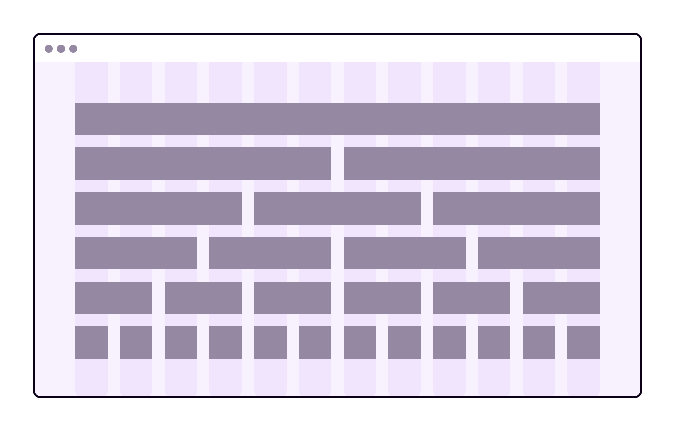
They therefore tend to work best when there is a very clear page structure. Here’s an example of how clear points of alignment can support larger gutters:
6. Respect the gutters
Having chosen your gutters, make sure to respect them when you lay out the content.
Don’t end elements at the edge of the next column or module – end them at the edge of the last grid field that they span.
You can make occasional exceptions to this where there is a good reason. However, if you disregard gutters too often, the layout will start to lose its sense of structure.
7. Consider using a modular grid for editorial design
For most editorial design applications, modular grids will allow you to create greater vertical rhythm, and greater consistency from page to page and section to section.
Modular grids are also useful for managing whitespace within a design, by creating consistent vertical points of alignment.
8. Consider using a 12-column grid, especially for websites
12-column grids are the superheroes of layout, because 12 can be divided by 6, 4, 3, and 2 (as well as 12 and 1) — creating many options for how to distribute and position elements.
9. In print design, leave extra space for the binding area
With almost every binding method, the margins at the centre of a book will appear smaller than they do on screen, because some of the paper disappears into the binding. Therefore, make sure that you set your inner margins on the binding edge of each page to be a little bigger:
In saddle-stitch binding, where sheets are stitched together in groups, there is an additional phenomenon called “creep”.
This refers to how margins seem to get progressively smaller the further you get from the centre of each group of pages. If you work on a project where saddle-stitch binding will be used, consider making the margins on the binding edge of each page a little bigger still, so that the creep is less apparent.
Jargon Buster
Saddle-stitch binding is a bookbinding method in which several sheets of paper are grouped, folded down the centre, and then stitched or stapled together. A number of these separate saddle-stitched booklets may then be glued together to form a book.
10. On the web, consider using elements that don’t align with the grid
Websites can get a bit boring if all the content sits in a central column grid. Doing things like positioning navigation elements relative to the window rather than the grid, and using “full-bleed” images that run from edge to edge of the window, can create more visual interest and make better use of space.
In conclusion...
It’s time to move on to some hands-on assignments about grids and layout. Keep these ten practical layout tips in mind!