Course · Part 4 · Assignment 8
Practise ![]()
Choose a Font
![]() Time limit: 1 hour
Time limit: 1 hour
Remember to use your visual timer! We recommend the inventor’s iOS and Android apps — just search for “Time Timer” in the app store.
Explanation
In this assignment, you’ll make your own font choices for a new cycling brand, and explain your reasoning. At this point, the font you choose isn’t as important as the thought process behind that decision.
Instructions
Read through the brief
First, study the brief for this assignment:
A new cycling brand called Summit wants to explore some different directions for how their branding could look.
Summit’s mission is to make cycling more inclusive. They want their branding to convey power, fitness, and fun. They also need it to be gender-neutral, and in particular to avoid looking “macho”.
They’ve asked you to choose three options for a main brand font that responds to their mission.
Choose three suitable fonts
 Set your timer: 50 minutes
Using your recent learning about typography, as well as the process and tips covered in the previous assignments, identify three fonts that you think would be suitable for the brand.
Remember to start by thinking about the needs of the project, and especially the keywords included in the brief: power, fitness, and fun.
Review the example solution
Once you’ve completed your work on this assignment, take a few minutes to review the example solution below.
Example solution
After studying the brief and creating a mindmap about associations with the keywords, we settled on three different directions to drive our font explorations:
- Geometric, because there is lots of geometry in cycling, from the circular wheels and pedal strokes, to the angles of a bike’s frame and the twists and turns of the road.
- Italic, because cycling is all about forward motion and momentum.
- Bold, to represent the muscle and power that cyclists develop.
We limited ourselves to sans-serif fonts, because we thought that other classifications of typeface would probably be too decorative for this brief. We also limited ourselves to what’s available on Google Fonts. We selected one font to represent each of those three directions (geometric, italic, bold).
Since we weren’t provided with any text to work with in the brief, we used the brand name (Summit), and set it in both regular case and uppercase. We also created an example tagline, “Cycling for everyone”, so that the client can get more of a feel for how the font would look and feel in headings and other text.
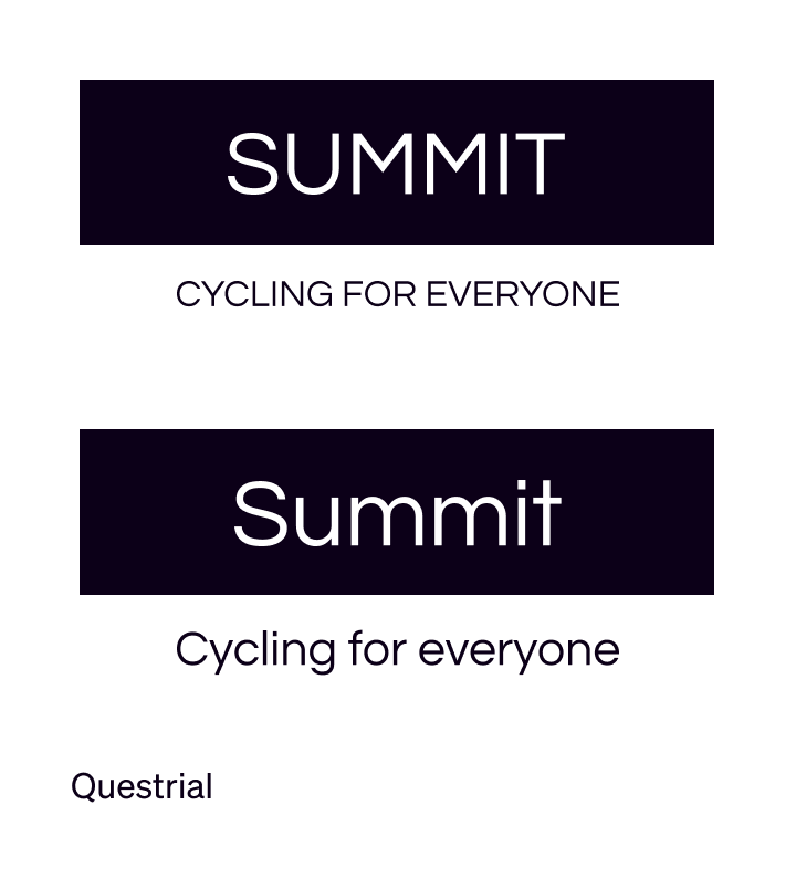
Option 1 — Geometric
Font shown: Questrial

Option 2 — Italic
Font shown: Be Vietnam, Extra Bold, Italic
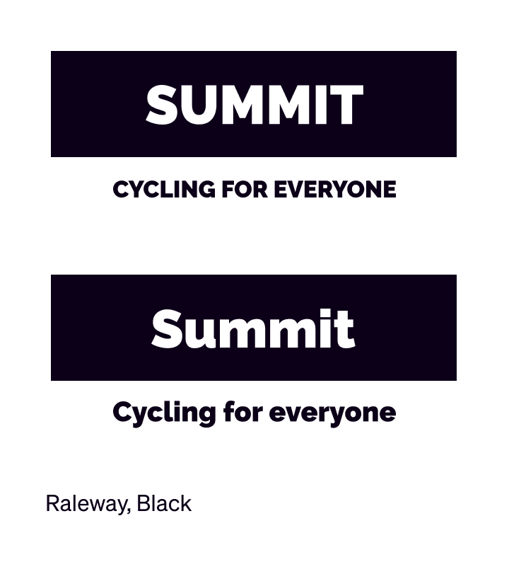
Option 3 — Bold
Font shown: Raleway, Black
What do you think? How well do you think our choices work? How could be improved?
In conclusion...
Now that you’ve had some practice choosing fonts, let’s move on to the next assignment and talk about how to combine two or more typefaces.