Course · Part 4 · Assignment 22
Read ![]()
Spacing, Whitespace, and Empty Space
KeyThree
The key points from this assignment.
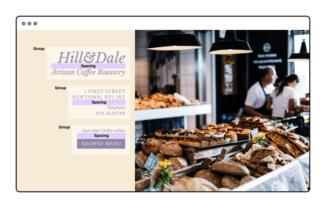
- Spacing is the space between individual elements within a group of elements, or within passage of text
- Whitespace refers to larger areas of space around groups or elements — it plays an active role in the creation of visual hierarchy
- Empty space refers to larger areas of space that don’t contribute to the structure of a design — empty space is to be avoided
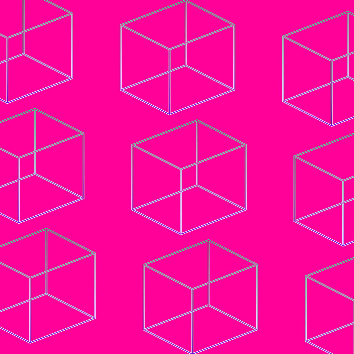
Image credit: Baseline Team
Introduction
Classical music is composed not only of sounds, but also of gaps, pauses, and silences. In much the same way, graphic design is made up not only of graphic forms like text, shapes and images, but also of the spaces between them.
In this assignment, we’ll explore three ways of thinking about space in graphic design: spacing, whitespace, and empty space.
If you’ve studied design previously, the way we use these terms might be slightly different from what you’re used to, but we believe these concepts provide a clearer model for planning and analysing space in graphic design.
Spacing
Definition: Spacing is the space between individual elements within a group or passage of text. (This is also known as “micro-whitespace”.)
Examples of spacing include:
-
The space between letters in a passage of text (you’ll remember this is called “tracking”; it’s also called “letter spacing”):

-
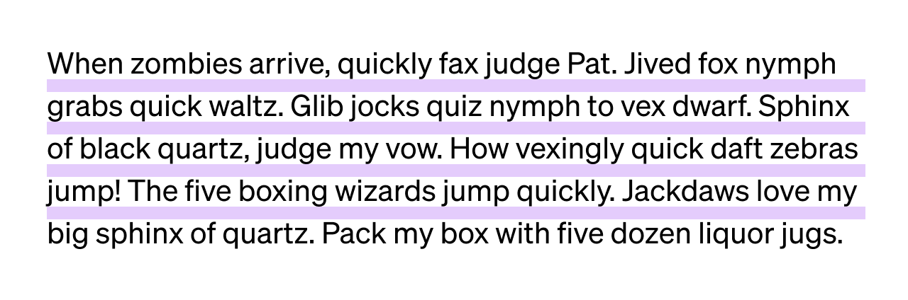
The space between lines in a passage of text (you’ll remember this is called “leading” — it’s also called line spacing):
-
The space between columns in a layout grid (this is called column spacing or gutter width, and we’ll cover it in the next assignment):
-
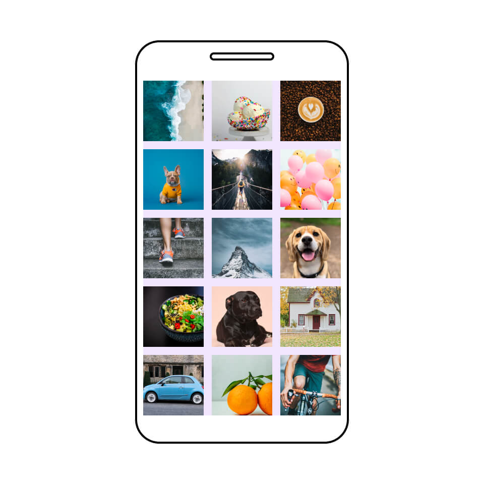
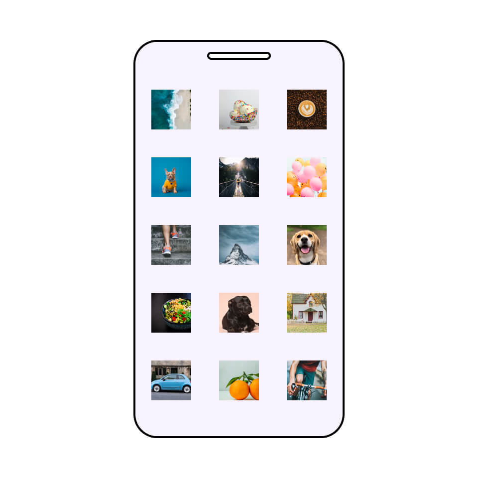
The space between cells in a modular grid:
-
The space between elements within other visual groups:
Whitespace
Definition: Whitespace refers to larger areas of space around groups or elements. Whitespace plays an active role in the creation of structure and visual hierarchy. (This is also known as “macro-whitespace”.)
Note: Whitespace doesn’t have to be white. It can be any colour, texture, or image, so long as it forms a “ground” (background) in the composition.
Examples of whitespace include:
-
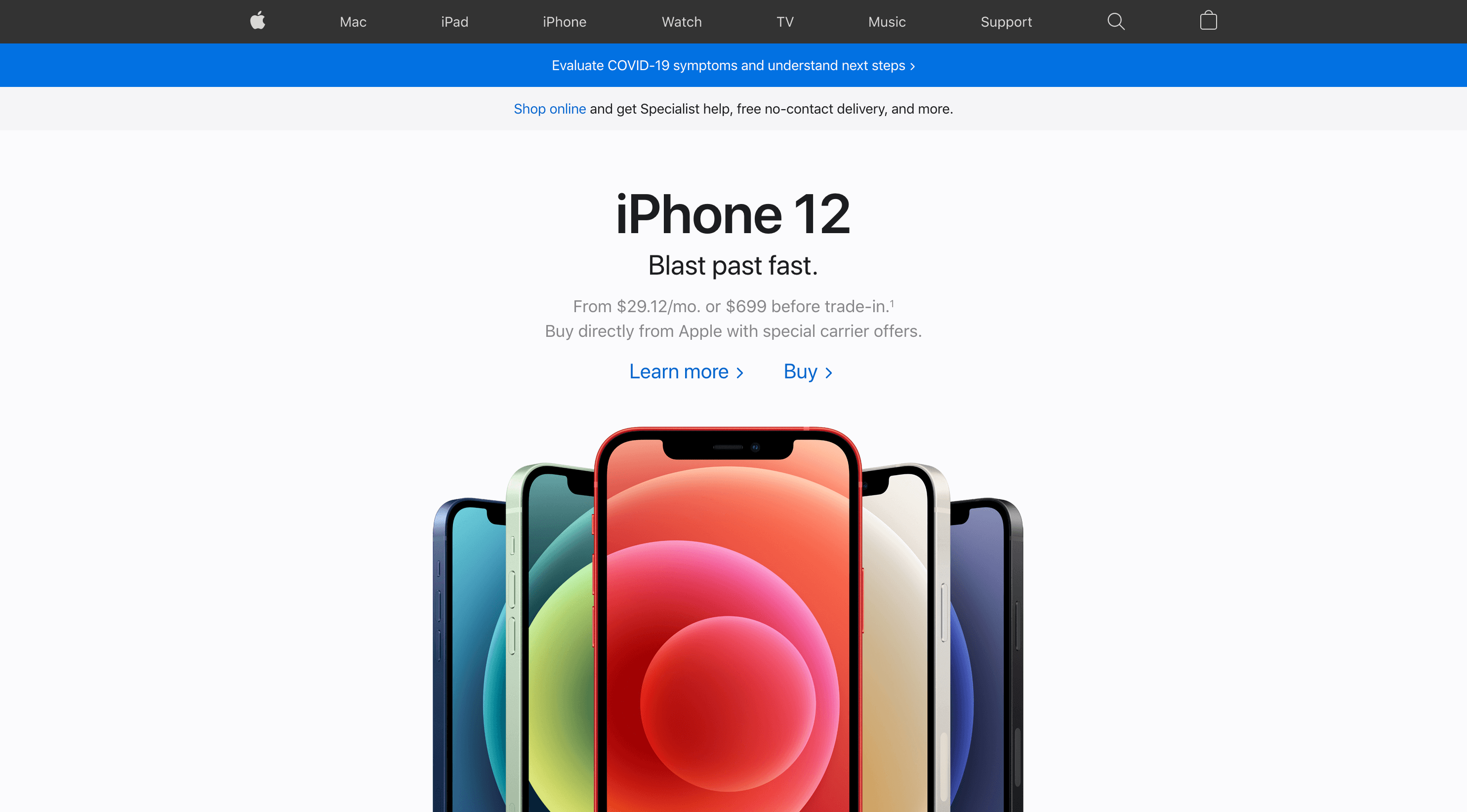
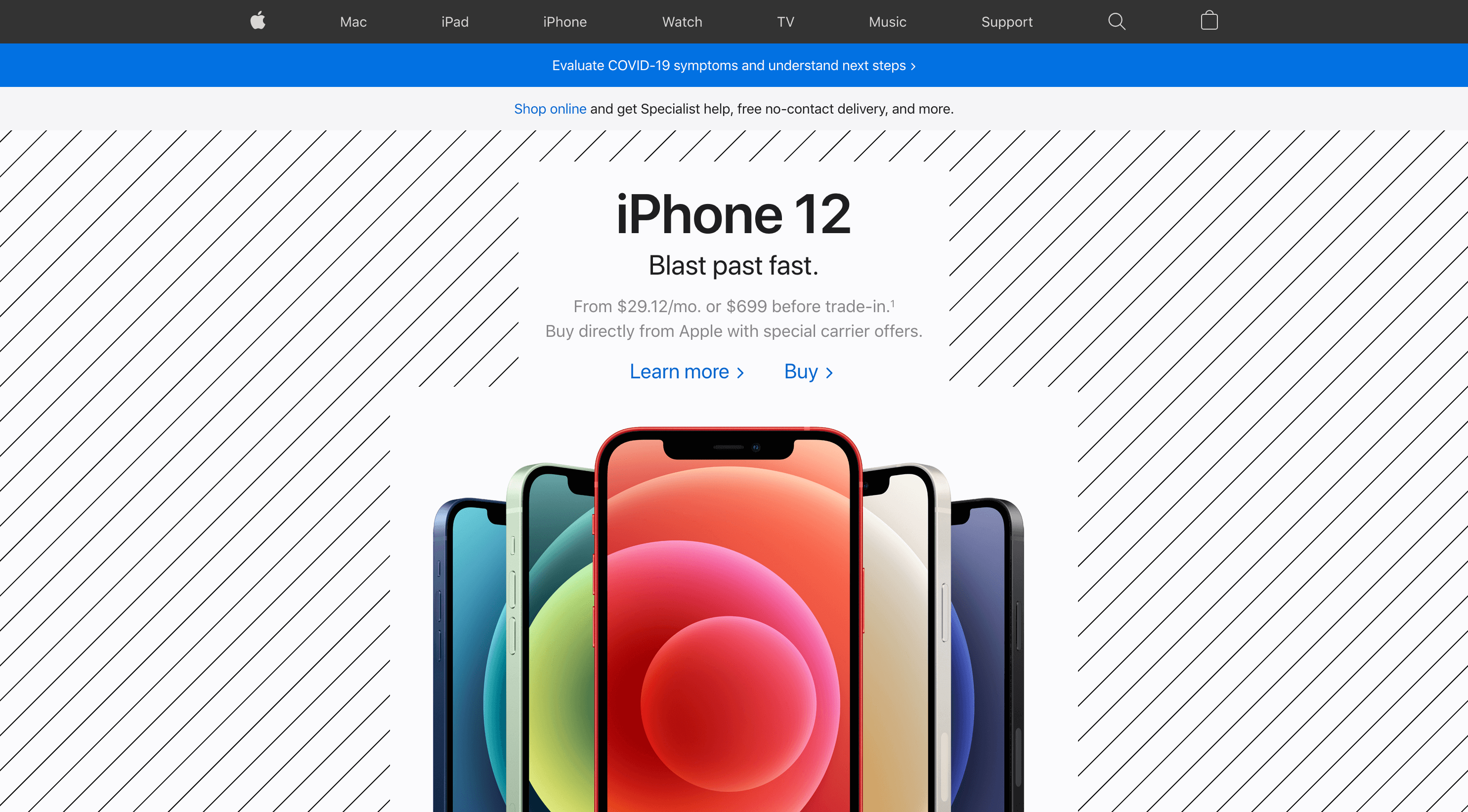
Space around a visual element or group, used in order to draw attention to that visual element or group:
-
Space between groups or visual elements, used in order to reinforce the grouping and hierarchy of content:


-
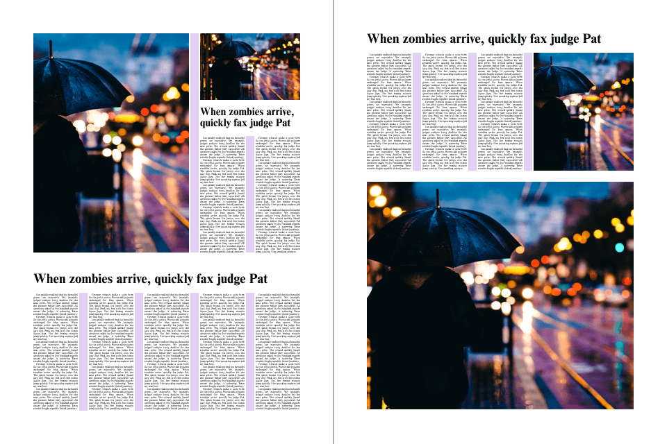
Space between groups or visual elements, used to create clear or dramatic separation between them:


Empty space
Definition: Empty space refers to larger areas of space in a composition that don’t contribute to the structure and visual hierarchy in a design. Empty space is to be avoided.
Examples of empty space include:
-
Too much space between elements that should form a group, like a heading and a paragraph:
-
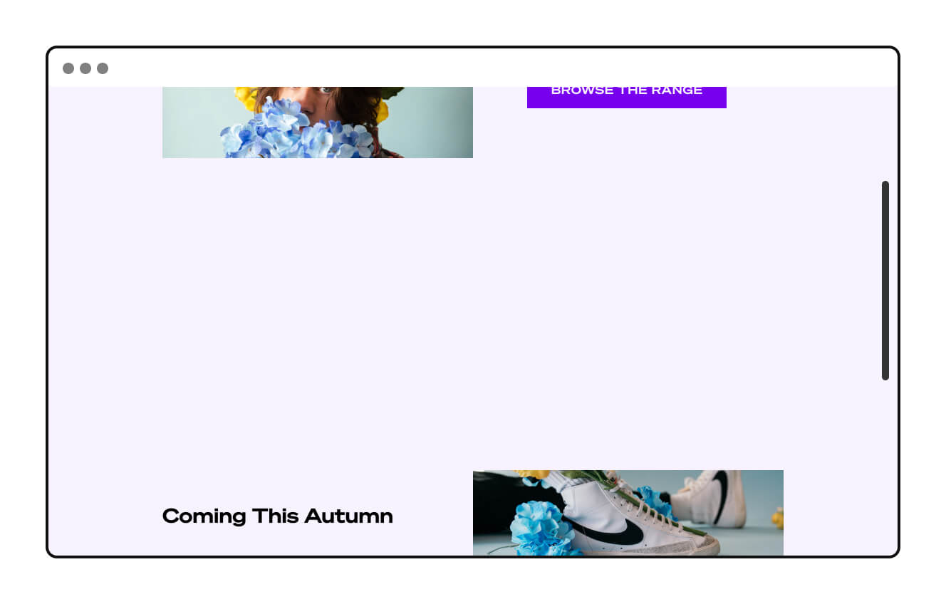
Too much space between groups, like between sections in a webpage:
-
Areas of excessive space that visually dominate content, rather than directing attention to those elements:
In conclusion...
As you work on the projects in this course, think of space as the connective tissue between elements in a design. Be on the lookout for places where there is too little of it, or where it is being stretched too far.
In the next assignment, let’s go through ten practical layout tips to help you make good decisions about grids and spacing.