Course · Part 5 · Assignment 12
Apply 
Guided Brief: Build a Brand Identity
Make a Simple Wordmark
![]() Time limit: 1 hour 30 minutes
Time limit: 1 hour 30 minutes
Remember to use your visual timer! We recommend the inventor’s iOS and Android apps — just search for “Time Timer” in the app store.
Explanation
Sometimes brands use a wordmark as their “whole” logo — like the FedEx logo we looked at earlier.
But it’s also common for brands to have both a logomark (a graphic form like the one you digitised in the previous assignment), and a wordmark, which is the brand name set in text.
In this assignment, design a simple wordmark to go with the logomark.
Instructions
Sketch wordmark ideas
 Set your timer: 40 minutes
In your notepad, write out the brand name in UPPERCASE, lowercase and Title Case, and explore the letterforms within the name.
Experiment with different handwriting styles — for example, try “printed” letters, joined-up letters, and script-style letters. You can also try adding serifs to letters, test out how thick and thin strokes look, and use a range of different pencils, pens, and markers.
In other words, just explore as much as possible on paper, and see how far you can push the design graphically!
Remember, though: the “best” design isn’t the one that is graphically cleverest, or most beautiful — it’s the one that best represents the brand.
Create a simple wordmark in Figma
Set your timer: 40 minutes
There isn’t time in this assignment to develop lettering from scratch — this is quite an advanced, and time-consuming, activity.
Instead, explore Google Fonts and any other typefaces you have access to, and find a font that has similar letterforms to your strongest sketch from the previous step.
Once you’ve done that, type out the wordmark using the text tool in Figma, and experiment with the following ways of customising it:
- Highlight the text, and adjust the letter spacing setting in the Inspector. You can also highlight one letter at a time to adjust the spacing letter-by-letter
- Try different weights of the font (light, regular, bold, etc.)
- Convert the text to vector shapes. Select the text layer, then press command shift O on Mac, or control shift O on PC. You can then double-click the wordmark, and adjust individual points to change the letter shapes.
Review the example solution
Once you’ve completed your work on this assignment, take a few minutes to review the example solution below.
Example solution
We chose the font “Alice” from Google Fonts, and customised it in two very simple ways.
We slightly reduced the space between the letters, and extended the serif of the “m” so that it joined up with the “b”. Here’s a before and after image:
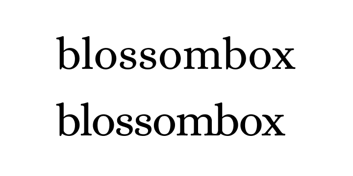
The customisations you make to letterforms don’t have to be big or dramatic. Applying small, subtle changes can be enough to make the graphic distinctive and recognisable.
In conclusion...
Next, let’s continue with typography, and choose some fonts for your brand.