Course · Part 5 · Assignment 17
Read ![]()
Editorial Design Basics
KeyThree
The key points from this assignment.
- Editorial design spans books, newspapers, magazines, reports, brochures, catalogues and more
- Yet these different applications share many common elements, including covers, headings, copy, images, running headers, and page numbers
- These constraints make editorial design one of the most exciting graphic design disciplines
Image credit: Waldemar Brandt
Introduction
It used to be conventional wisdom that the rise of the internet in the late 1990s would inevitably lead to the decline and death of print design. Happily, that turned out not to be the case.
There many contexts where printed matter remains the best design solution. And, arguably, the rise of digital media has heightened people’s appetite for high-quality physical books and magazines — not least because they make us put our phones down.
In this assignment, we’ll look at some of the most common forms of editorial design, then briefly examine what ingredients they have in common.
Types of editorial design
Each type of editorial design follows slightly different rules and conventions, because of the different purposes they serve, and the different constraints involved.
You’ll already be familiar with a lot of these different design patterns from your own interactions with printed matter. As we move through the list, try to gather examples of each one from around your home.
And the next time you’re out and about, see if you can pick up some free brochures and catalogues to add to your collection!
Books
Books span a very wide range of styles, and use layouts that range from the very simple to the very complex.
The traditional novel or work of literature is usually little more than text set in a single wide column on each page:
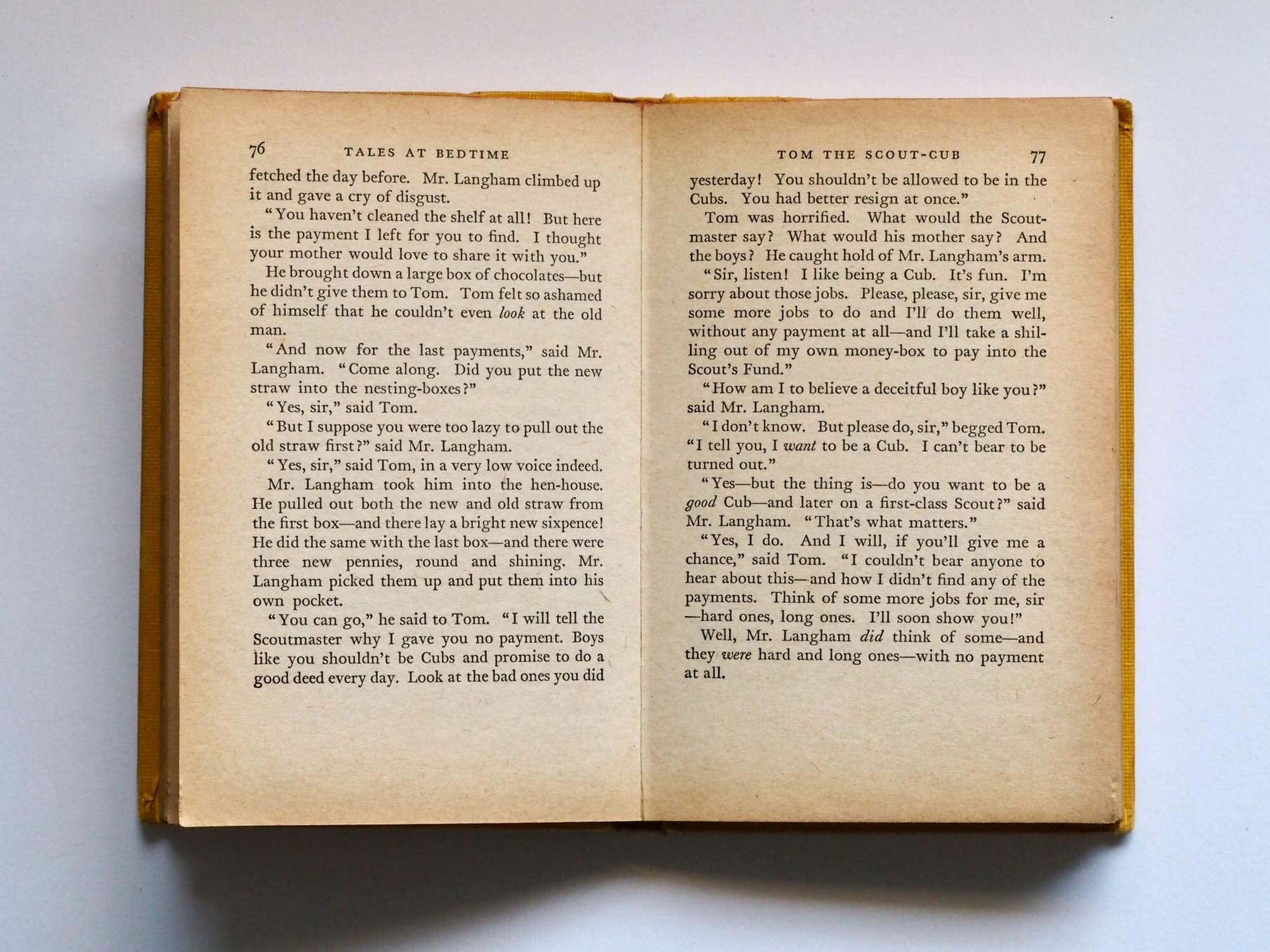
Image credit: Jess Bailey
History books and biographies typically follow the same basic layout as a novel or work of literature, but they also tend to include photos and graphics to illustrate points, people, and events.
Here’s a spread from Ruben Pater’s award-winning design for the 2016 book “The Responsible Object: A History of Design Ideology For the Future”:
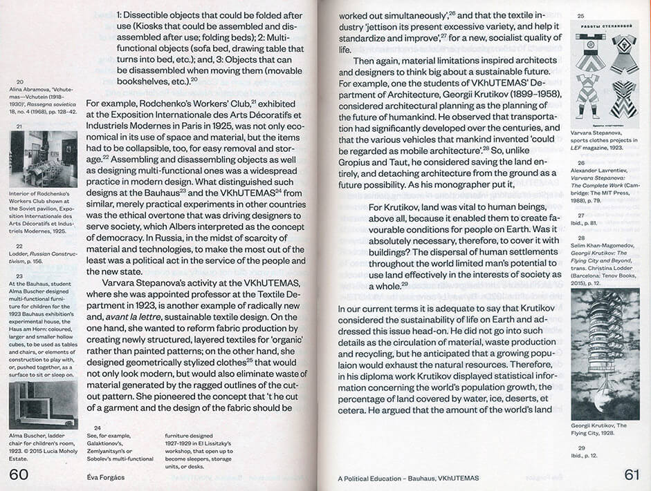
Image credit: Ruben Pater
Textbooks and other reference books tend to be the most complex, since they often have a lot of images and a lot of different types of content, including things like exercises, recaps, glossaries, and so on.
This spread from Ellen Lupton’s book “Thinking With Type” weaves typographic images between captions and paragraphs of text:
Image credit: Ellen Lupton
Children’s books can also come the way of graphic designers, and they usually demand visually stimulating results, with an emphasis on size contrast and colour contrast in particular.
In collaboration with his wife Ann Rand, who wrote the text, the great twentieth-century designer Paul Rand created many children’s books. Here’s a spread from “Listen! Listen!”:
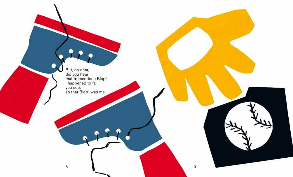
Image credit: Ann Rand/Paul Rand/Princeton Architectural Press
Newspapers
The first newspaper was printed in Germany in 1605. In the centuries since, newspaper design has evolved significantly.
A hundred years ago, the average newspaper was entirely black and white, and was mainly formed of dense columns of newsprint, with the occasional photo or illustration. Here is the front page of the New York Times for 13th June 1920:
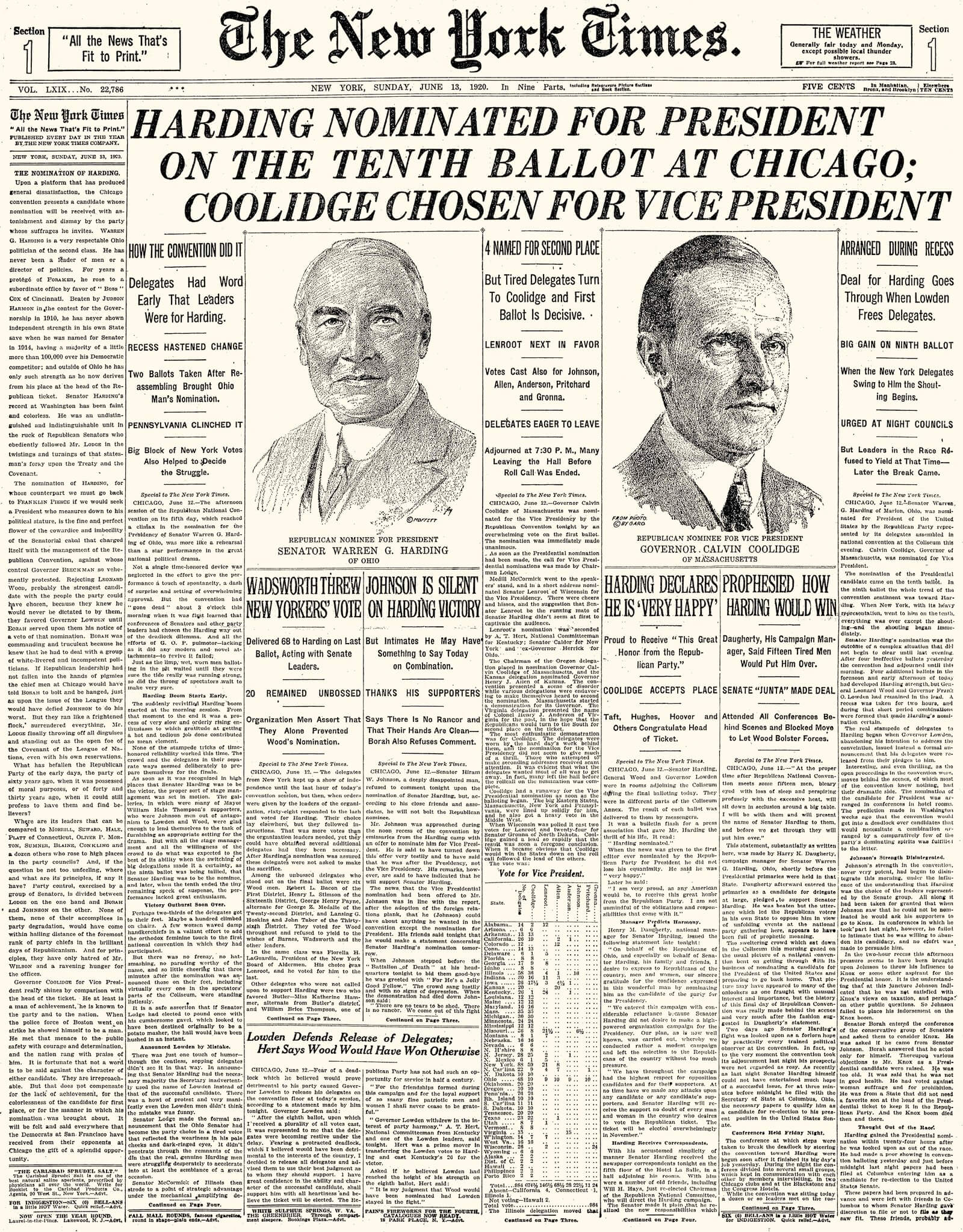
Image credit: New York Times
Today, newspapers are typically printed in full colour, with large headlines, feature photos, and highly flexible layouts. Many also now use a smaller “tabloid” paper size. Here is the front page of The Guardian for 9th November 2020:
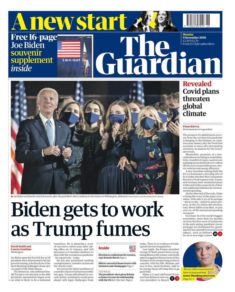
Image credit: The Guardian
Magazines
Although they span pretty much every conceivable subject, most magazines share a lot of common aspects:
- impactful covers
- lots of photos, illustrations and graphics
- customised, graphic use of typography for headlines
- variation of pacing
- full-page ads
- use of a modular grid
- extensive whitespace
Below are some spreads from three excellent contemporary magazine designs. The first, Kinfolk, demonstrates graphic use of typography and dramatic use of whitespace. (These spreads are taken from various issues.)
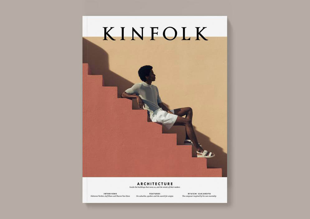
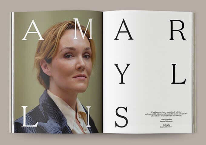
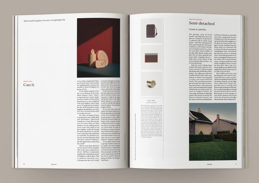
Image credit: Kinfolk
The next set of spreads are from Surface magazine. As well as graphic use of typography, this design uses varying body text sizes to create visual structure and interest.
Photographs are also used in such a way that the shapes and patterns within each image help support the balance and hierarchy of the overall layout.
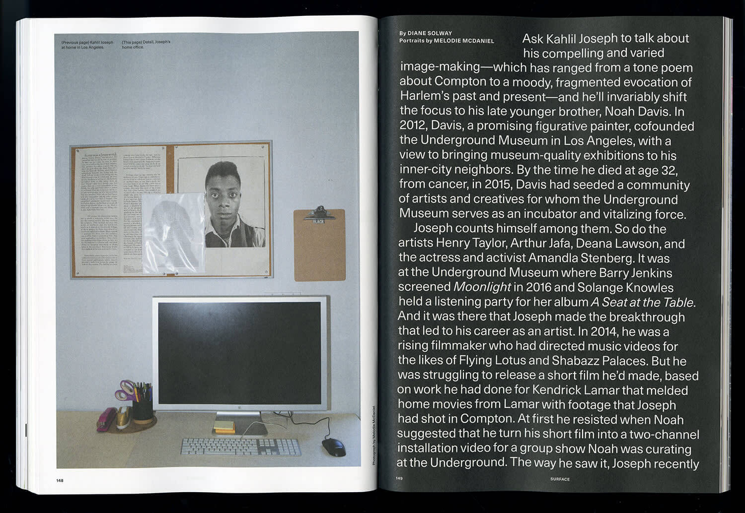
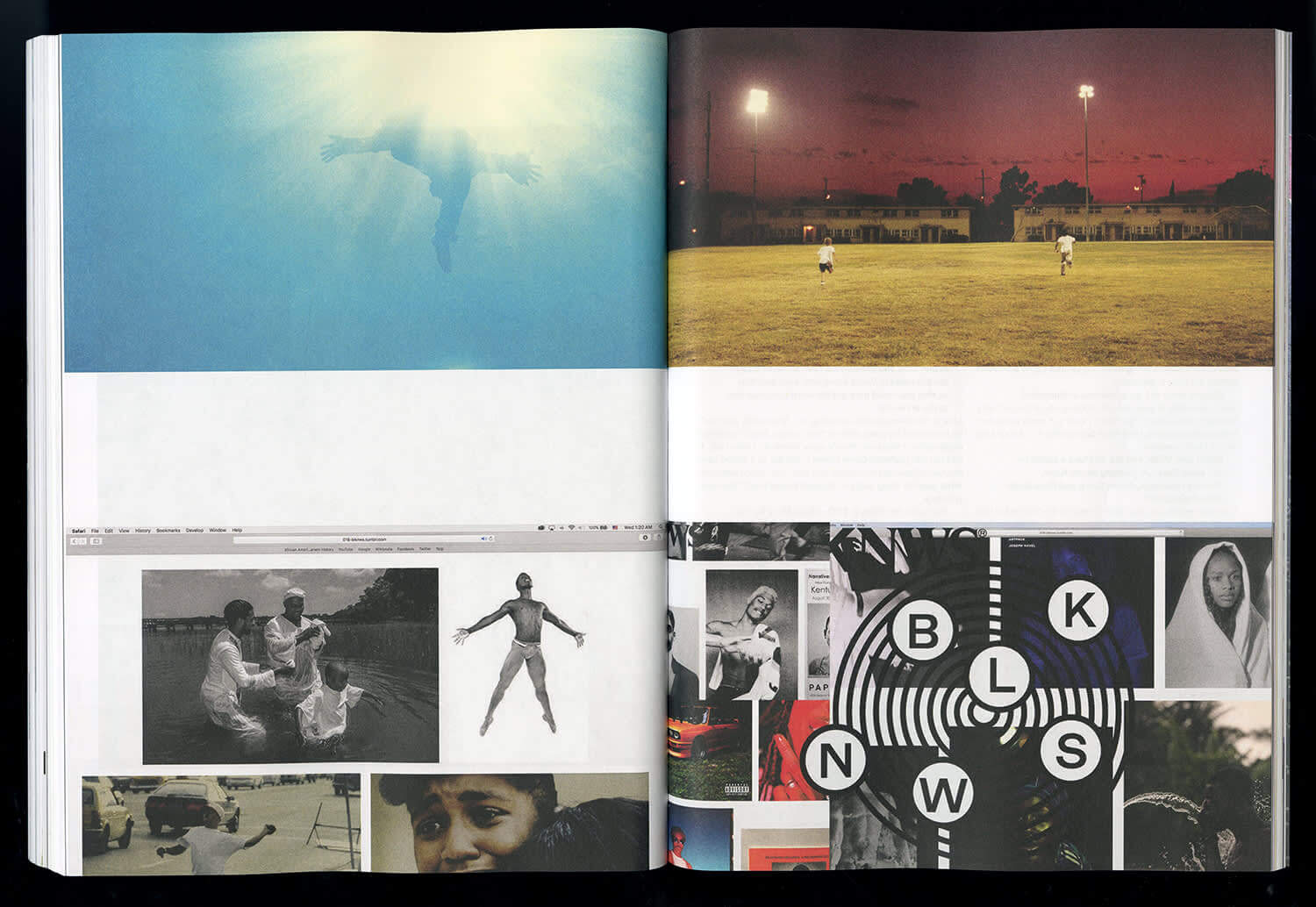
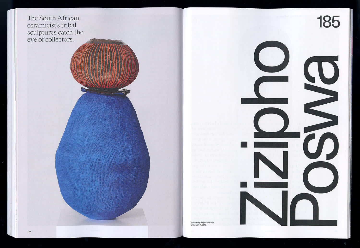
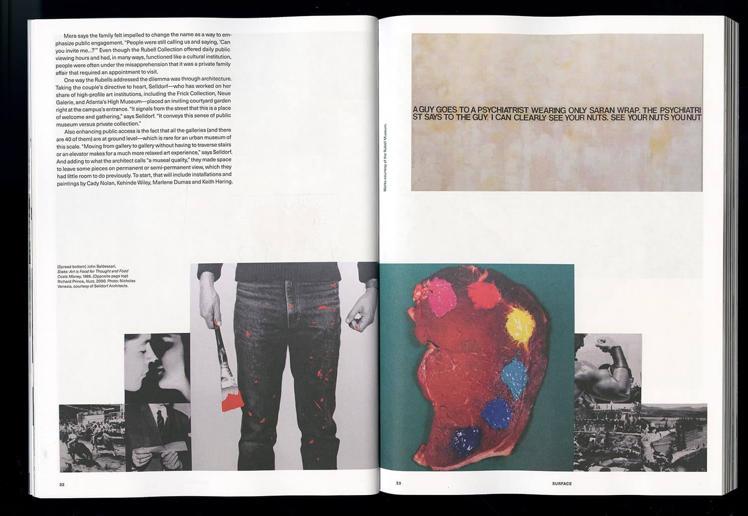
Image credit: Surface
Finally, these spreads from Wallpaper magazine demonstrate a more conservative approach to typography and typesetting.
They are also a great example of how to integrate full-page ads into a print design. Notice how the shapes and colours in each ad complement the content on the facing page.
Although ads are often thought of as a necessary evil in print design, these spreads show that they can play an important role in pacing content and separating features.
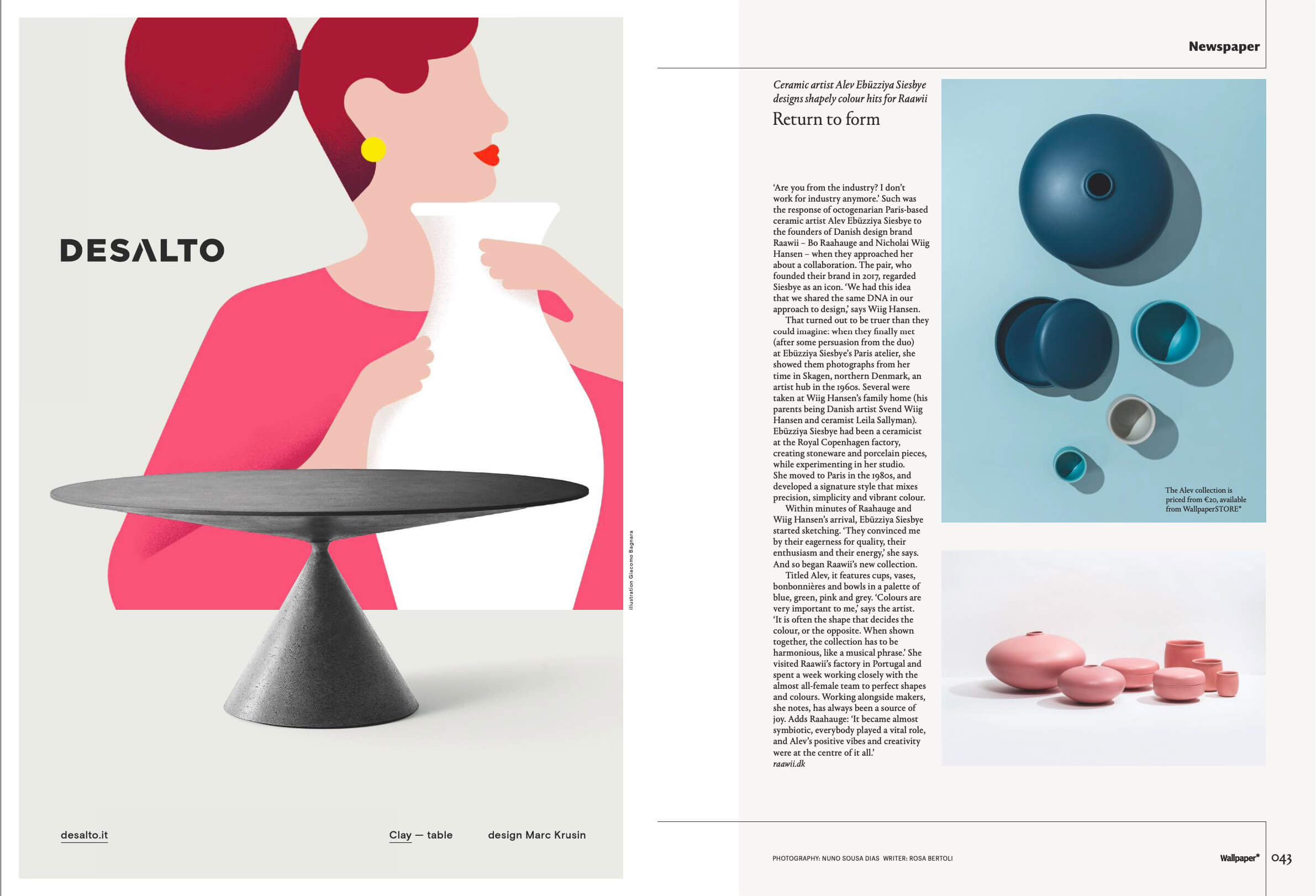
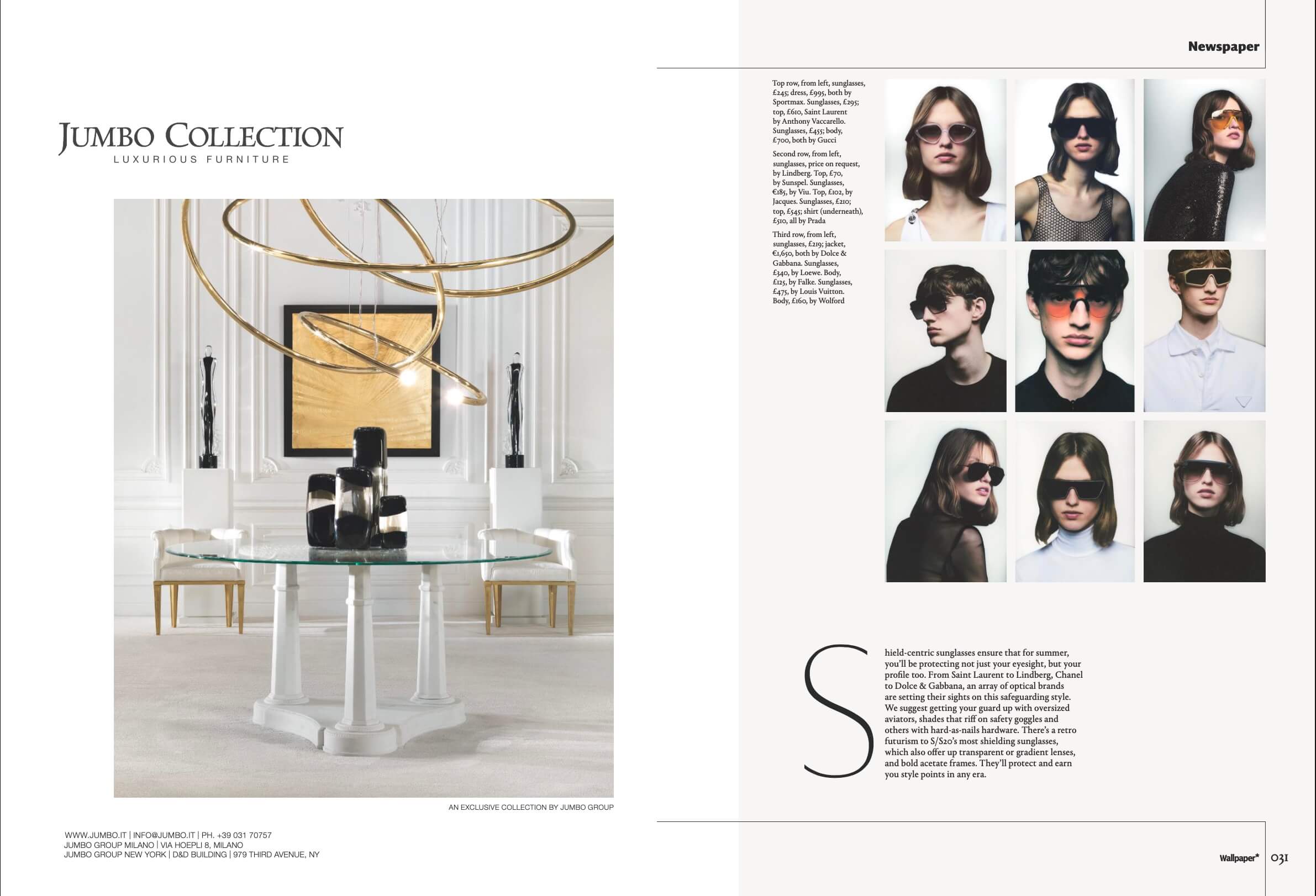
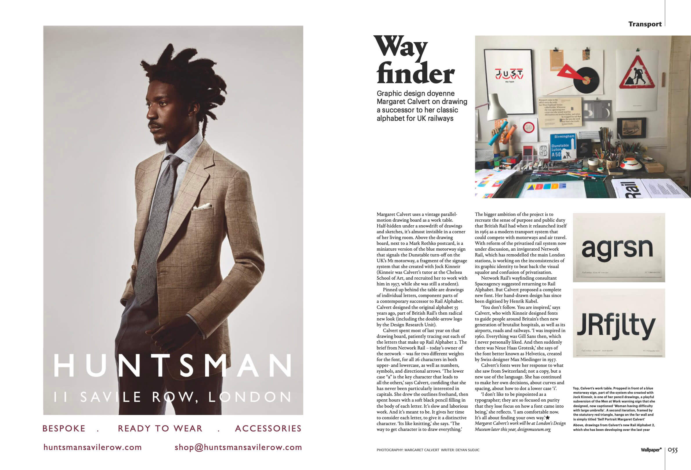
Image credit: Wallpaper
Reports
Annual reports for businesses and charities are typically similar in physical dimensions to magazines, but need to fulfil quite a different purpose.
Usually, they need to align perfectly with the brand, while clearly communicating detailed facts and figures, and telling a story about progress made since the last report.
Here are a few front covers and page spreads from some excellently designed reports.
This report from the organisation New American Economy is a great example of how to combine branding and data visualisation in an editorial format:
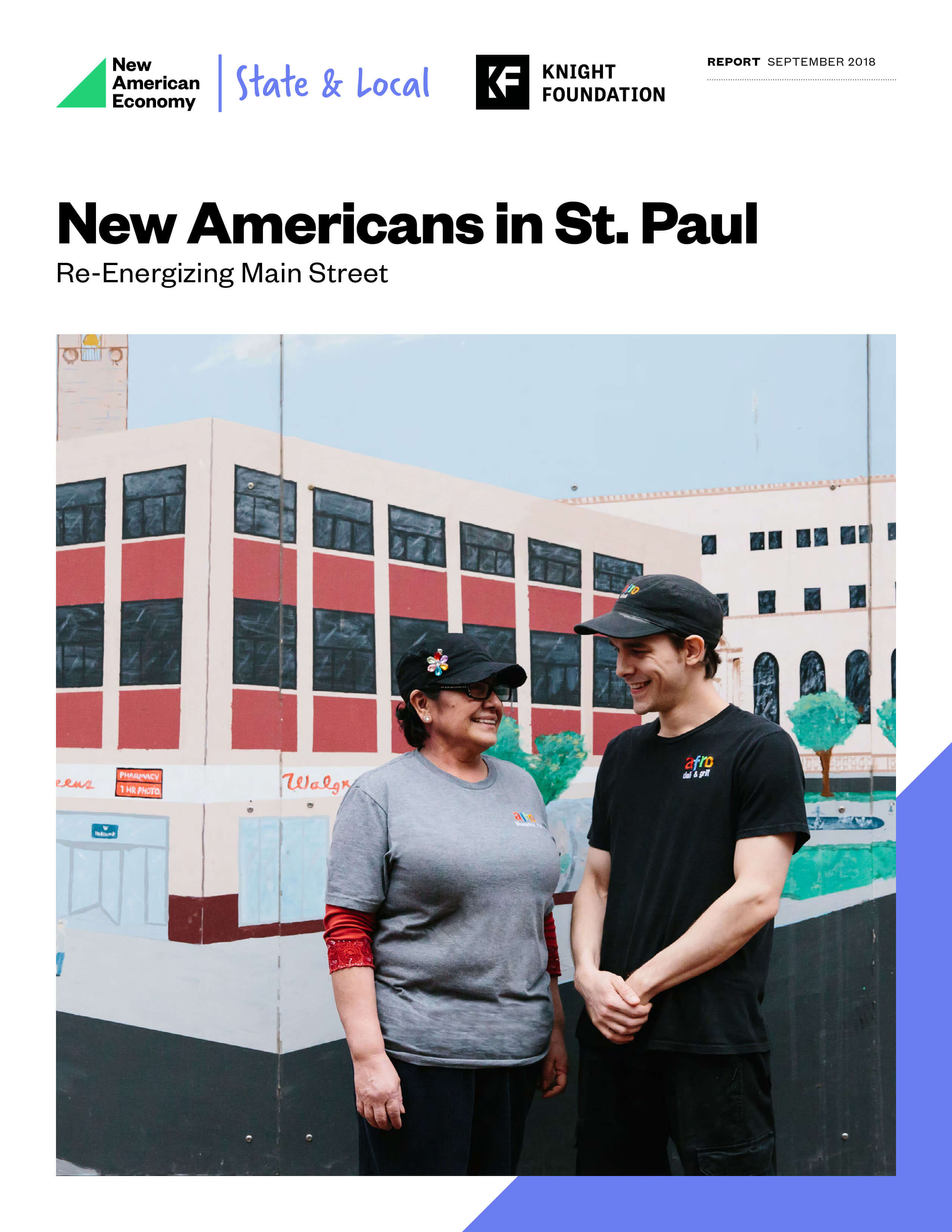
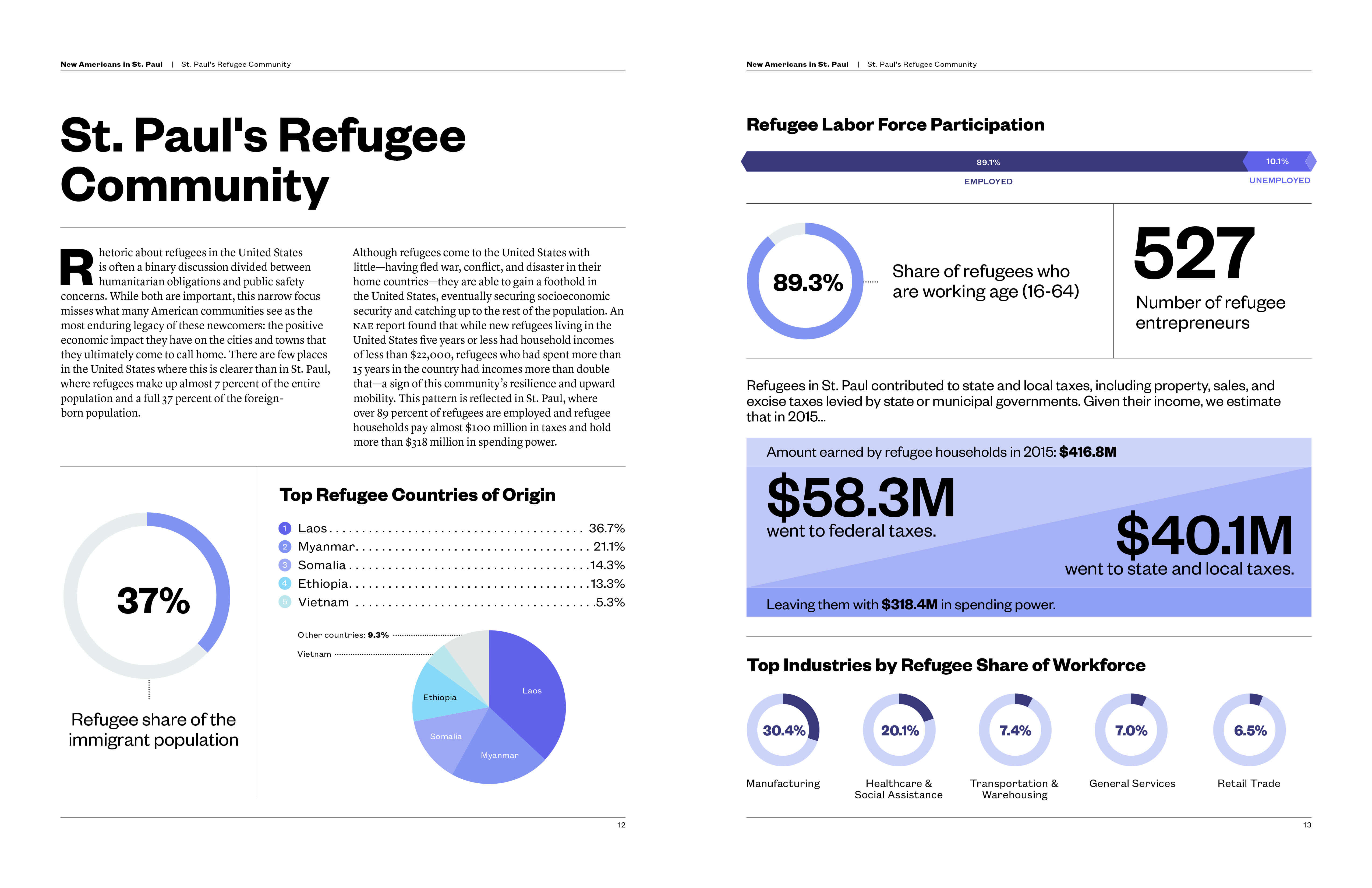
Image credit: New American Economy
Next, this report from the oat milk manufacturer Oatly draws on the brand’s distinctive typography, colour palette, and light-hearted brand personality:

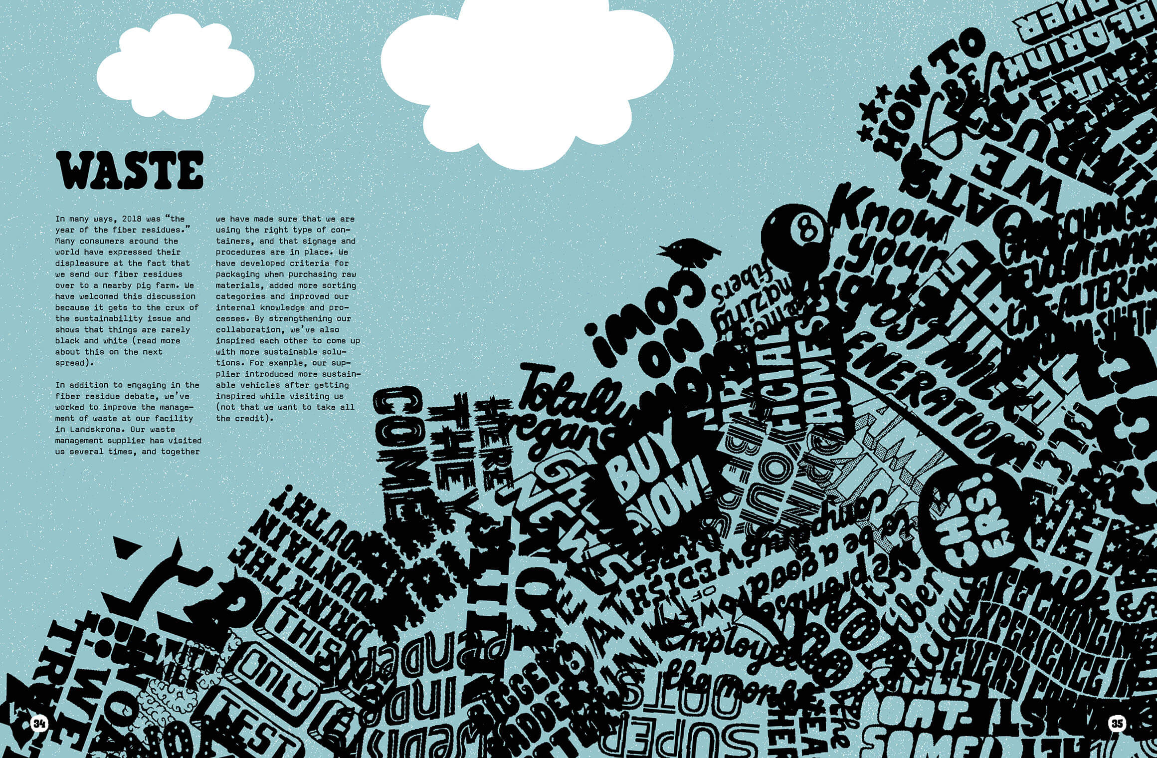
Image credit: Oatly
And lastly, this report from the charity Equal Justice Initiative uses high-contrast colours and a stark illustration style to reflect the seriousness of its work:
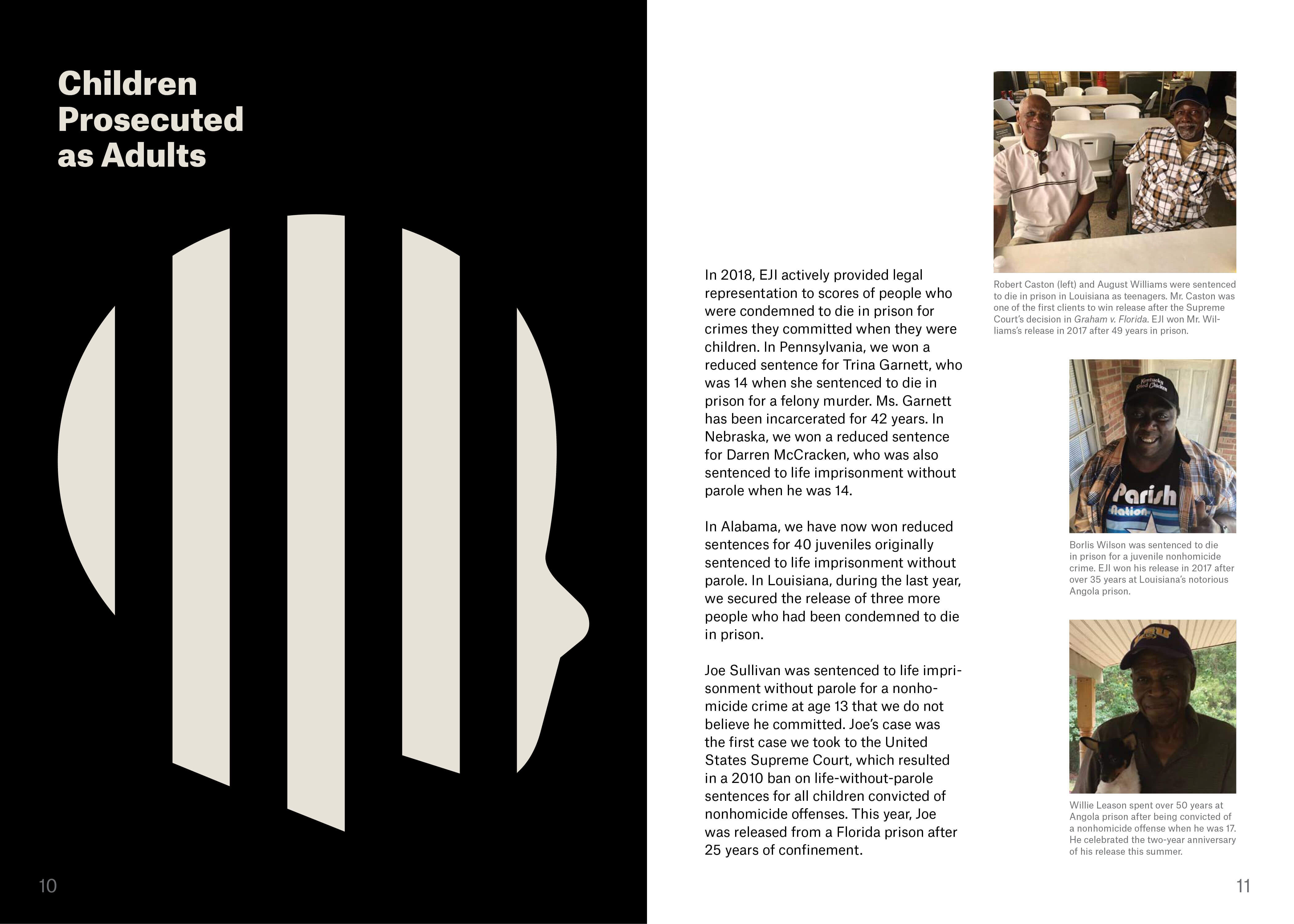
Image credit: Equal Justice Initiative
Brochures and catalogues
Finally in this list, another common form of editorial design is seen in brochures and catalogues.
These publications typically pose the challenge of having very repetitious content — for example, each item probably has a name, a description, an image, and a price.
The editorial designer’s task is often to turn that dry content into something enticing and visually varied.
Here’s another look at the IKEA catalogue we referred to in Part 4:
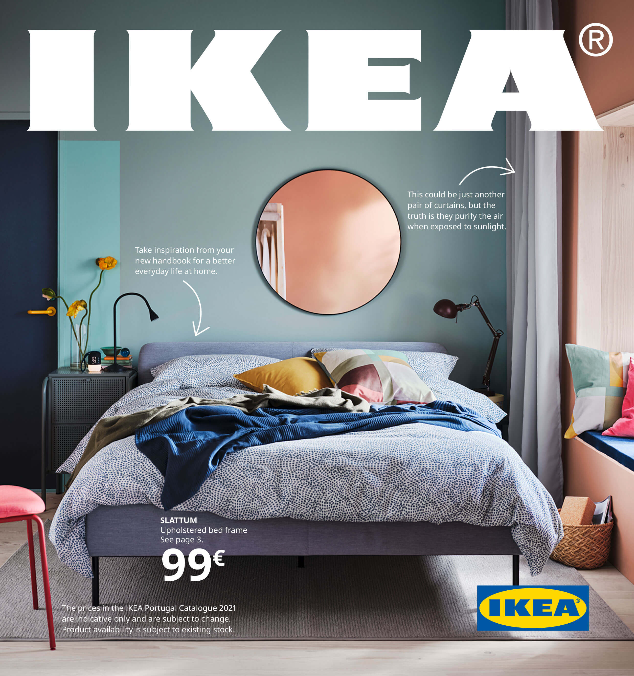
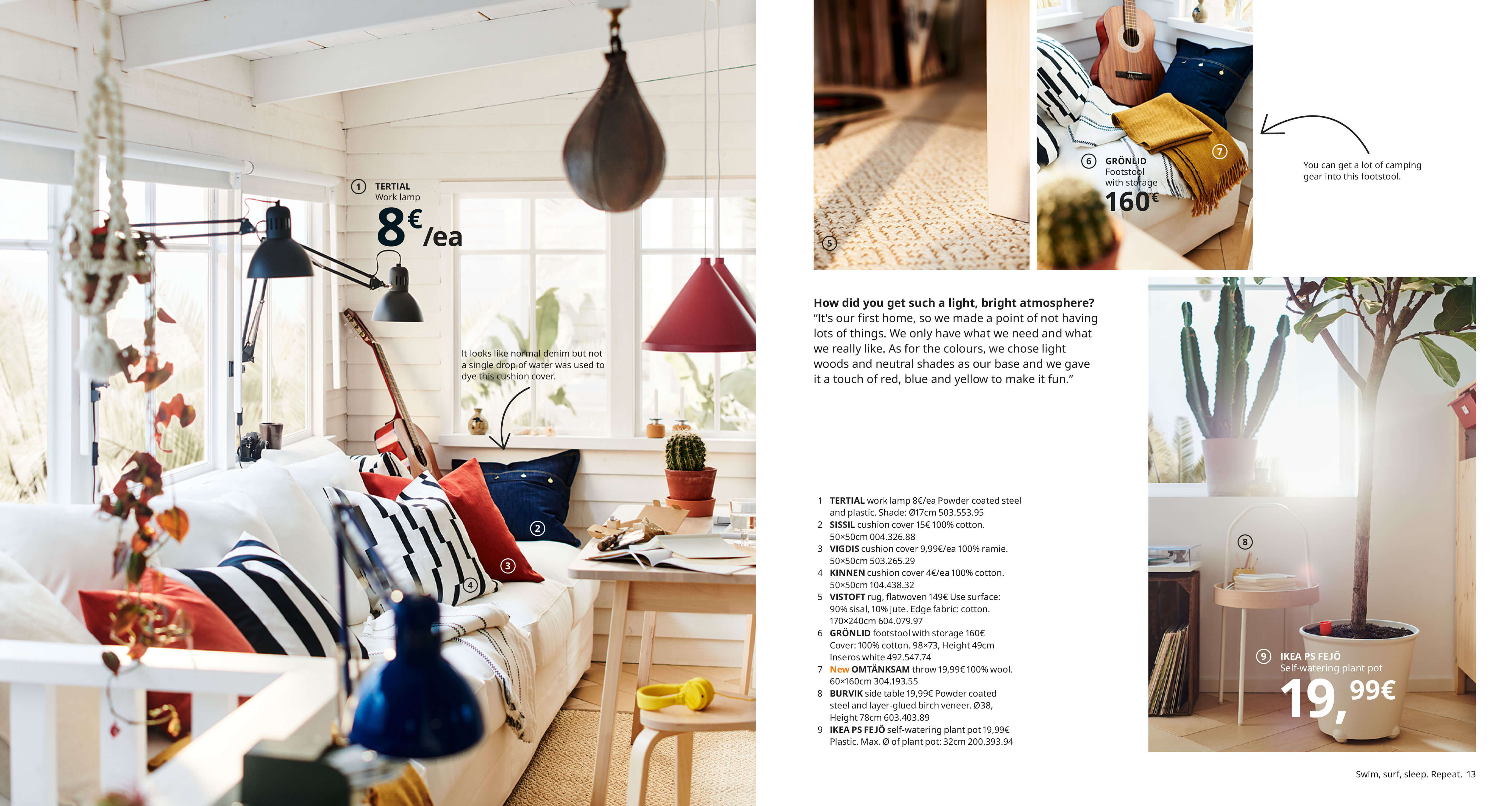
Image credit: IKEA
Brochures have a specifically promotional purpose, so often need to be a bit more impactful or experimental in order to capture people’s imagination. Here’s a brilliant example of brochure design for The Edgeless School:
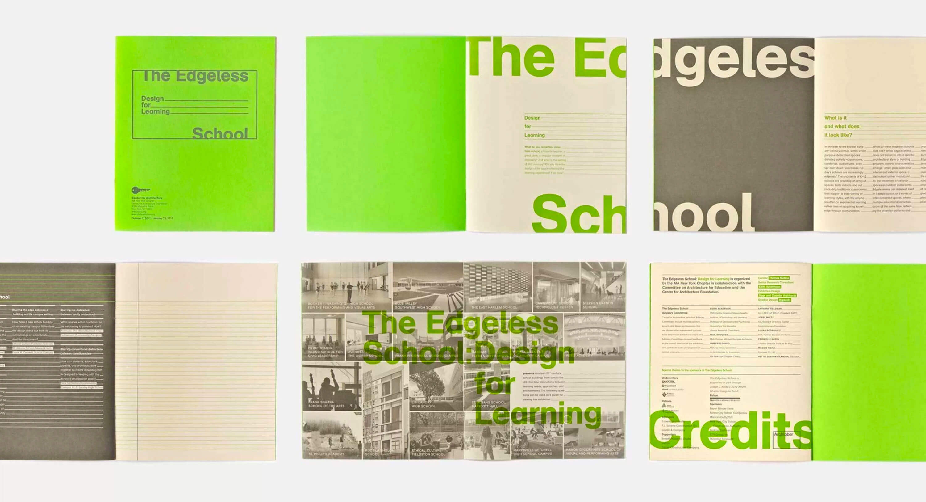
Image credit: The Edgeless School/Hyperakt
As you’ve just seen in the examples above, editorial design is a diverse field. Nevertheless, the kinds of project we just explored above have many ingredients in common.
Editorial design constraints include:
- Paper size
- Maximum number of pages available
- Whether full colour is available, and on how many pages
- Printer-specific constraints
- Other project-specific requirements
Elements include:
- Headlines and headings
- Copy (text)
- Photographs
- Illustrations
- Tables, figures, and diagrams
- Footnotes, labels, and captions
- Page furniture (page numbers, running headers, etc.)
- Ads
In conclusion...
As you begin to work on your own editorial design projects in the assignments ahead, remember that the list of ingredients above is quite short.
Ultimately, the job of the editorial designer to present text and graphics in a way that supports the communication of the content to its intended audience.
In the next assignment, let’s look at some of the things that make an editorial design great!